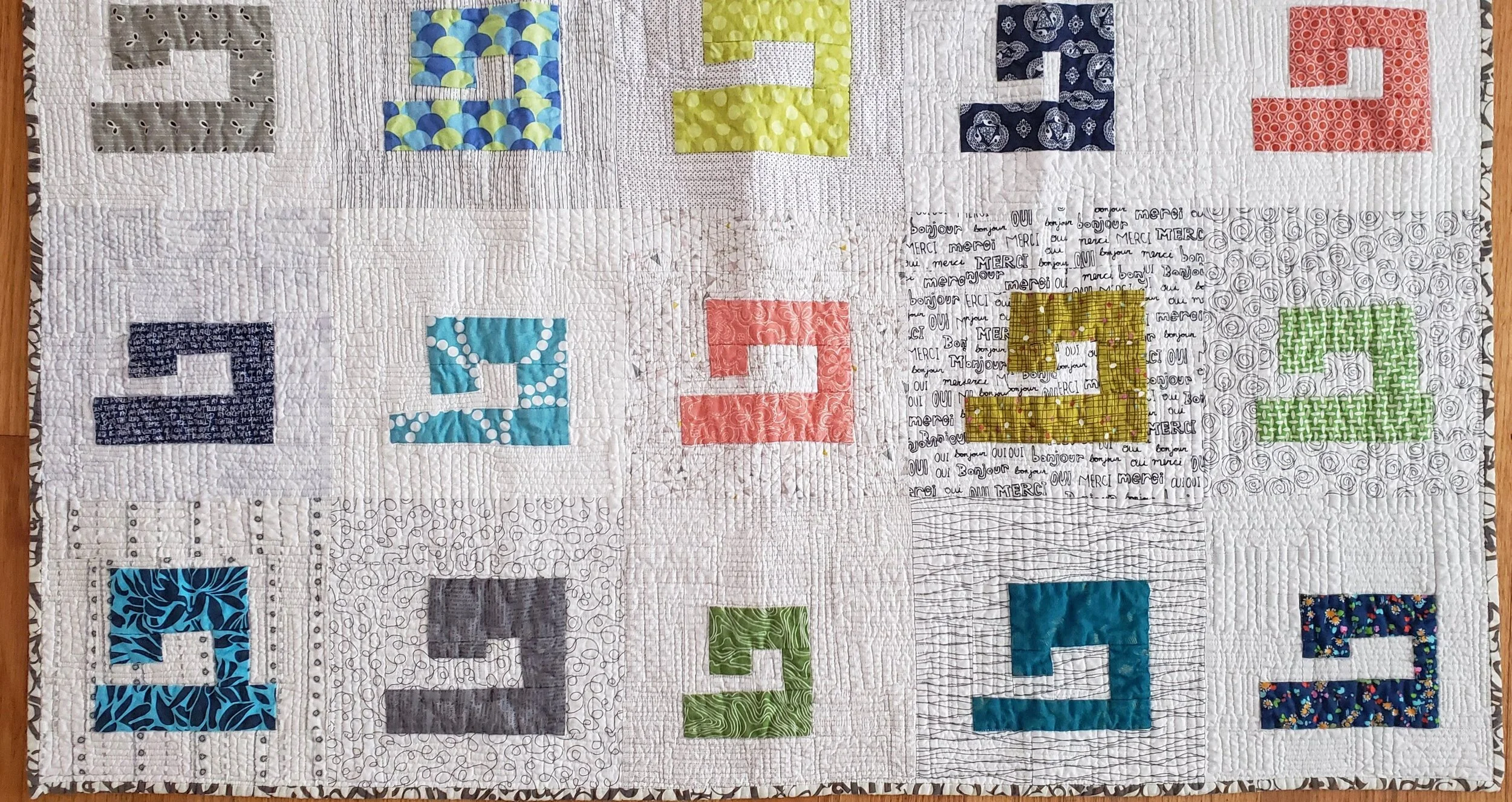
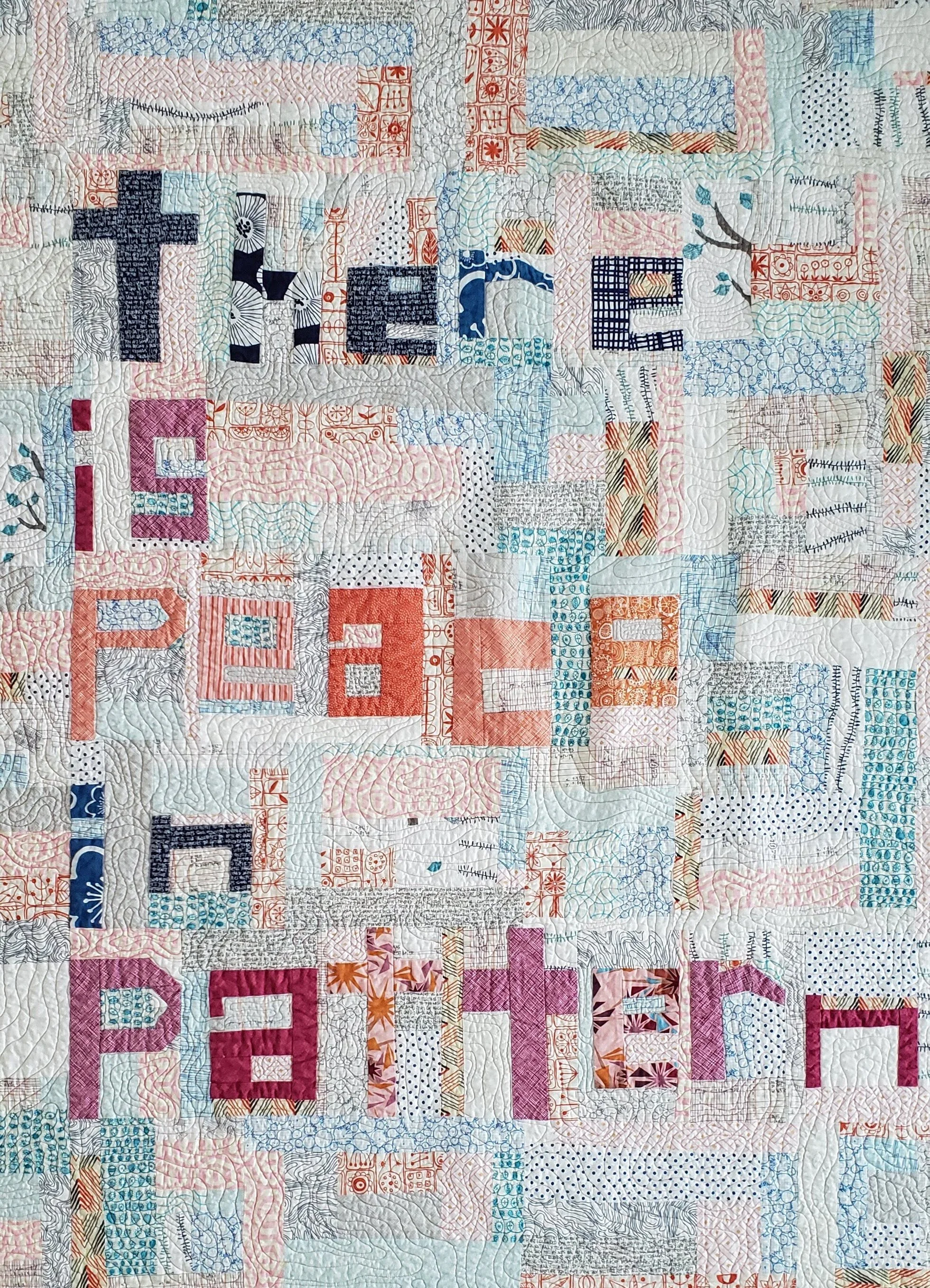
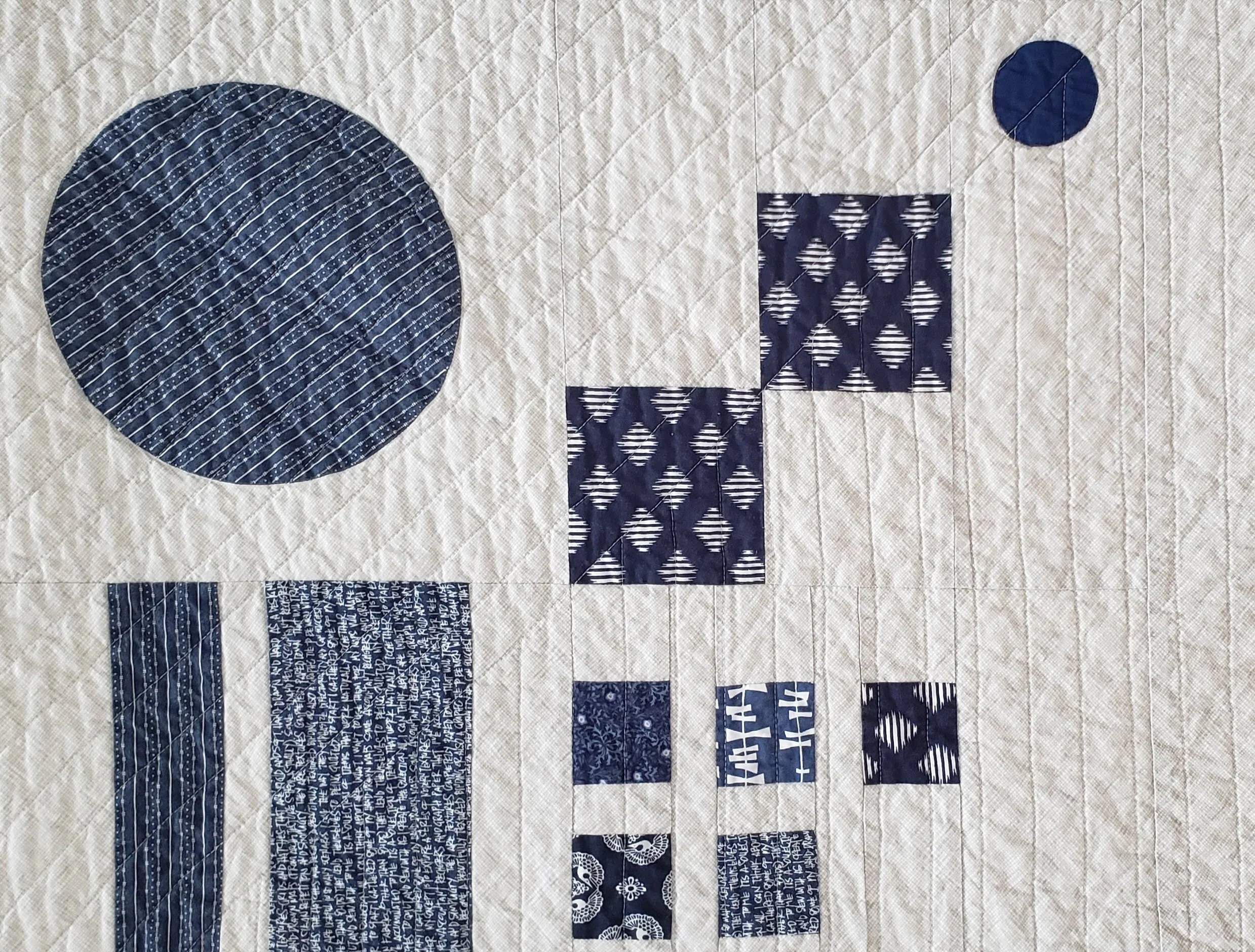
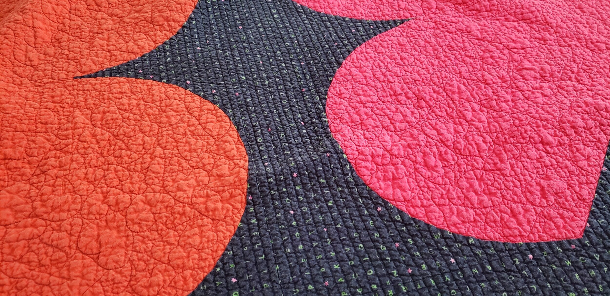
"teaching"

No Travel? No problem! Webinar Opportunities

Improv Letters/Words Cheryl Arkison

Oh! The places I went.

Working as a quilt professional has taken me to some mighty amazing places. From the small towns and big cities, quilters are the same. We just to make and create and enjoy the company of others. We are there for ourselves, we are there to make for others, we are there for the fabric. And, if you are one of my students, you are there for me. I consider it an immense privilege to be able to entertain, to teach, all of you.

I miss it.

The travel, while stressful, always came together in truly memorable experiences for me. You’ve brought me to some pretty amazing places and gave me the time to explore just a little. A few times there were language barriers, but quilts do end up being a universal language. Ultimately though, it is the people that make it all worthwhile. Quilters are pretty amazing people. And that’s a universal truth no matter where you are in the world.

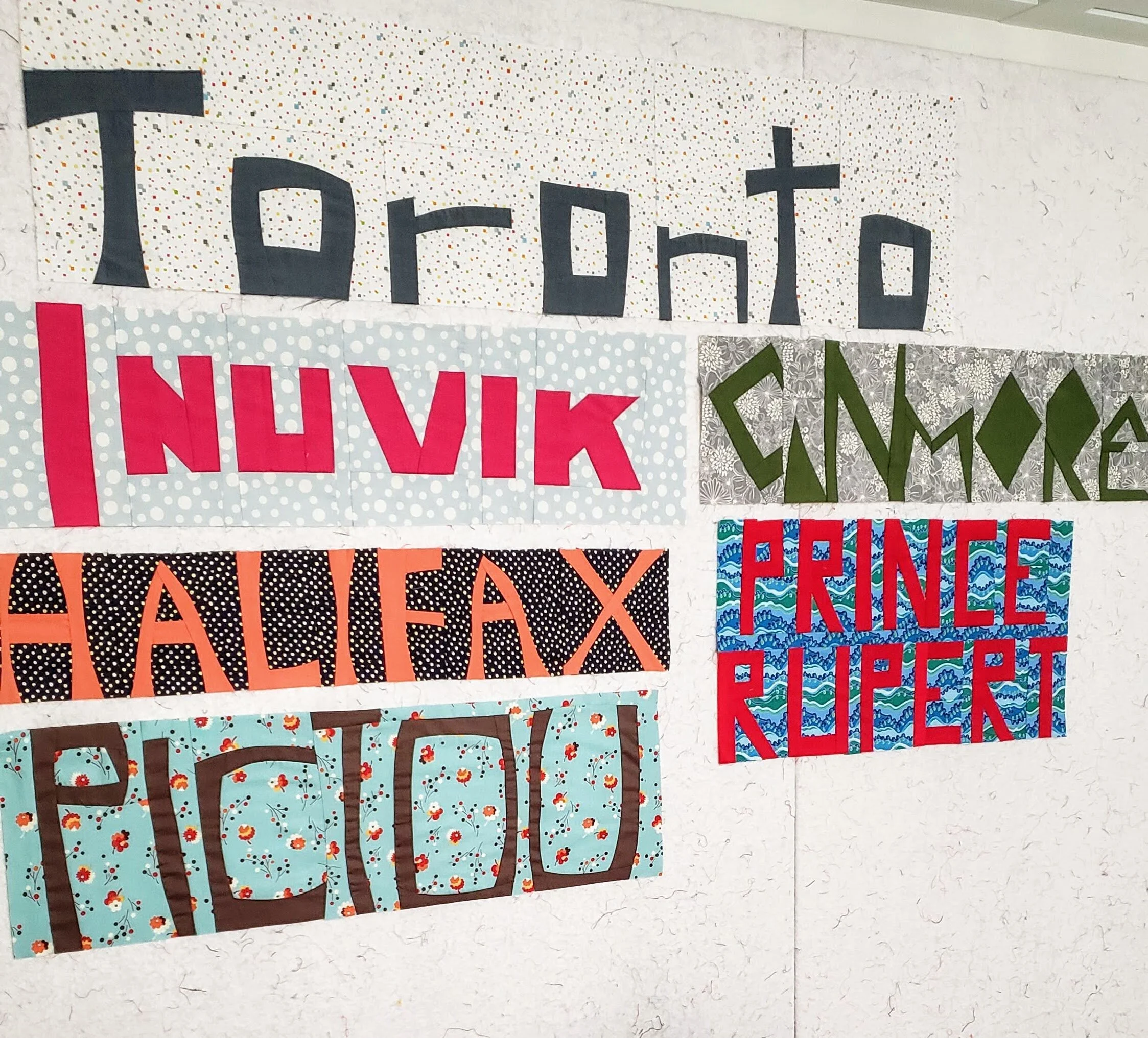
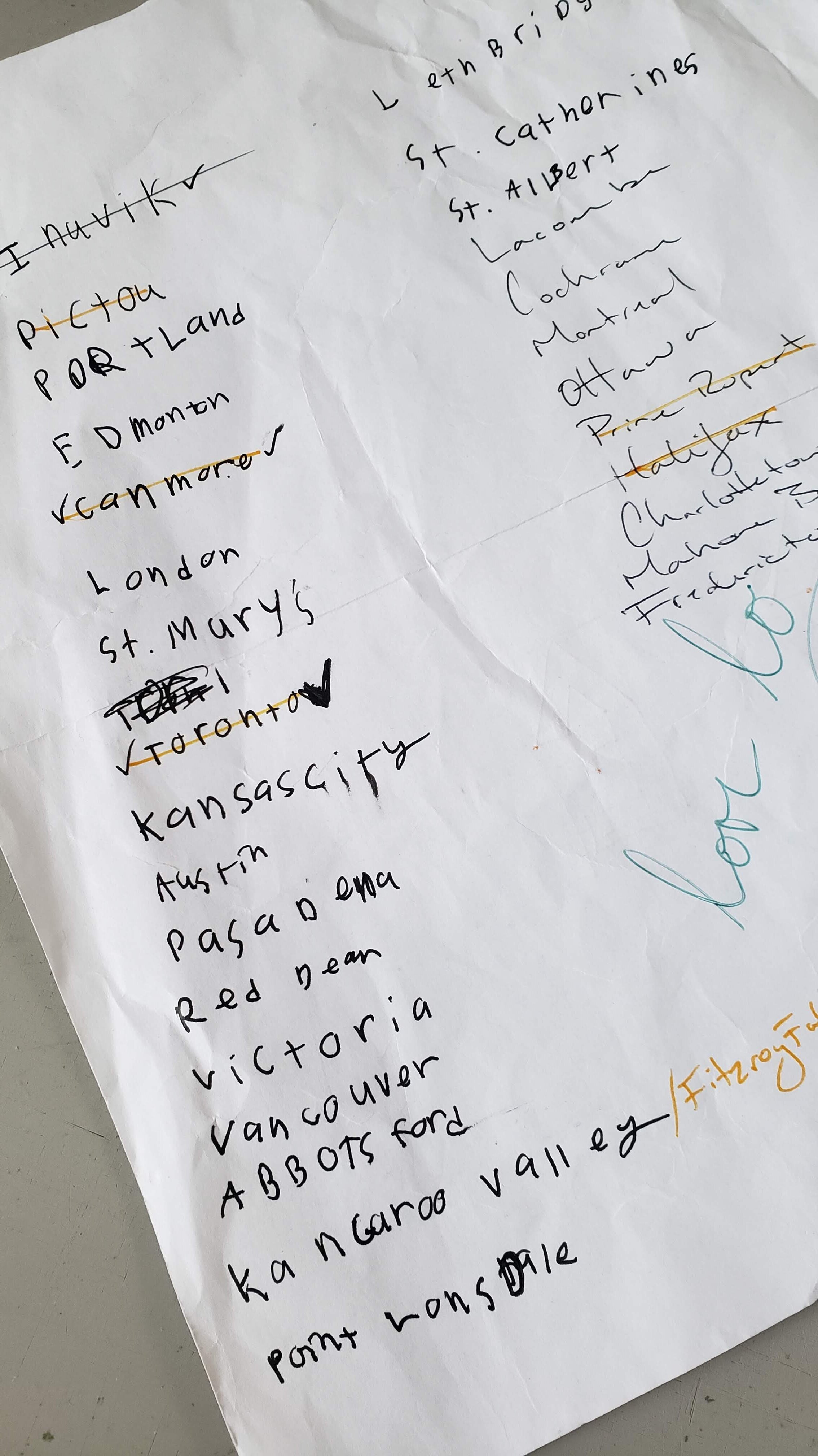
Quilting locations Cheryl Arkison

As a teacher and entertainer I loved the moment in someone when they ‘got it’ best. As an improv teacher I’ve seen people struggle with the open endedness then the turn around as something comes together in a beautiful, albeit unexpected way. Or the visible relief when they don’t have to have it all figured out in order to sew. Or the joy in a simple little trick that will make all their sewing easier. Or the laugh when we all realize that we don’t need to take ourselves so seriously.

While I admit that online learning deprives me of those moments, it does nothing to diminish them for everyone else. I’ve played in the online world and always wanted to do more. So let me tell you I am working on it. You know, in between all the homeschooling and running and business and keeping everyone loved and mostly happy.

In the meantime, I’ve opened up some webinar opportunities. This way you can get me in the comfort of your own own for either some sewing/demo presentations or for a lecture/trunk show style presentation. Book with a group of friends, your guild, your store, or even just yourself! We can’t be together just yet, but I can at least show up in your sewing room.

Does this mean I will have to INTERNET to my list of places?

Quilt Bravely - Say Hello to Prints as Background

This is the second in a series of posts encouraging you to be different, quilt different, quilt bravely. To bend or even break some rules while pumping up your creative voice. You have the creative confidence, I’m just here to remind you of it.

Most of the first few quilts I ever made - some 2 decades ago - were pretty colours with a white background. For those first few years I couldn’t imagine how I would make a quilt any other way because it just looked so perfect to me. Well, I’m not sure what changed, but it’s been at least a decade since I made a quilt with a plain white background!

To be clear, I was almost never using plain white, a solid. No, I was using that lovely stuff called White on White, or what we used to refer to as WOW prints. A pretty shiny white ink on white fabric. Now, of course, the whites were never all the same and this row of fabrics in any quilt store will read from bright white to eggshell to cream.

Side note: if you ever find that white ink to be too bright, use the wrong side of the fabric. You get the idea of the print without the glaring brightness of the ink.

Then I discovered low volume prints. There weren’t as many then as there are now, but they definitely existed. More often than not that can still be located in the black and white section of the fabric store. Only now you can get a lot more choices of coloured ink.

I do find that people are afraid to use prints in a background, worried that they will overwhelm the design. Or, they are used and the design disappears. Here are two fundamental lessons to making sure neither thing happen.

Value Matters

Value is the relative light and dark of a fabric. The key word being relative. It is about what the fabrics look like next to each other. If you want your design to stand out, then you need good contrast between the main design components and the background. This matters especially so when all the fabrics are prints. It isn’t enough to just have colour contrast, or maybe you want a monochromatic look. Either way, making sure the value of the background prints contrast with the design elements is important.

You also want to make sure that your background prints are all of similar values. They don’t have to be match match perfect, but aim for similar. This leads to the next key lesson.

Sewing Machine Quilt, check out Pattern Drop

Sewing Machine Quilt, check out Pattern Drop

Texture Matters

Texture is the look or density of the print. Is it a sparse, large scale print with negative space between design elements? Is is a dense text print with little space. Side by side, the dense print will look darker.

It isn’t that you have to pick prints where they are all the same density, but knowing that some will pop while others will recede allows you to balance their use across a quilt. And if you have one print that really seems to be taking over the background you can do two things: remove it, or add more similar prints, so nothing stands out on its own.

Colour can make a difference in backgrounds. Be willing to experiment with pale colours instead of white. Pick multi coloured low-volume prints instead of black and white. Mix grey with black and white. Or heck, make your main design elements a light colour and your background a delicious, dark print.

Have fun playing with prints. They are a pure delight. And we have such amazing fabric designers in the world providing us with endless inspiration.

Check out the first in the Quilt Bravely Series: Creatively Contrasting Binding.

For more details on using low volume prints as background make sure to check out my book, A Month of Sundays. It gives you all the lessons!

Neutral Values Quilt Top

Values Quilt Cheryl Arkison

Woah! Major back pain/sciatic flare up here. I spent last weekend either laying on the floor or rocking on my feet - in between ballet recitals and year end parties. I needed a creative boost. And, frankly, something to do that was distracting. Since I needed to stand a lot I spent some time on the design wall.

You see, this is the nice thing about so many quilts under construction. I needed a set of blocks for some design wall play and was able to pick from a few stacks. I chose a bunch of half square triangles. They started life as sample blocks in my Values class. Always make samples that coordinate and eventually you have enough for a quilt!

neutral values 2.jpg

It was just a stack of random blocks. I asked my sick, bored kid to count the blocks, then I played around with an idea until I could make it work with the blocks I had. In my time on the floor I lay below the design wall to contemplate options. While standing I could move things around and eventually sew here and there. I’m really happy with the way it worked out. It isn’t that big - only 55” square - but for now I’m adding it to the list of quilt tops. But if I teach that class again this coming year I might have more blocks to add to it!

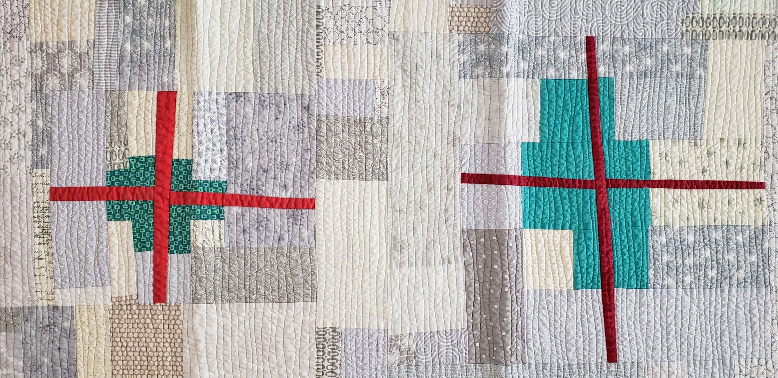
Plus Size - Scrap Quilt Extraordinaire

Scrap Quilt Values Plus Cheryl Arkison

Plus Size

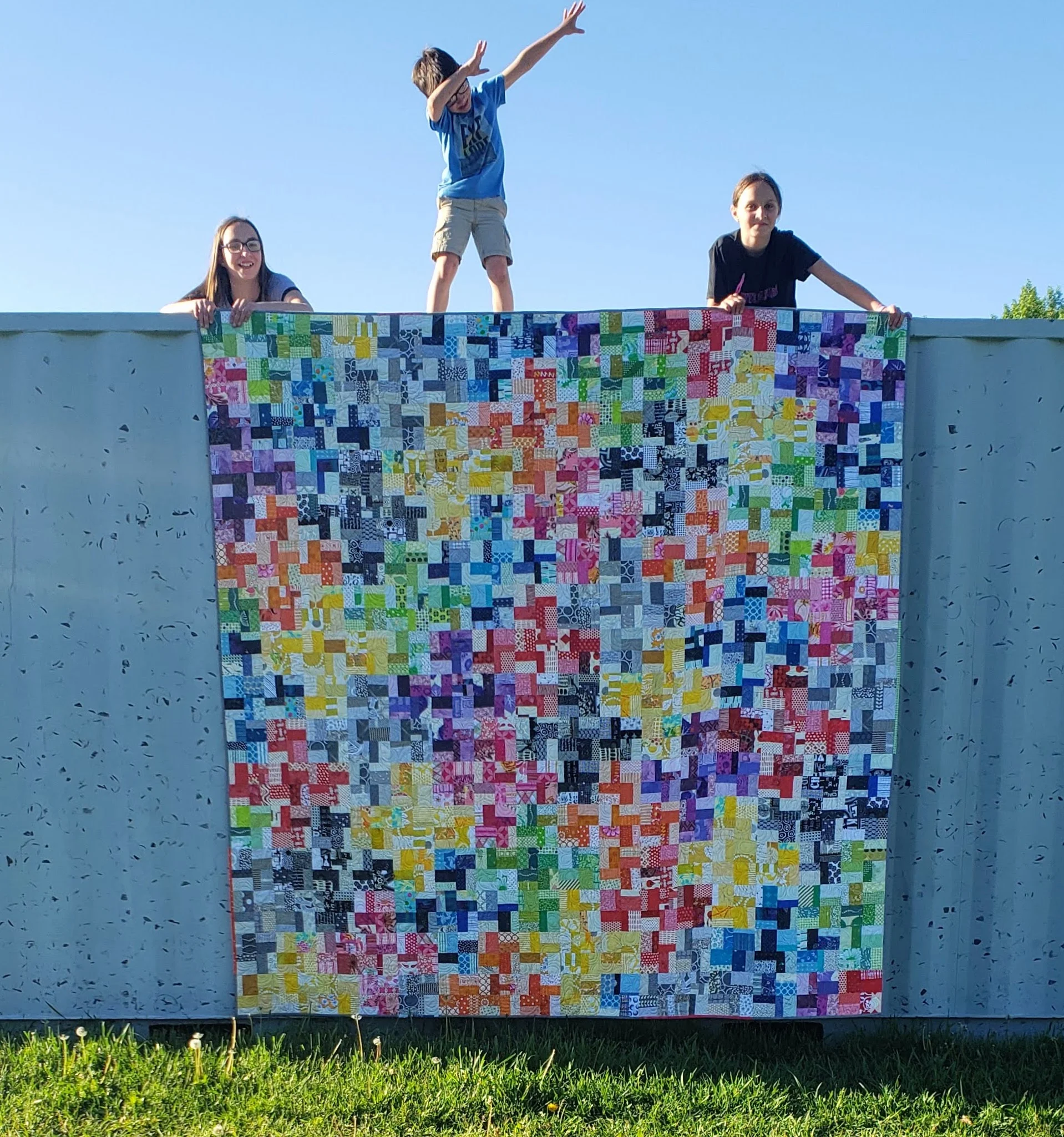
96” x 96”

When you get the kids involved in the quilt photo shoot there will always be a Dab. There were a few other moves, if I’m being perfectly honest. Good for laughs, and fun photos.

Finished the binding on this massive quilt recently. It took me a few weeks to get it done due to that whole chronic pain thing and a desire to not sit much. And this is definitely one of those instances where I didn’t quite appreciate just how big of a quilt I was making!

Values Plus Quilt Cheryl Arkison

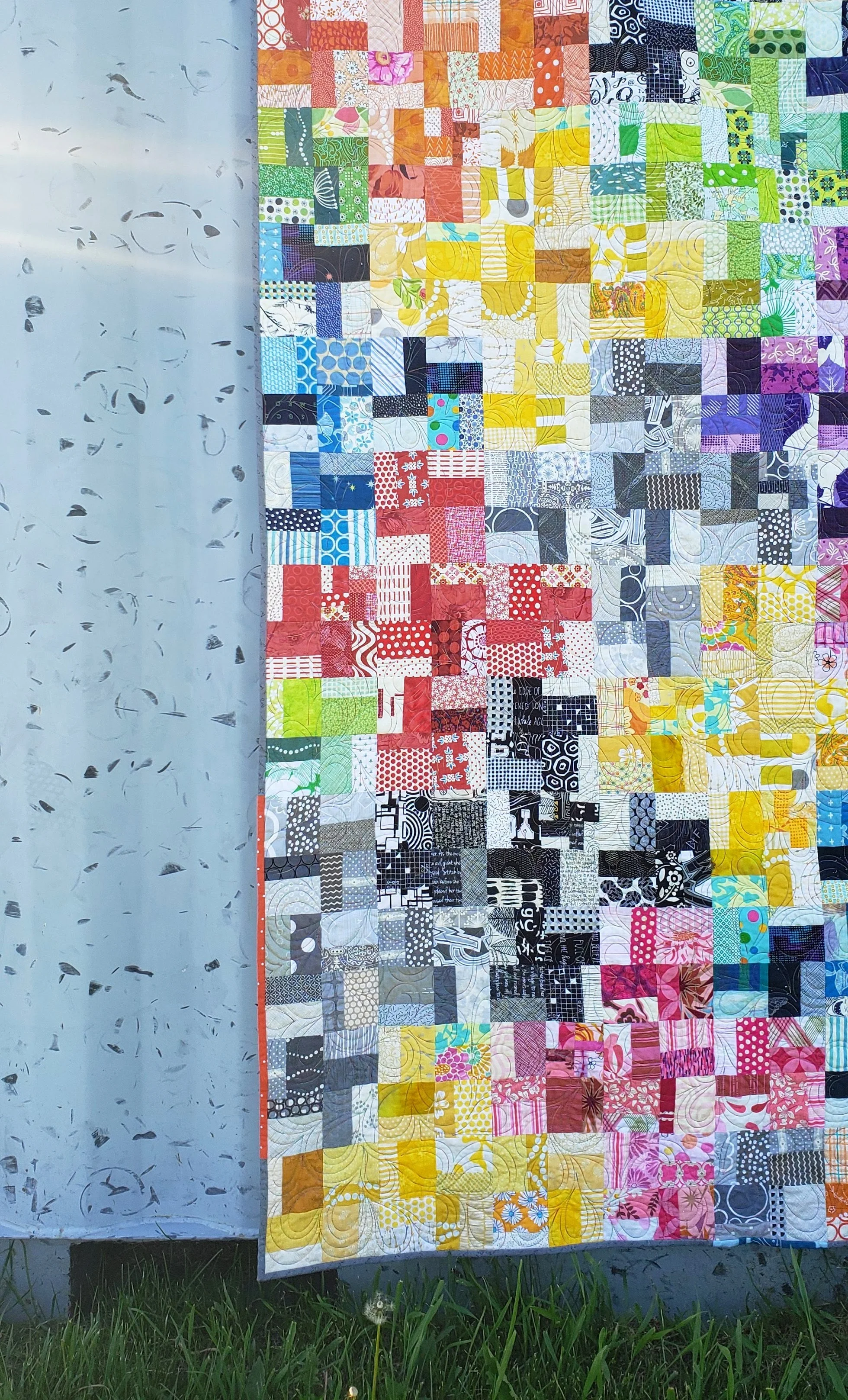
The entire quilt started with me walking the walk, instead of just talking. An IKEA bag full of scraps that needed to be sorted combined with a few sample blocks. An obsession with making blocks and dealing with all those scraps later and I have a finished quilt. Well, a few more steps in there. But funny how as soon as you finish the quilt your forget all the steps that got you there!

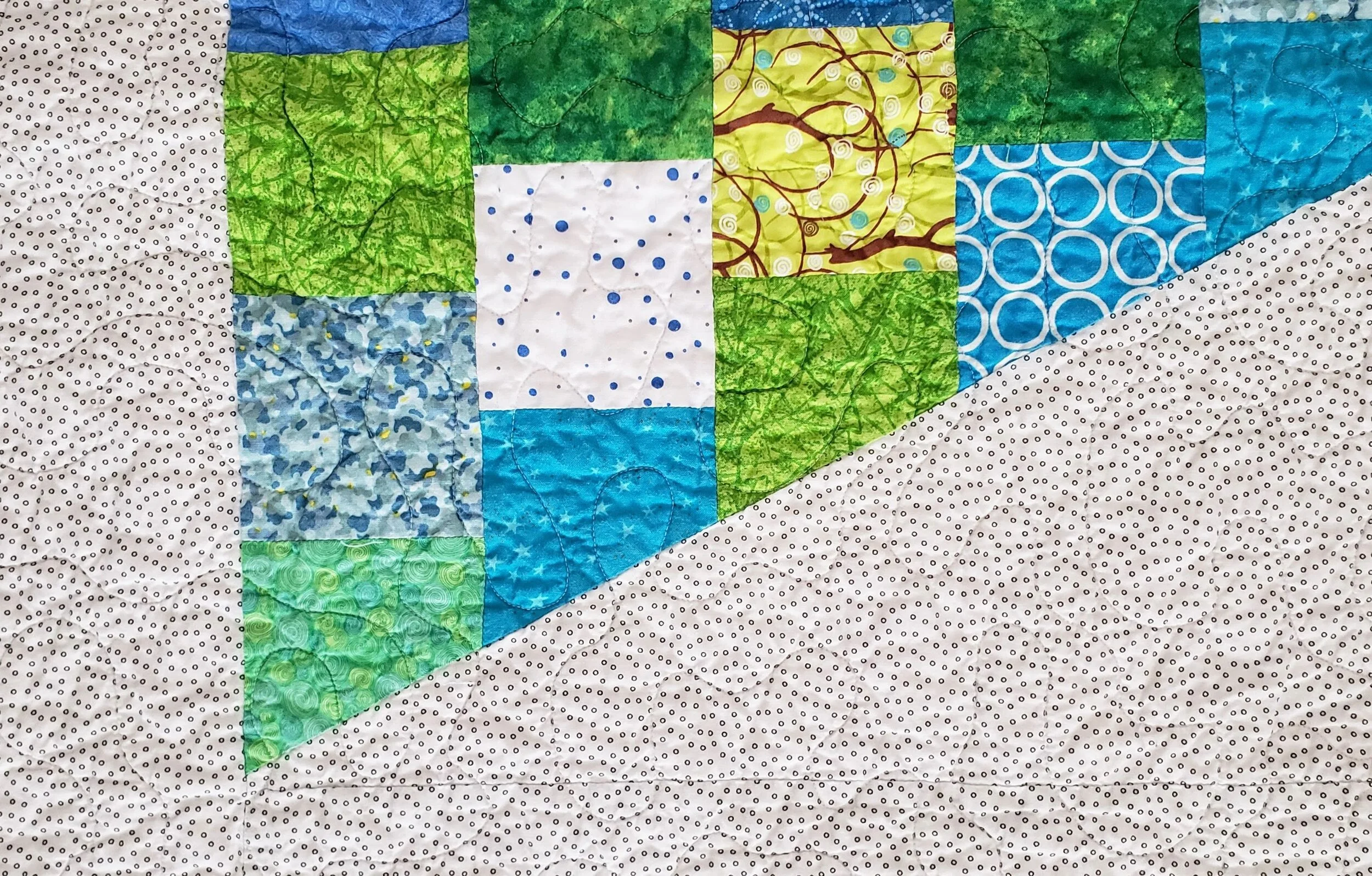
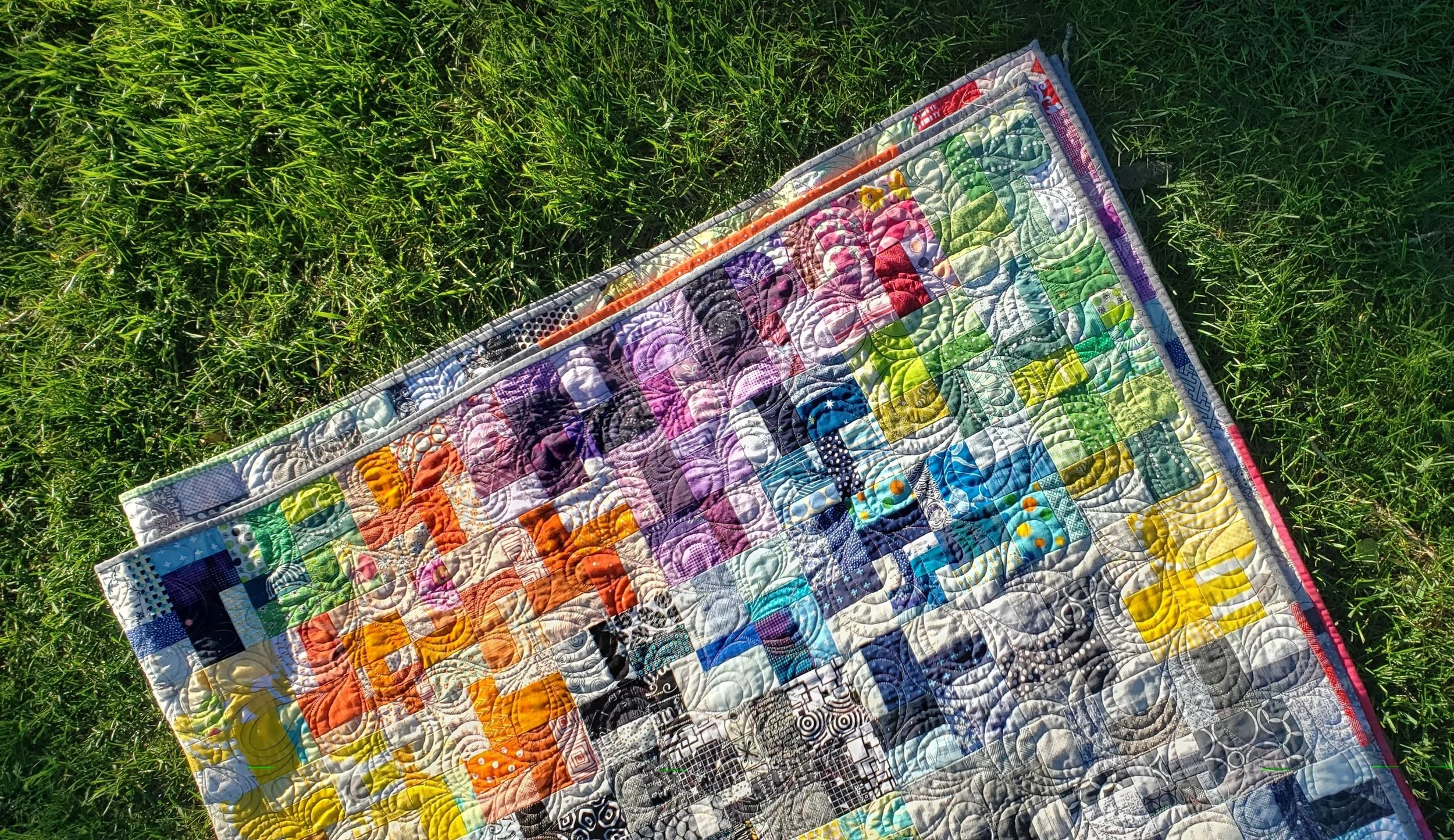
Of course, it helped that I had someone else quilt it for me! When I finished the top my local friend asked if she could work on it. Um, yes! I made up a back with some multicolour prints in my stash and dropped it off. The good thing about a scrappy quilt like this is that an all over design is absolutely perfect. With so much going on in piecing and prints you won’t see the quilting. Well, unless the sun is directly shining on it! Lee picked this great modified paisley. I’m a girl who likes contrast so I really like it against the angular piecing.

All over long arm quilting Quilting By Lee
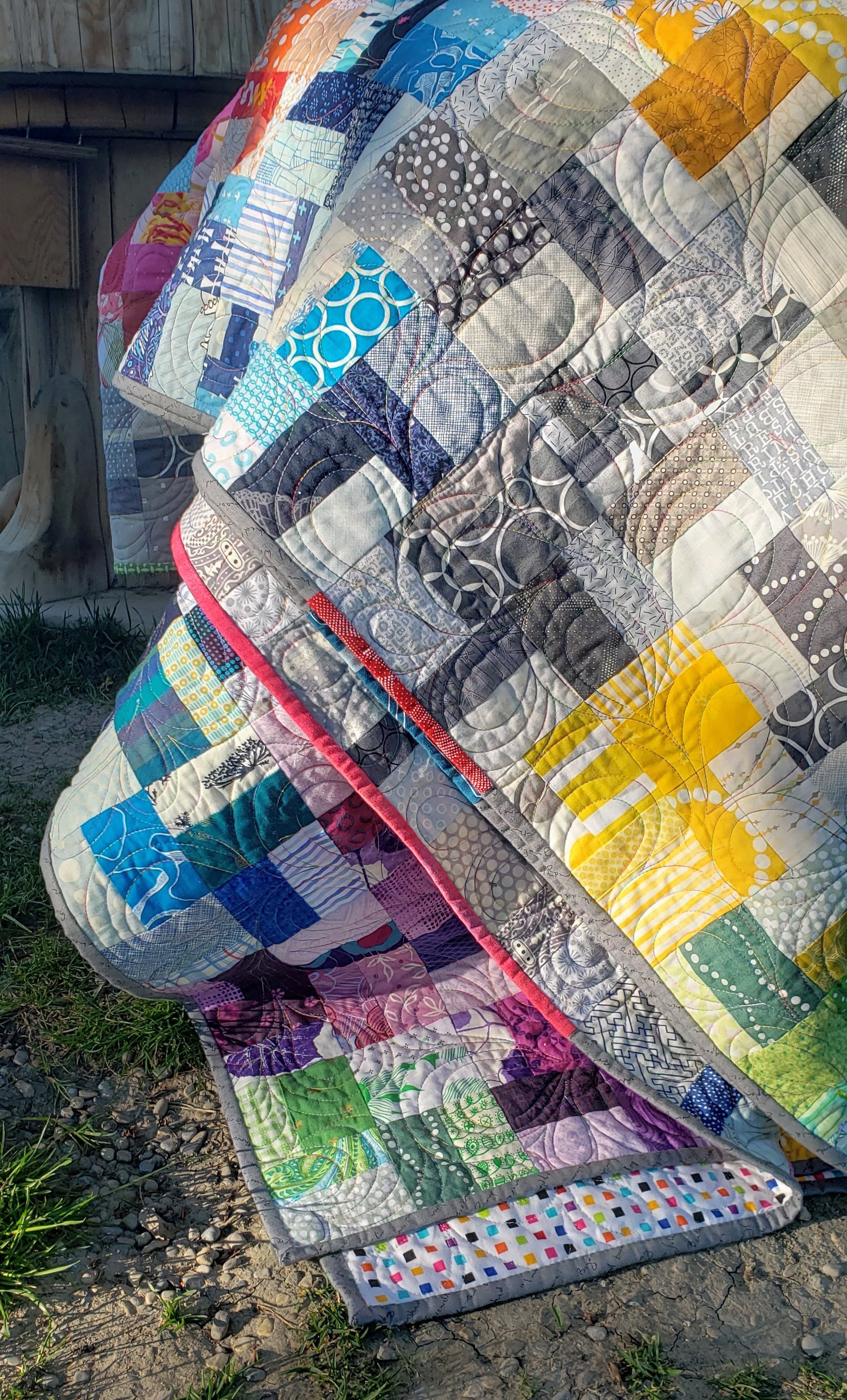
Pieced Binding Cheryl Arkison

Initially I was going to do a black binding. Too harsh in this case against all the prints. Then I was going to do a black and white stripe but I after tearing apart my stash for the one I had in mind I remembered that I used it on the back! In the end I went with a grey from my Tag fabric collection. The text is written on the bias so it makes a perfect binding. To keep it from being too boring I pieced in other colours where there was grey on the edge of the quilt.

The name - like many of my quilts - has a double meaning. Triple, actually. 1. The blocks are based on a class I teach called Values Plus. 2. I like the double pluses - using the plus blocks to make colour block pluses. 3. Today was a fat day. Hey, we all have them. And when I was lamenting my plus size body I saw the quilt and it made me smile. My body is real, and this quilt is Plus Size.

Plus Size Quilt