"creativity"

November Morning Make 2022

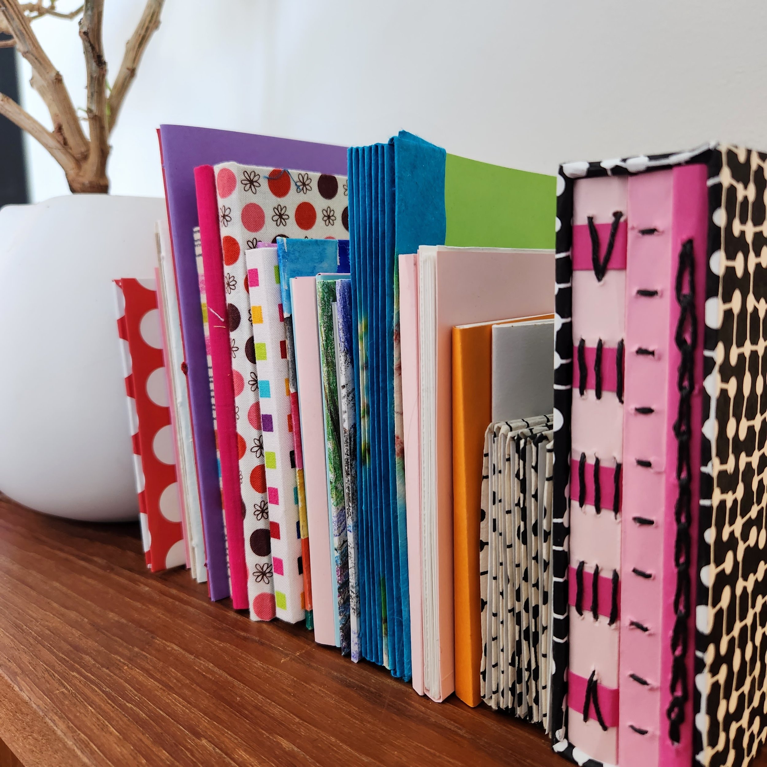
Colourful collection of handmade book structures next to a potted Poinsettia that has seen better days

Well this was a different month!

I have a Creative Bug membership. In fact, it is like a gym membership for me. I pay for it each month and almost never use it. Oops! But the daily practice I did in November made it all worthwhile. Every day I worked on a book structure, as led in a class by Faith Hale: 30 Structures in 30 Days - A Daily Practice in Bookmaking.

There was an investment in supplies to start - book board, an awl, an Xacto knife fancy paper, glue, waxed thread. I shopped at two local art stores and the big A to get it all. In all honestly, the paper cost the most and I have a lot left. I was nervous about the knife, having sliced off part of my thumb as a kid with a similar blade. This time I followed instructions and I am 47, not 7.

Collection of 30 colourful small book structures lined up

Faith did a great job of moving through a number of techniques for folding, cutting, and assembling the book structures. Some were super simple and only took a few minutes. Others were a multi day process. We stitched sometimes, others we just folded. Some books have hard covers some are just paper. I even got to add fabric from my stash to a few because there was no official book cloth to be found.

The simplest ones are my favourites. Or the ones with interesting folds. Or the ones with hard covers. I picked out some of my favourites and filmed them for more detail.

I can definitely see making some of these again as gifts or for special notes for special people. All of these are currently blank. Now that I know how to make them I would like to try again with the pages already filled or at least planned out prior to assembly.

All in all, this was a fantastic month! I absolutely enjoyed this creative challenge. It still had me playing with colour but was a new to me experience. Totally perfect for Morning Make.
August Morning Make 2022

Whenever people tell me that can’t sketch out quilts because they can’t draw I like to pull out my own sketchbook. Chicken scratch, random lines, and quite often things that only make sense in my head. You don’t NEED to draw to quilt. As long as you can think about where your seam lines go you are good. That being said, I always want to draw better.

I’ve done drawing for Morning Make before. Quick little still life sketches of things around me. It was a good exercise but building a skill isn’t a one and done thing. So in August I decided to set myself a drawing challenge again. This time, however, I explored a technique called contour drawing.

In contour drawing - at least the way I did it - your pen isn’t supposed to leave the paper. You are doing one continuous long line. Some people do it blind, as in they look at their subject and never the paper. I was not ready for that. But in slowing down to look at my starting image and translating it through a single line I was able to focus on shape and composition. You can’t draw everything in the picture. Well, you probably could, but I didn’t. Depending on the source image (pictures from my phone) I narrowed the focus to only certain elements. Sometimes background were completely eliminated, sometimes just enough to give context. It was an exercise in looking just as much as drawing.

I’ll be honest, I think some, if not all, are quite bad. That is, if you compare to people for whom drawing is a livelihood or serious endeavour. There was improvement, for sure. Some are even better than I would have expected. All were, at least, recognizable. Regardless of the results it was an enjoyable exercise.

Jules, or my Arkison in Australia Quilt

Mustard yellow, pale blue, and white quilt blowing in the breeze between two spruce trees

Jules

85” x 66”

I’ve never been so sad to finish a quilt. Seriously, a few tears were shed.

This was an epic quilt making journey that started on my teaching trip to Australia back in 2016. I was demonstrating improv curves for some students and grabbed the first two interesting fabrics from the little shop onsite. Over the course of my trip I did a few more demos with that fabric, then collected fabric from both my students and a screen printing adventure. When I came home it made sense to me to keep playing with all those fabrics, like they were meant to be. I added a bit more from my stash and away I went.

Improv quilting can be a total free for all and work wonderfully, but it also works really well with guidelines or even limitations. In addition to my limited colour palette I restricted my improv components to a few key shapes/techniques: curves, diamonds, triangles, and little bits. It may sounds like a lot, but it actually isn’t. Not when it comes to improv.

A mustard yellow, pale blue, and white improv quilt blowing in the breeze

I basically kept making components until I ran out of the fabrics, leaving a little behind to help me create a quilt top. I did not pay attention to size of the blocks when making or squaring up. When I felt finished making all the components I moved on to my favourite part - making them all play well together in the quilt top. Design wall play is the absolute best. It’s all about making it work as both a composition and simply to use up all the pieces.

And then she sat. And sat and sat. That’s just how things go in my world. I even had the backing fabric - gifts from Emma Jean Jansen, an Aussie designer and one of my students in Australia - but wasn’t ready to quilt her yet. The truth is that I knew how she deserved to be quilted and I wasn’t quite up for the challenge.

When I was asked to put together my show for the Heritage Park Quilter of Distinction display I knew I had to include this quilt. It was time to face the work.

Close up of a mustard yellow, pale blue, black and white quilt with hand stitched details

My plan from the beginning was a combination of machine and hand stitching. And most of the machine stitching with would in the ditch. On a quilt like this that meant a lot, a lot of starts and stops. Which also means a lot of burying threads. Nothing like taking on this much work on a deadline! Did I mention the hand quilted elements too?

The bulk of the handwork was finished on an epic road trip we took in May. At least, the parts not done in front of the TV while I ignored the world. It even required a stop at a quilt store in Kelowna and I was very sad I did not have time to shop for anything other than a tool to help me bury my threads. There is at least 20 hours of handwork in her. She is full of my love.

Sure, it was a lot of work and every single stitch was worth it. The quilt came out exactly how I wanted it to, how I envisioned her.

The machine quilting was all done in a pale blue thread from my stash. It might have been a Presencia 100% cotton collected years before the quilt even started. The hand quilted touches were all done with Wonderful Perle cotton, in a couple of different blues and yellows. This included stitching down the binding, on the front, with big blue stitches.

I won’t lie, I was also intimidated by doing that much handstitching, even though it was my own idea. But thankfully, quilting an entire quilt for Morning Make last year built my confidence and comfort.

A girls arms hugging a mustard yellow, pale blue, and white quilt

Did I mention there were a few tears when she was finished? That trip to Australia was formative for me. It was her furthest and longest I’ve been gone from home. I developed and delivered multi day workshops which were an absolute dream. The people I met were incredible and I am still in touch with many of them. This quilt also defined one of my favourite ways to make a quilt - by playing.

She is named for Jules. Jules McMahon was the woman who brought me to Australia. We knew each other online and had met at the early QuiltCons. But that trip solidified a friendship through road trips, sweets exchanges, late nights with wine, creative bonding, gluten free Chinese food, exploring for Lyre Birds, a love of circles, and one chilly ocean swim. We have similar levels of insanity and drive and I am grateful to her for the trip to Australia, yes, but also for continued friendship and inspiration.

April Morning Make 2022

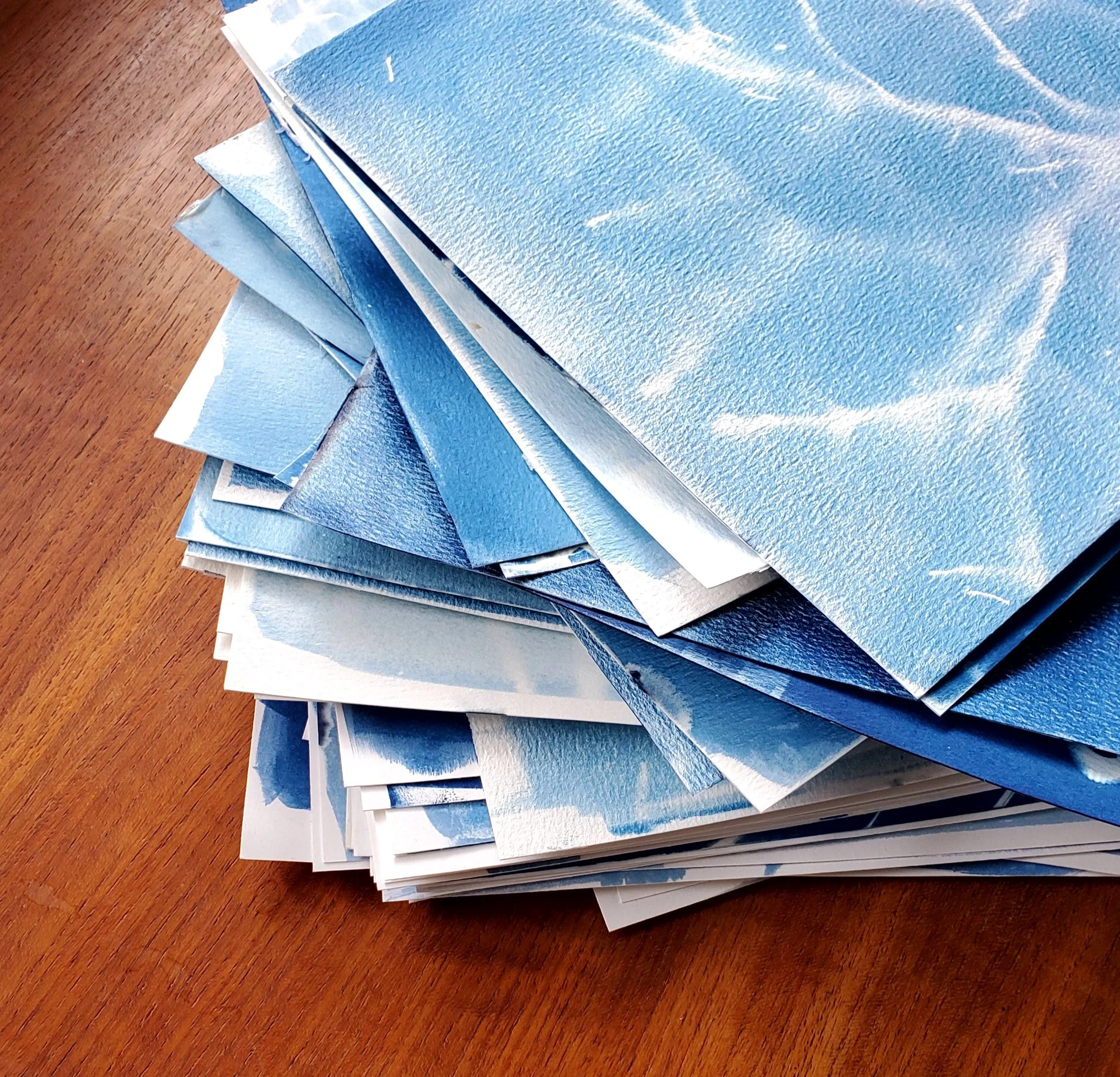
Stack of papers coloured blue with cyanotype

April was an exploration of light, more than anything. Indeed, I’ve never paid this much attention to light, shadow, and sunshine before. It was an excellent practice in paying attention, in noticing.

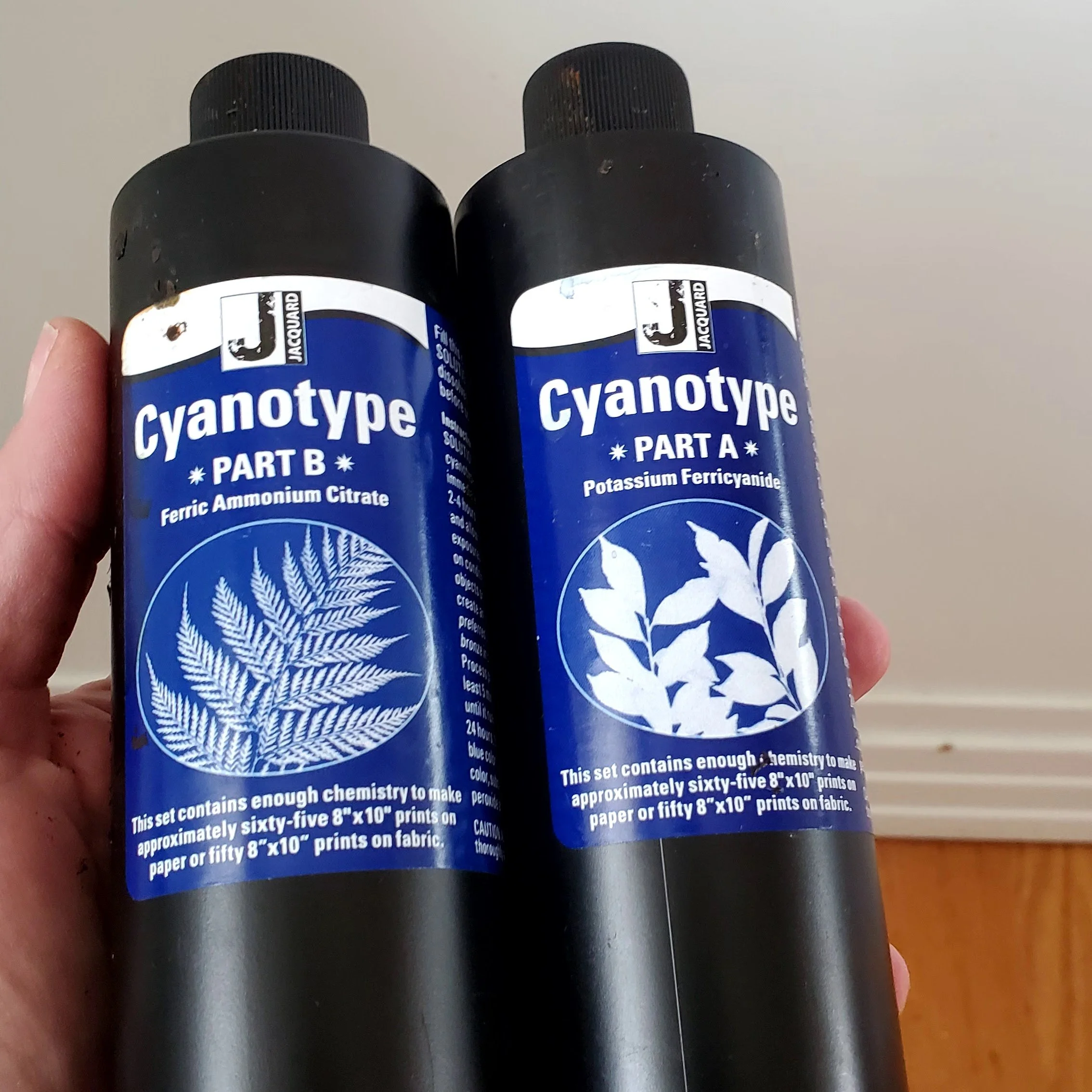
Cyanotype is a form of light exposure, like photo developing. You use chemicals on paper, fabric, or anything that can be coated (I saw someone do rocks and I want to try that!) It requires the interaction of the two chemicals: potassium ferricyanide and ferric ammonium citrate. You only really need to know that you need equal parts of each and to mix them together right before using. I picked up the set from my local art supply store.

Bottles of chemicals for making cyanotype prints

For the first half of the month I mixed the chemicals at night, painted the paper, and let them dry in a dark bathroom. Light exposure starts the process of creating the print, hence the windowless bathroom. For the second half of the month I played with wet exposure, meaning you paint the paper with the just mixed chemicals and go straight to the creation of the print. In the end, I couldn’t really tell the difference from the results.

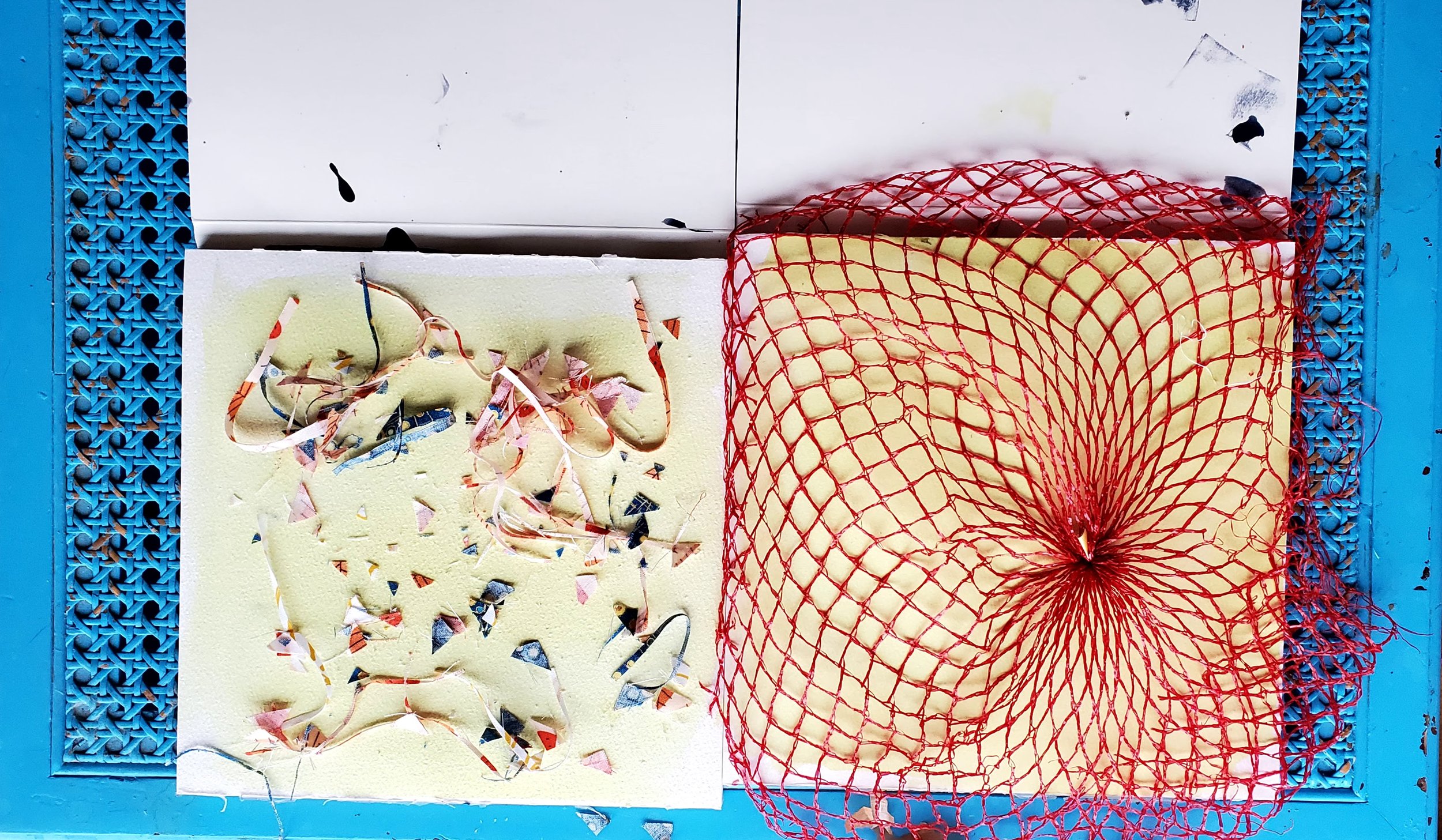
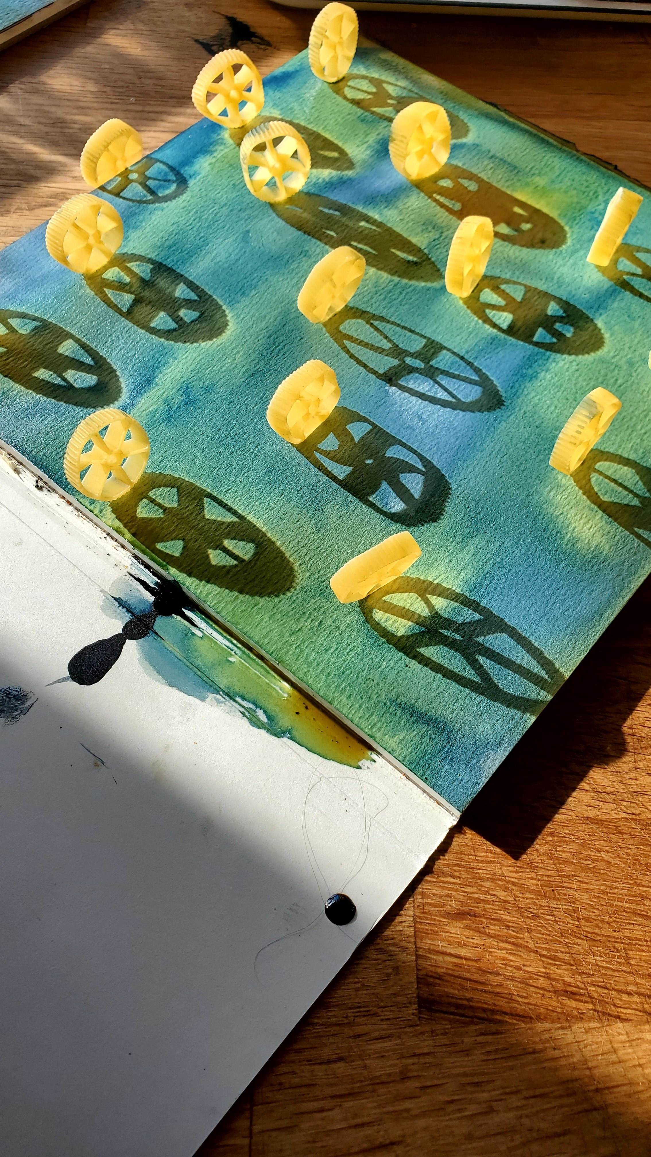
To create the print you place an object on the treated paper and let light do its thing. Where the object is placed and in its shadow the outline remains while the rest of the paper gets exposed. Essentially, you are creating a negative image.

The beginnings of a cyanotype print with fabric trimmings and a mesh onion bag

Where things get both exciting and frustrating is with the shadows. Not that sunny? An object with diffuse edges? You get a ‘blurrier’ print. Very sunny? You get shadows. Depending on the time of day and the level of sunniness, you can get very sharp images or long shadows. I found the exploration of these differences fascinating and learned to exploit them to create different things. Seeing as this is morning make and it was April in a northern location, I had a lot of shadows to play with and sometimes not a lot of light. It means I will probably play a bit more in the peak of a summer’s day.

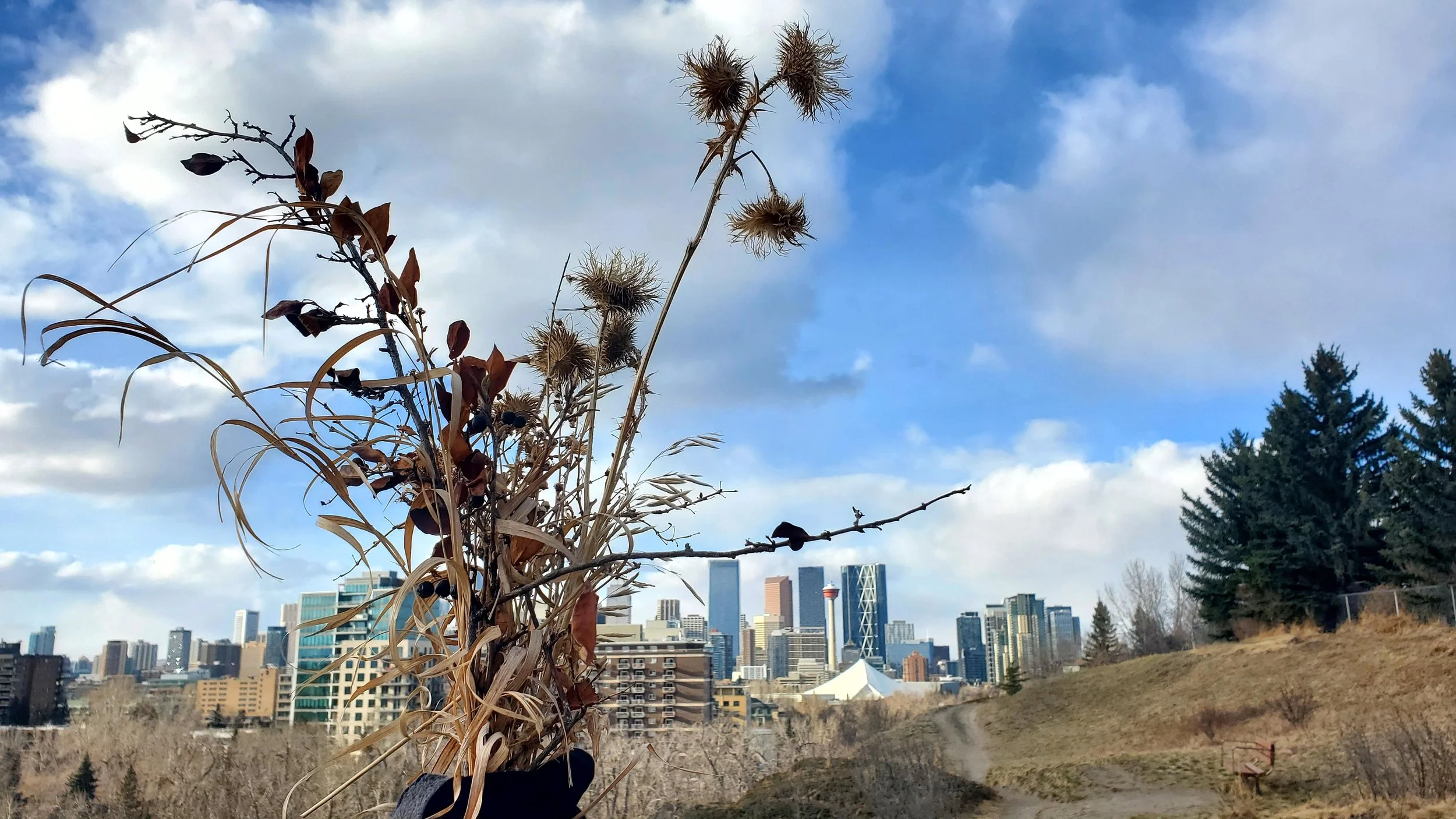
Bouquet of dried plants and grasses again the Calgary skyline

The other act of noticing this month was in looking for things to use to create the print. You see a lot of cyanotype prints exploring shape through living objects like plants and flowers. It was April in Calgary, not a lot of greenery! But weeds, grasses, and last year’s living plants provided fascinating textures to use. Going for walks I found myself nothing plants and sticks in new ways, or even discovering new to me plants. I never picked anything living and cut dead things, leaving roots in tact in case it was a perennial. I also explored the house for objects, using kitchen tools, jewelry, games, even garbage. If it can create a shadow it can create an exposure.

Four different cyanotype prints created from natural and household objects

Each day I made 2 prints, so ended up the month with a lot of prints, some definitely better than others. Here are four of my favourites. From top left, in clockwise order. A necklace from Elinor Stenroos on dry. Shadows from slurpee cup and jar lids on dry. Cheerios on wet. Thistle on wet.

Some days I got the real dark, indigo blue colour typically associated with cyanotype, others it was quite pale. To be honest, I never really figured out what created the difference. it always felt like I was putting the same amount of the chemicals on the sheet. I suspect my proportions of the two agents varied, but I don’t really know. Length of exposure varied too, depending on the light conditions that day. I don’t think that effects the colour though, as I exposed almost all to the same colour before washing. (The chemicals look pale green when they go on then change colour as the exposure happens, usually showing done when a bronze or dark green.)

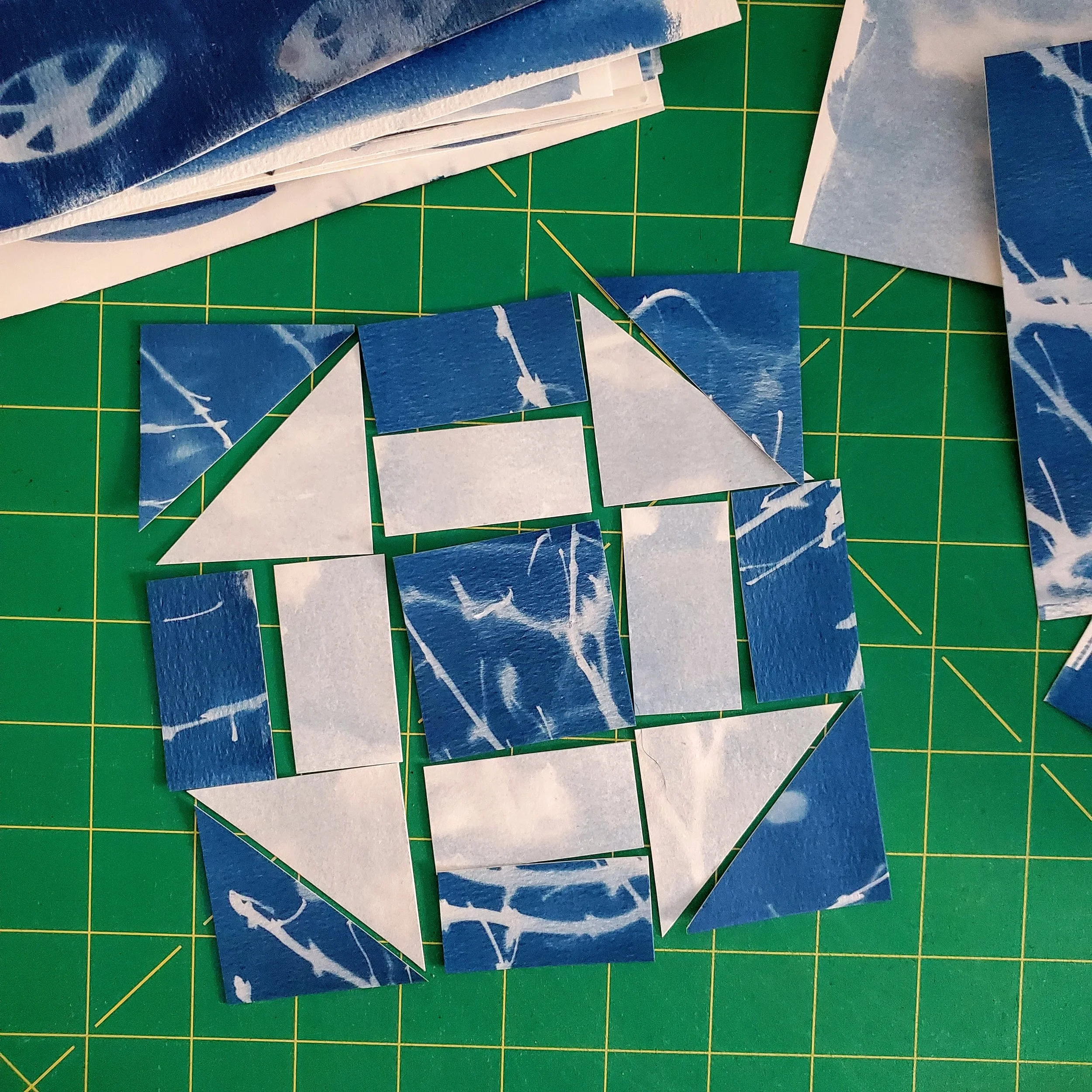
Yes, you can do this on fabric and that probably made a lot of sense for me, a quilter. However, I wanted to try the paper and besides, it’s not like I needed more fabric! That being said, I also don’t need 60, mostly mediocre, cyanotype prints. So I got a notion for a secondary art project.

Cyanotype prints cut apart and arranged in a churn dash quilt block

I need to test my assembly idea for these but if it works, I think it could be pretty cool. And it just might get by the ‘no quilts on the wall’ rule in the house!

At the end of the month I have to say this was a lovely exploration. I admit to being intimidated by the chemicals and the idea of it at the beginning. What foolishness! It is actually really easy, I felt totally safe mixing the agents together, and it was an adventure to see what could happen. Sure, things didn’t always work and I’m still on the low end of the learning curve but it was a low stress experiment. The anticipation each morning of what could happen was a great way to start the day. Pure creative optimism.

PS. I saved a highlight of the process - start to finish - on Instagram.