Morning Make - January 2020

Learning poetry

Back in elementary

Haiku was the start

Cheryl Arkison Haiku

Do you remember back in school and the famous 5-7-5 syllable count of learning Haiku? We were taught it then because the perception is that they are easy, simple, elementary. And while you can write one following the count rule, that doesn’t mean they are any good!

Haiku is a form of poetry originating in Japan. Initially, they were written as objective, pictorial pieces. They usually described something in the natural world or made seasonal references. Quite often there are two subjects, contrasted through the visuals the words present. Haiku is subtle and can be both melancholy and beautiful.

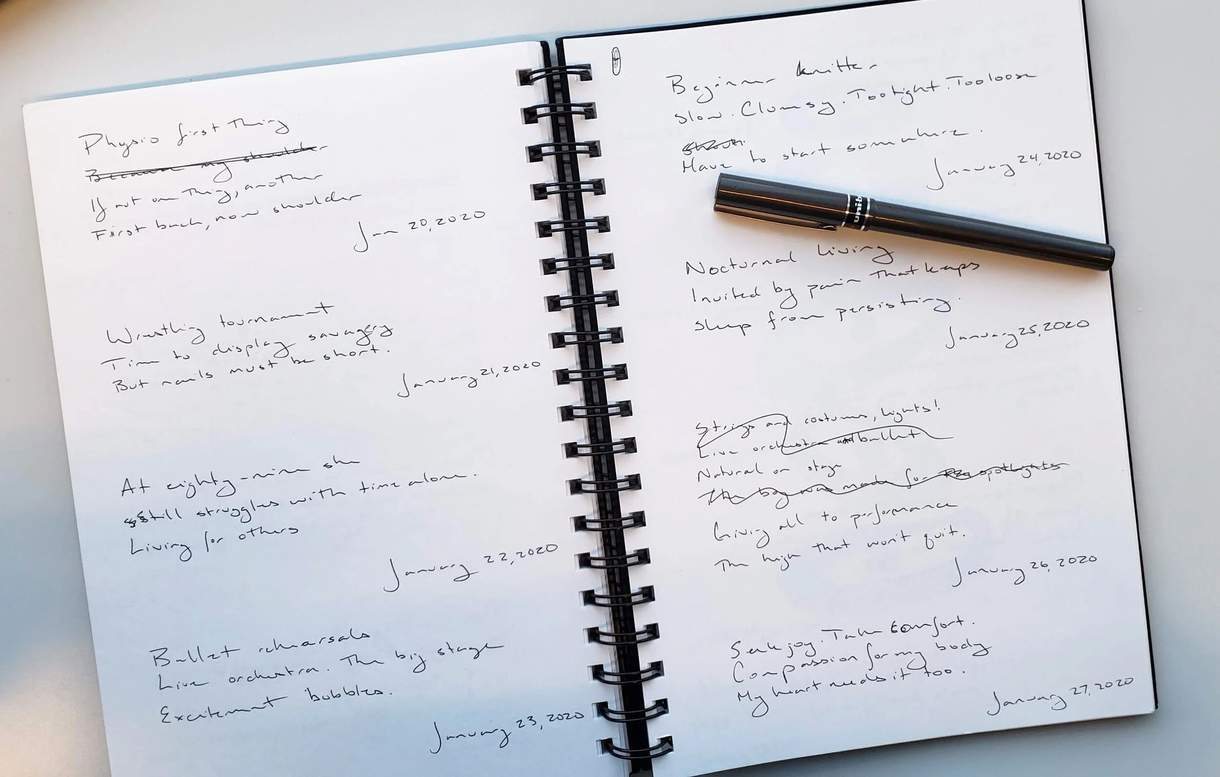
For January I decided I would write one haiku each day. I threw out the subject conventions and mostly ignored the other rule about the subject contrast. At least, I didn't much care if that happened but tried to do it some times. Now, I am not a poet by any stretch of the imagination, but I do like words. I love the way we can express emotions and the sparseness of 17 maudlin syllables was inspiring. Most of the haiku reference what was going on in my life at the moment, so they serve as a diary too.

Here are some of my favourites from the month:

People I don’t like

Invading my dreams last night

Woke up feeling gross.

(January 10)

Lazy Sunday start

Because it’s damn cold outside

That hockey game though

(January 12)

Love overflows yet

It pools at my feet almost

Unconditional

(January 15)

Wrestling tournament

Time to display savagery

But nails must be cut short

(January 21)

Nocturnal living

Invited by pain that keeps

Sleep from persisting.

(January 25)

Seek joy. Take comfort.

Compassion for my body

My heart needs it too.

(January 27)

A daily habit

To jumpstart creative flow

And ease anxiety.

(January 29)

February is here and I’ve laid the pen down for a needle and embroidery floss. Follow along with my Morning Make on Instagram. Better yet, join in! #morningmake is the hashtag.

Ripples - A Water Inspired Quilt

Ripples Cheryl Arkison

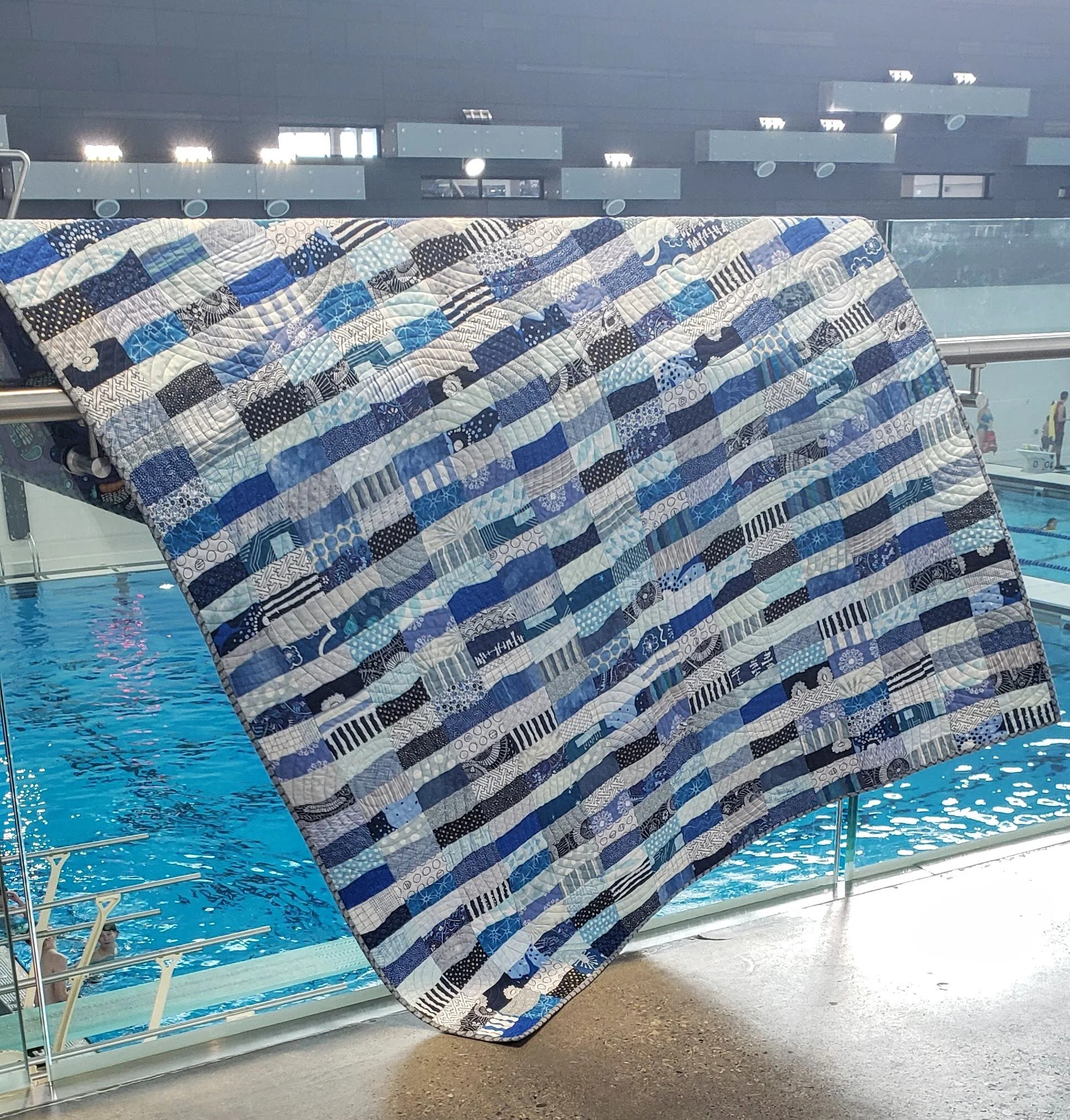
Ripples

52” x 68”

Next in the landscape series of quilts. (First there was Mountain Meadow, then Names for Snow).

Completely inspired by the deep blue landscape of Prince Rupert, British Columbia. Whether it was the morning sun reflecting off the calm ocean, or the hidden blues of the spruce trees in the rain, or even the rolling fog covering the community like a quilt, they all found a home in this quilt.

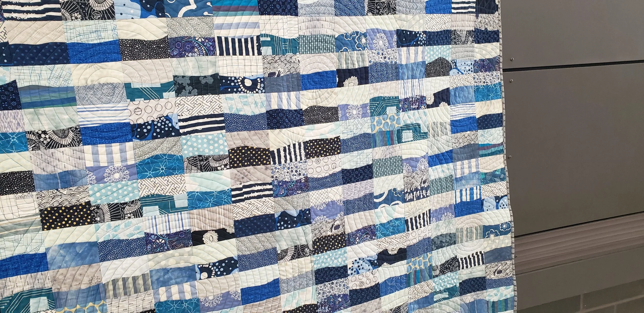
Simple improv curves, the repetition of blocks and colour an homage to all that I saw that long weekend on the coast. A way to capture the energy of the community and the creativity of all the people I met. This is absolutely Improv With Intent.

Free motion quilting circles


Quilted with concentric circles to emphasize the Ripples. Kind of like the ripples on the surface when you toss a handful of rocks into the water. Or the ripples when the seals poke their heads up to see what you see. Or when the fish bubble up, trying to hide from the seals and the herons. Or, as I see more often than not in our life on the Prairies, kids jumping in a pool!

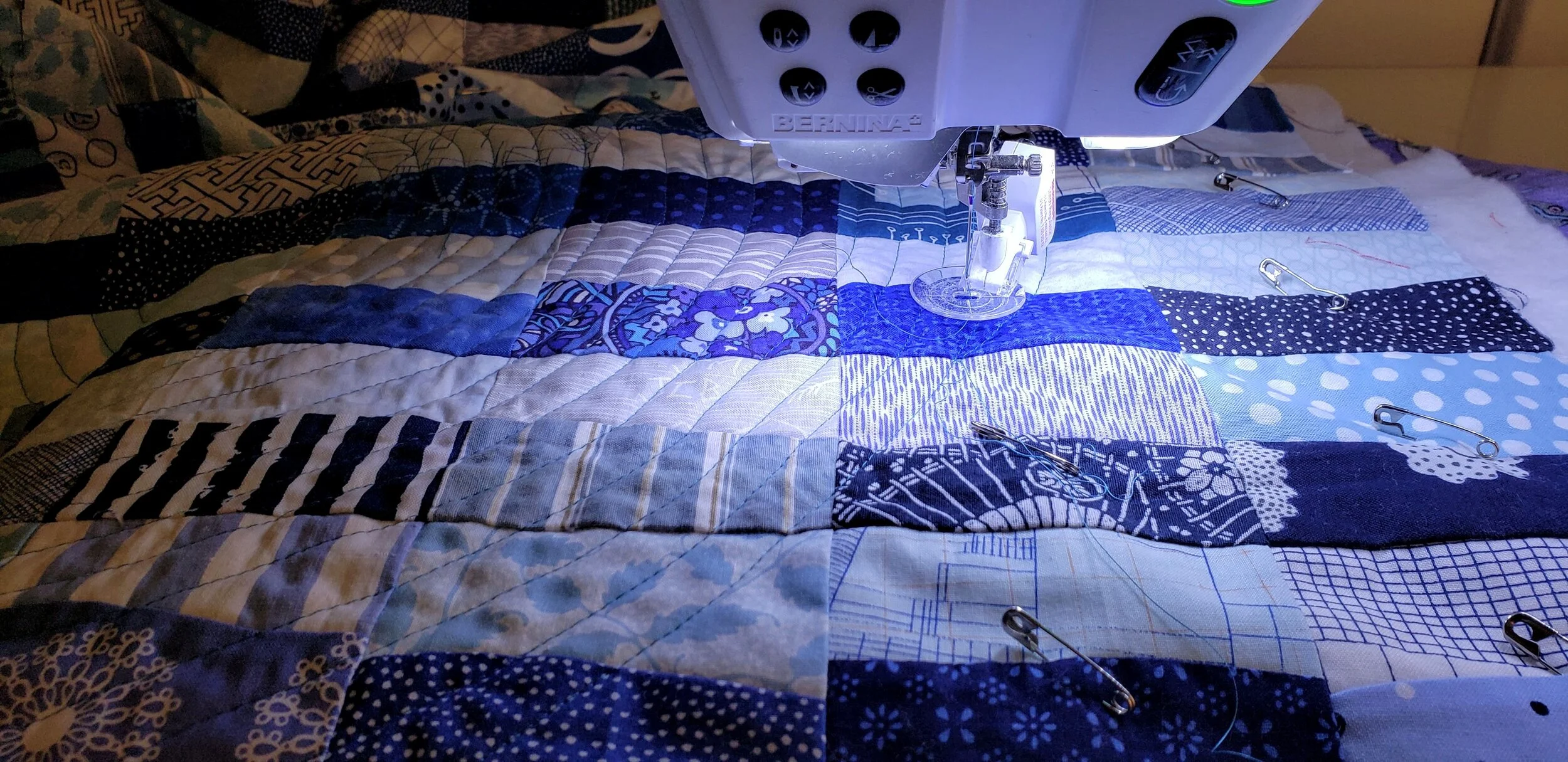
The quilting was done on my Bernina 820 with an Aurifil 50W in teal. It blended with the front and the fabric on the back.

Ripples Cheryl Arkison Improv Curves


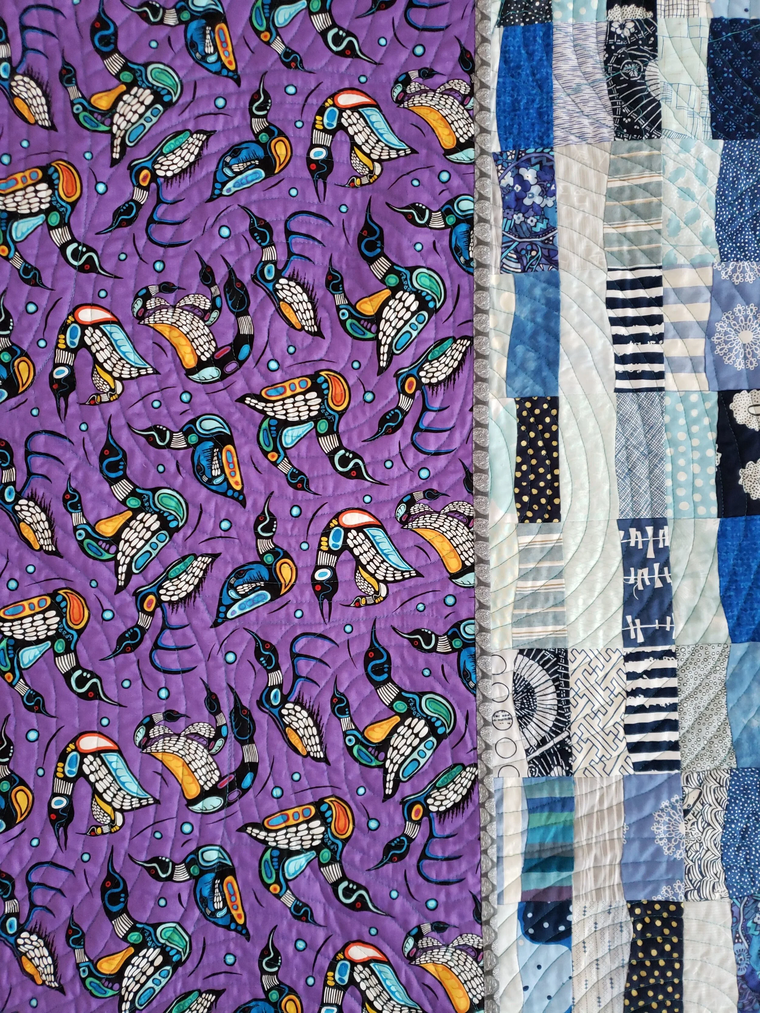
Backed with a gorgeous loon print from Mark Anthony Jacobson, an Ojibwe artist. Bound in grey, one of my own prints, to remind me of the fog, the logs, and the weathered wood of the docks.

To see more of the inspiration, check out the original post.

Mark Anthony Jacobson


Contentment versus Happiness in Life and Quiltmaking

Where do you find happiness in your quilting? Is it is the process or a specific part of the process? Or is it in the finished quilt?

Machine Quilting Cheryl Arkison

I’ve been thinking a lot lately about the difference between contentment and happiness. Here is what I shared with my newsletter readers last week:

So many of us are always on the look out for happy. We think happiness is the ultimate goal. We are wrong, I see now. Contentment is what we should seek. 

Think of it this way. When you have a baby the exhaustion level, physically and mentally, is high. So is the amount of stuff and drudgery in your day. But then the day comes that they genuinely see you for the first time, the day they roll over, the first night they sleep for 6 hours straight, pulling themselves up at the coffee table, crawling, walking, the first word. These milestones are all the happy we desire. They are excitement and pure joy. But they aren't really enough to get us through the day to day, the repetitiveness, the mess of parenting a baby. Unless, of course, we can embrace the naps on our chest again, cleaning the favourite toy of spit up again, the screeching, and even the diapers. Contentment is when we can look at all of that and still smile.

Happy is an exclamation point. Contentment is a smile. 

If our lives are filled with nothing but exclamation points it will be fun, sure, but also exhausting. Here's another way to think of it. Imagine your last good vacation, if you can. Was it all adventures - zip lining, horseback riding, spicy cooking classes, the tallest building in the city, surfing lessons? Probably not. But maybe you did one or two really exciting things and then otherwise enjoyed strolling the beach or city streets, reading a book, a delicious bakery where you lingered. If it was all the adventures - the exclamation points - it would be a lot of fun, maybe a bit stressful, and very, very tiring at the end of the day. But those quieter moments, the ones that make you smile and sigh are delightful.

Regular life needs to be a combo of both. However, instead of seeking happiness, we should be looking for what makes us content. More importantly, we should be looking around us and realizing that what we have is good and brings us contentment. You might be surprised at what you see.

Then I was speaking with a lovely lady in my neighbourhood this week, also a quilter. She spoke about how she will look at a finished quilt and wonder just how she got there. Like suddenly it is finished and the making of it has slipped away. Yet the making of it is where her peace is.

Contentment = enjoying the quilt making process.

Happiness = the finished quilt.

So I suppose that now that I’ve thought of it this way, I see my love for the process in an even better light. And it explains my defence of unfinished quilts. I would much rather have contentment, a smile, in my life on a daily basis than the energy of an exclamation point. Don’t get me wrong, happiness is awesome, finished quilts are awesome, but finished quilts only come around a few times a year. Why hang all my joy on sometimes success when I can have peace everyday in the making?

To that end. I did finish a few quilts recently so I was happy to pull out an old, favourite project. I’m jazzed for it and sneak in to the sewing room in spare moments to put together just one more string of Itty Bitty curves. The piecing makes me feel joyful, the work growing gives me all the smiles, and the daily making is 100% about contentment.

Improv Curves Cheryl Arkison Tag Fabric


Quilt Bravely - Creatively Contrasting Binding

This is the first is a series of posts encouraging you to be different, quilt different, quilt bravely. To bend or even break some rules while pumping up your creative voice. You have the creative confidence, I’m just here to remind you of it.

So you need to bind a quilt? You might be one of those quilters who not only selected their binding fabric with the rest of the fabrics but also made your binding before needing it. That would be awesome! This post is for those of us looking to jazz up our quilts with binding, not just treating it as an afterthought.

Binding selection generally comes as the quilting winds down. Maybe even as the quilted quilt sits and marinates or you muster the energy to do it at all. You might have a default binding - black and white stripes, anyone? You might search for just the right shade of blue that coordinates with everything in the quilt and the quilt back. You might pick the stripe from the fabric collection that the quilt top is made from.

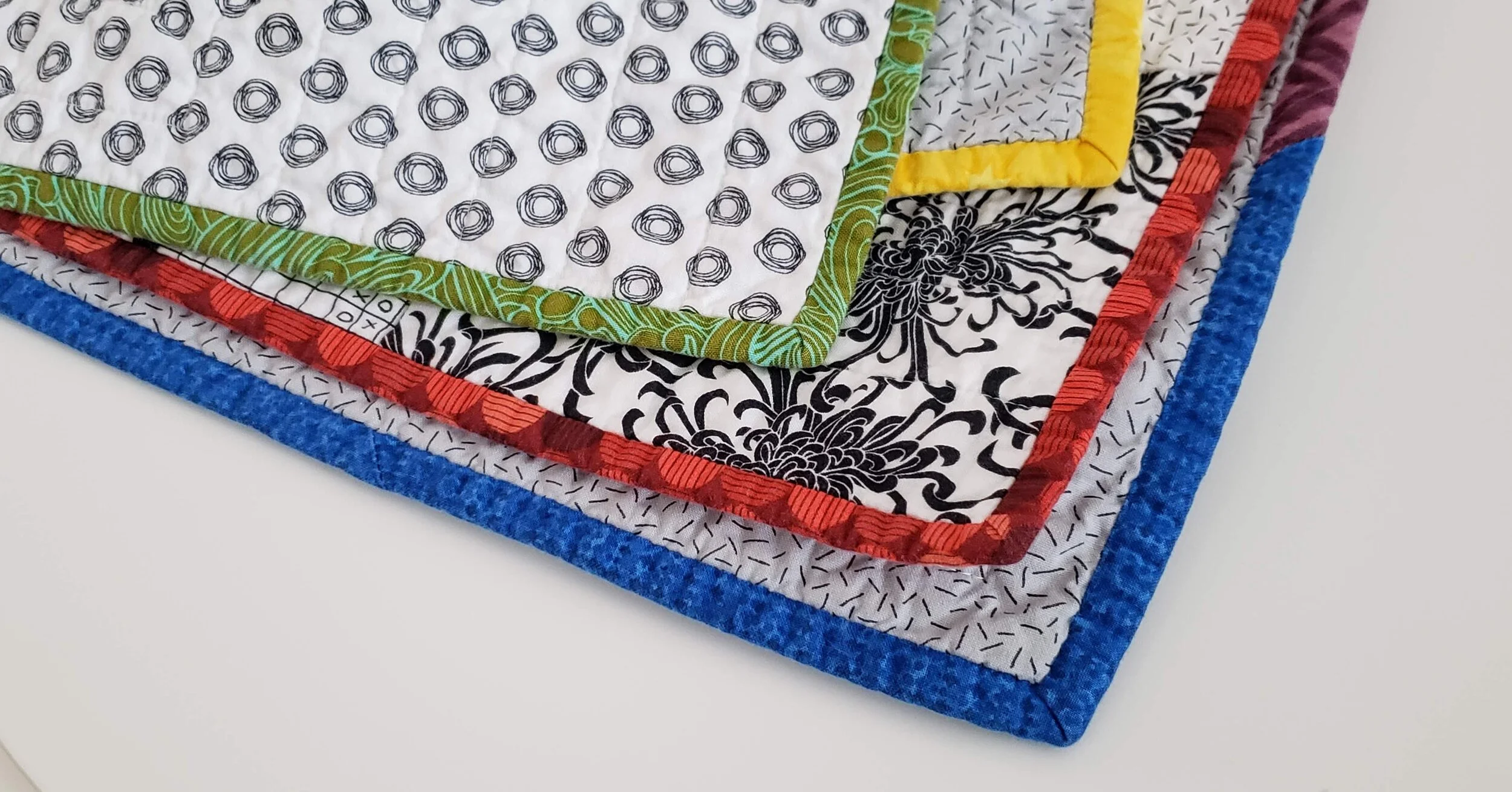
My challenge to you is to embrace a contrasting binding. Whether in colour, style, value, or design a contrasting binding might be exactly what your quilt needs for a stellar finish. If not contrasting, think creatively about what choice you can make. The unexpected one is often the exact right one. Here are some great ways to play with your binding selections.

Colour Wheel Contrast Binding Fabric

High Contrast

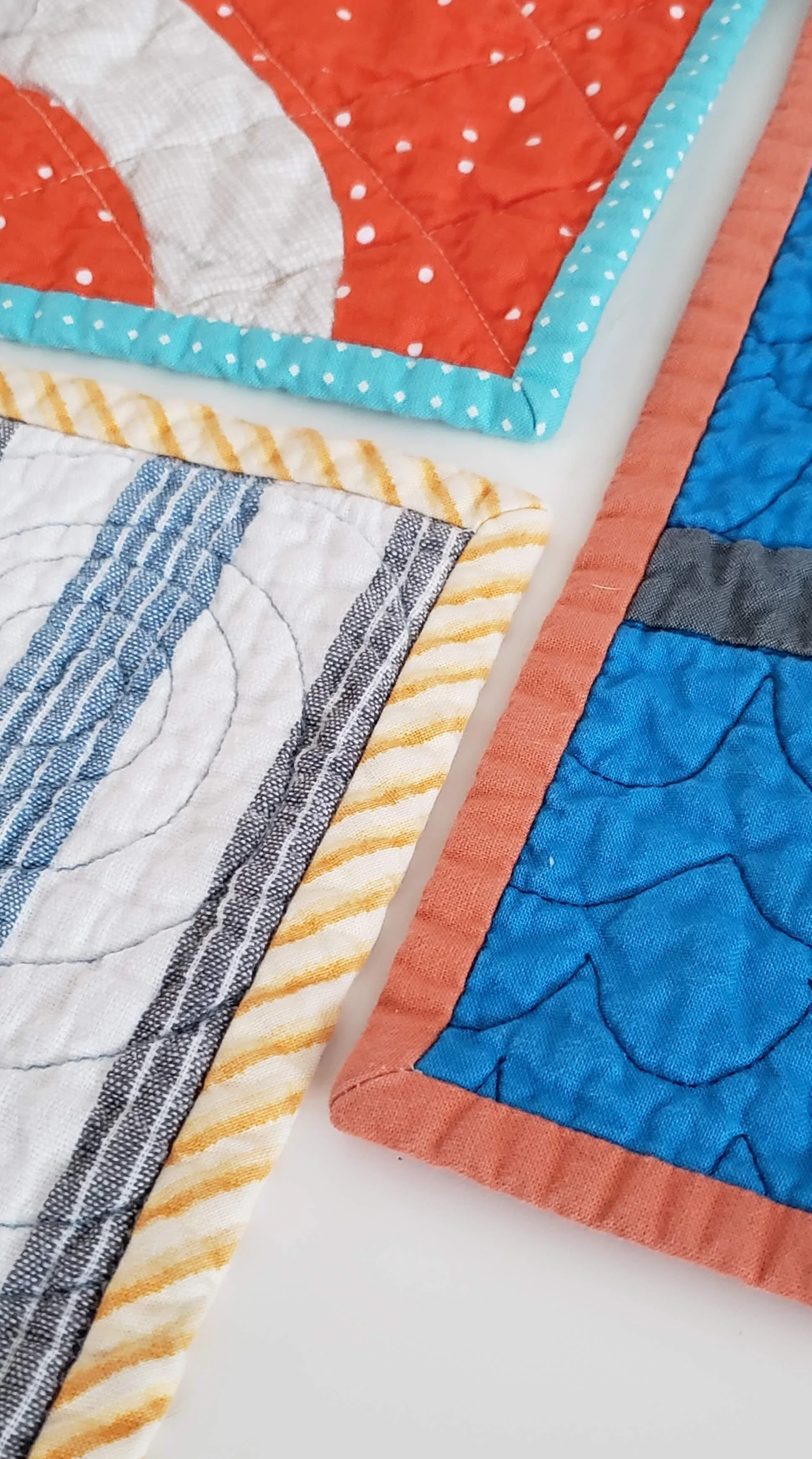
Use the colour wheel or simple preference as your guide. Pick a colour not even in the quilt top but that coordinates nicely. Using the colour on the opposite side of the colour wheel is an excellent way to do this. For example, orange and blue.

Shiver

Stripes

(yet to be shared)

Binding Fabric Selection

Highlight a Little Used Colour/Fabric

If you have just a little bit of a colour in the quilt top use the same colour binding fabric to wrap it all together. The examples above show me pulling out the green in the background print, even though there is no other green in the quilt top and using the same coral fabric that is only used sparingly in a quilt with 100 blocks.

Smooch

Lilla

Quilt Binding Options

Look to the Back

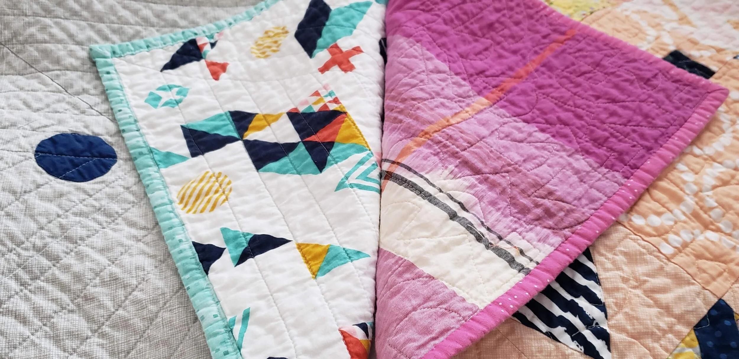
You may have picked a fabric that coordinates with the front but doesn’t necessarily use all the colours of the quilt top, go ahead and pick your binding from that fabric.

Lilla

Compose Yourself

Pale binding.jpg

Think White or Pale

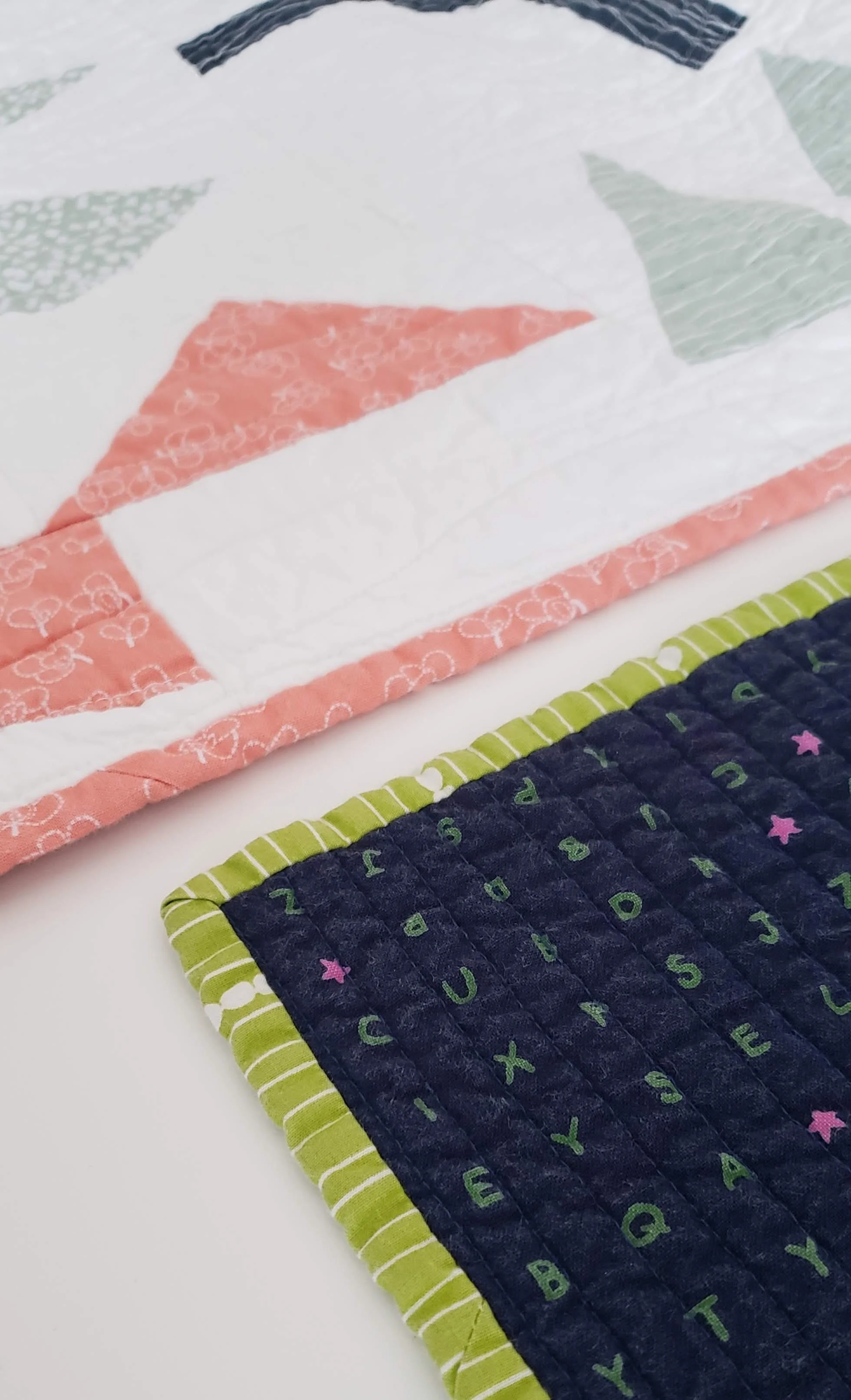
Most of us shy away from a white binding, fearing a show of dirt. Let me tell you, that isn’t a fear worth having. It looks absolutely amazing on a quilt. Whether a print or a solid a light binding is an exciting frame to your work.

Morning Make I

Crossword

Pieced Bindings

Insert Highlights in Bindings

Add a pop of a different colour randomly or make intentional inserts to extend the design of your quilt top. This is the moment to really think of your binding as part of the quilt and not necessarily just the frame.

Plus Size

Pieced Bindings

Pieced Bindings

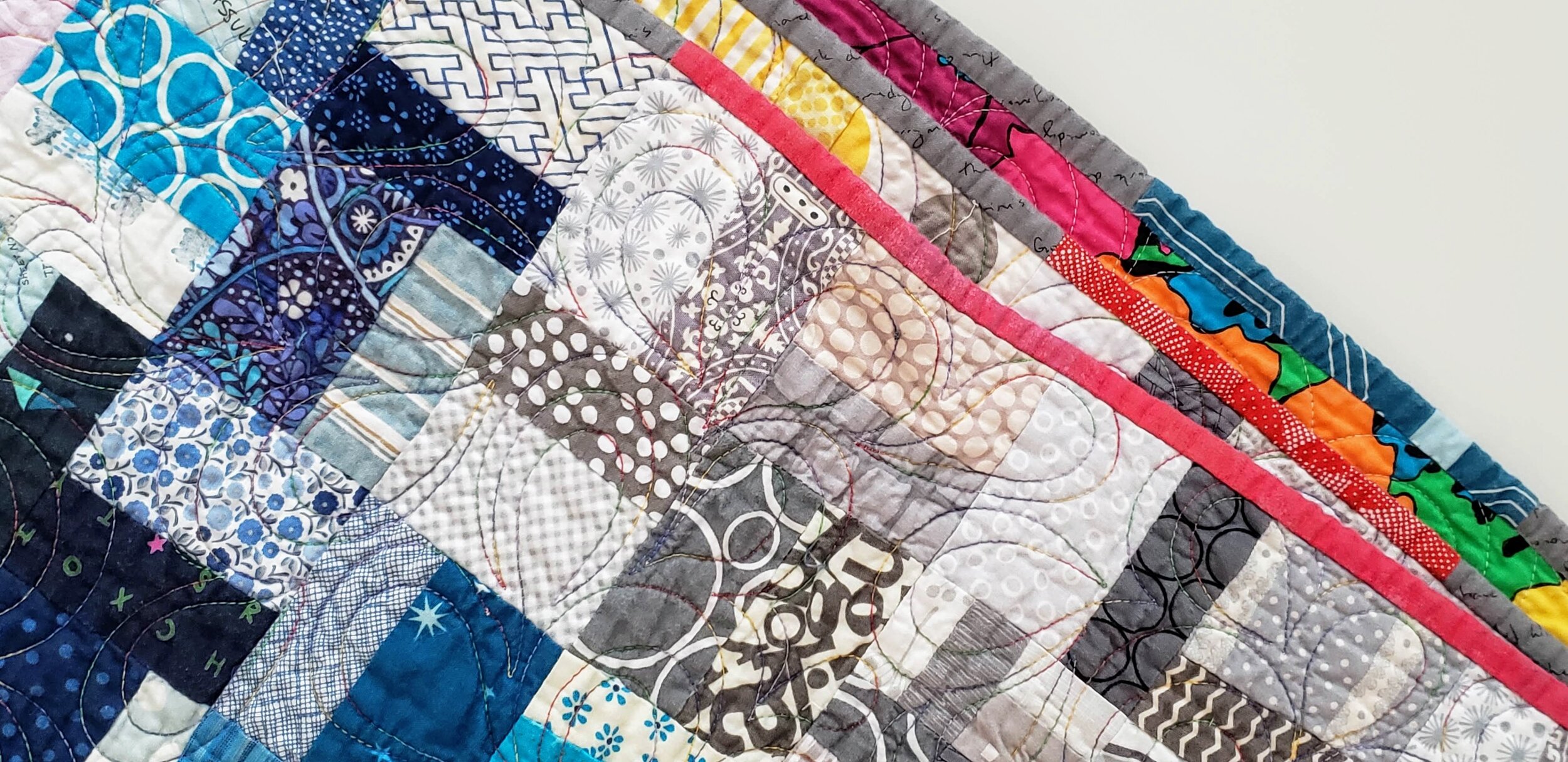
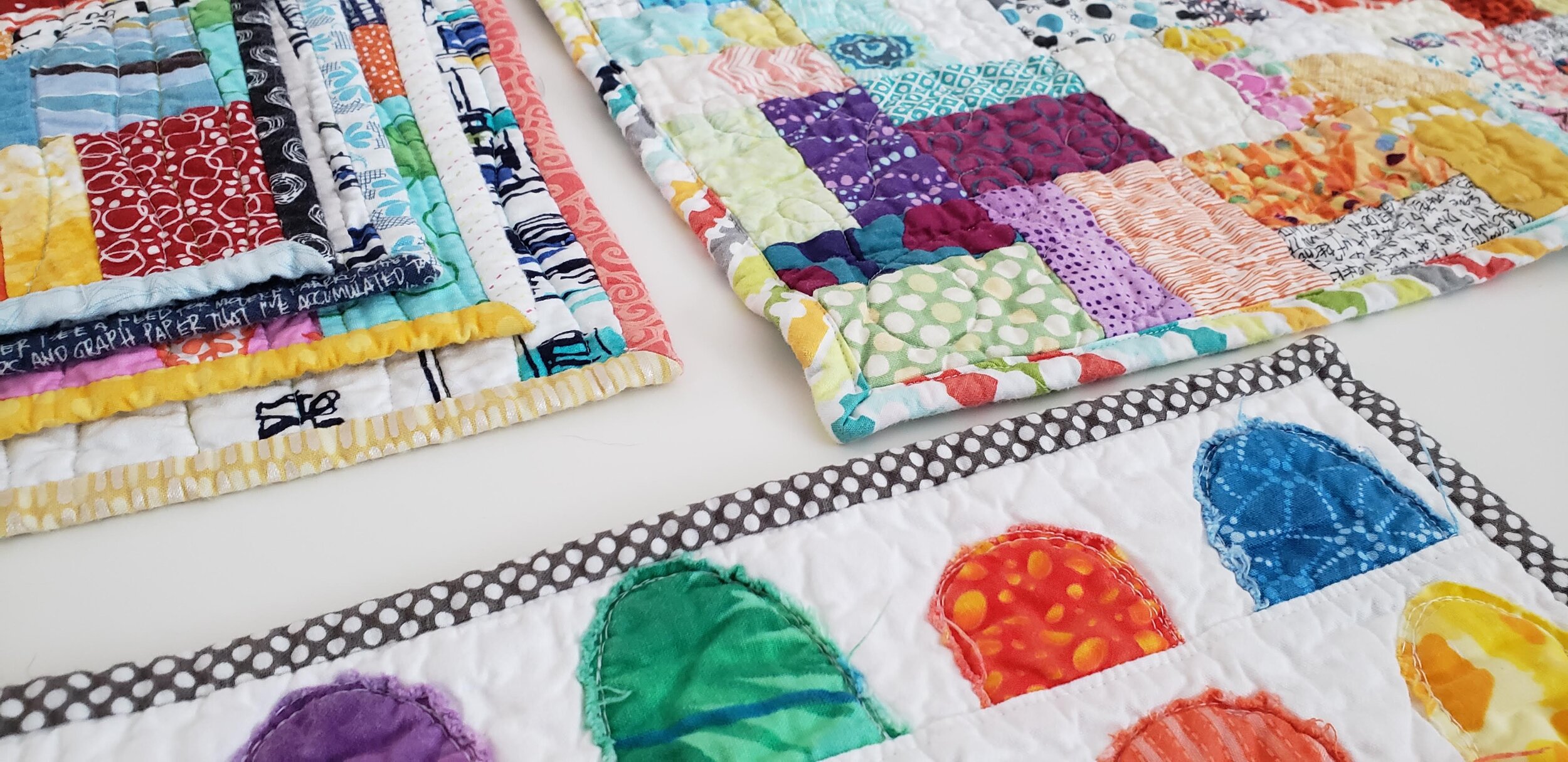
Okay, so all bindings on a not-mini quilt are technically pieced. Use different fabrics to accentuate the design of your quilt top. For example, I made a rainbow of binding to wrap around my Pride quilt. I’ve used leftover strips to create a scrappy binding. Play with it.

Pride Quilt

Binding a Scrap Quilt

Scrap Quilts Call for Anything and Everything

Probably the most commonly used binding for a scrap quilt is some form of black and white stripe. It’s nearly a cliche. Sure, it looks good, but think outside the box. Grey is a good option. As is using the scraps of binding you have stashed all pieced together. Multicolour prints also look great. Or pick one colour you feel is underrepresented in your quilt top and use that.

Values Plus

Wine Gums

Forgiveness

Funky Quilt Bindings

Embrace the Uneveness

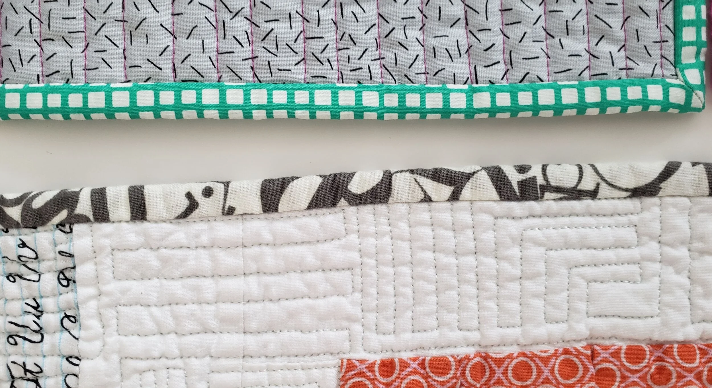
One of the reasons people love a stripe on the bias is that there is no concern about it looking ‘off’. And when was the last time you used a plaid or check on a binding? Just run with it and let your eye move around and even be fooled. It’s quite a fun effect actually. Essentially, you are ignoring the pattern to embrace what the fabric can do on the small scale of a binding.

Sewing Machine Quilt

Pocket Squares