

Color of Connection
58” x 64”
The premise behind the Color of Connection quilt along was to sew together, yes, but to also inspire discussion and efforts around diversity and inclusion in the quilt community.
Diversity and inclusion in the quilt community? I believe that while quilters come in all stripes and colours, the spaces are dominated by white women. So yes, quilters are a diverse bunch, but it is still a far from inclusive community. This #colorofconnectionqal is highlighting that. I've met a number of new quilters and new to me quilters, quite a few with stories about bad experiences with quilt guilds and communities. It is painful, but not surprising that this is still happening. Quilting community is going to be a reflection of the larger world. Just because we are quilters we aren't all magically kind and wonderful, despite the grandma stereotype. If we want the change here and everywhere we have to make the change.
This was my first quilt along, at least the first I can remember participating in. I felt it was important to both join the discussions and lead by example. It really wasn’t about the quilt. (But I will still talk about the quilt in a moment.) It was about a bit of a reckoning for our quilt community. It was also about building community for ALL quilters, for acknowledging that the spaces we are creating may not be welcoming, and for having this Color of Connection community be a truly inclusive space.
Kudos to the organizers Porfiria Gomez, Keyana Richardson, and Michelle Collins.
Now, to the quilt.
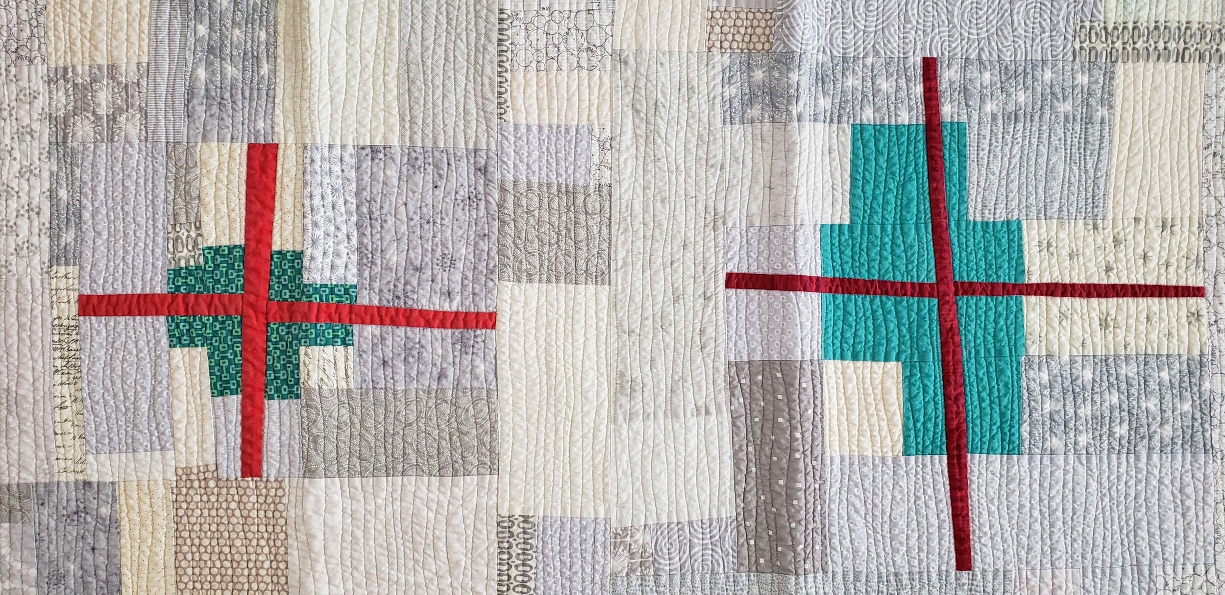
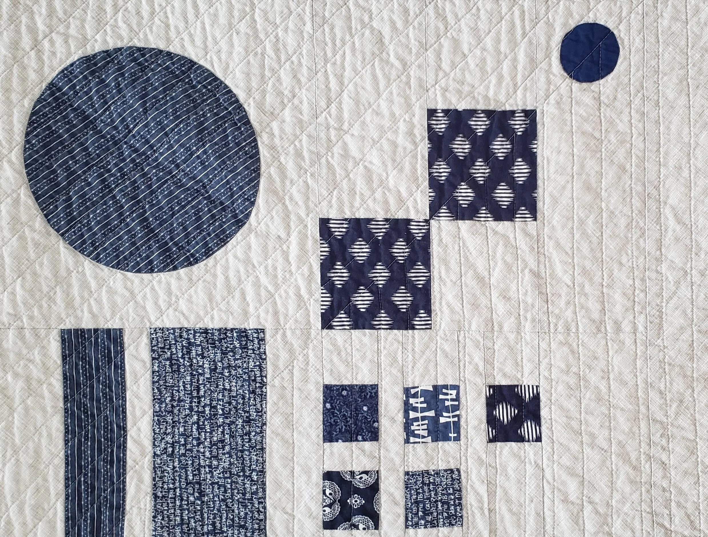
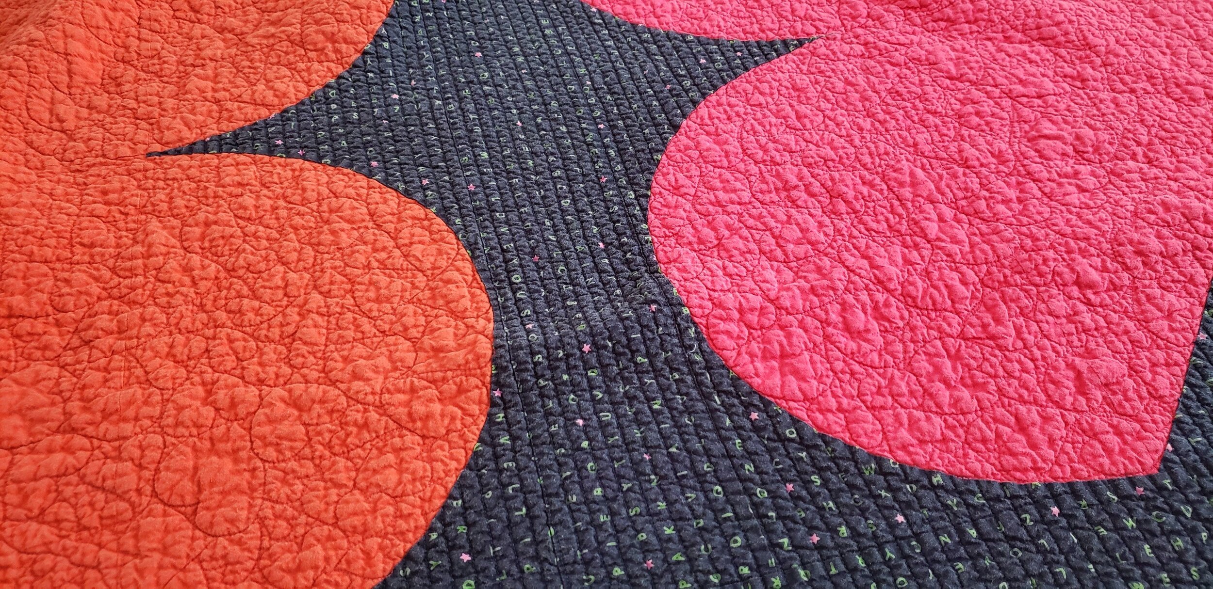
It’s me, so you know I have a hard time following a pattern. I followed the quilt along and the discussion prompts, but played with the pattern a bit. The original quilt called for large solids or at least large cuts of prints. As my scrap bins were overflowing I decided I would make slabs and cut my pattern pieces from them. I started with black solely because I was thinking about Black Lives Matter. This particular quilt seemed like a good one to get symbolic. After that I chose warm colours to share joy and warmth of people. And because they looked good.
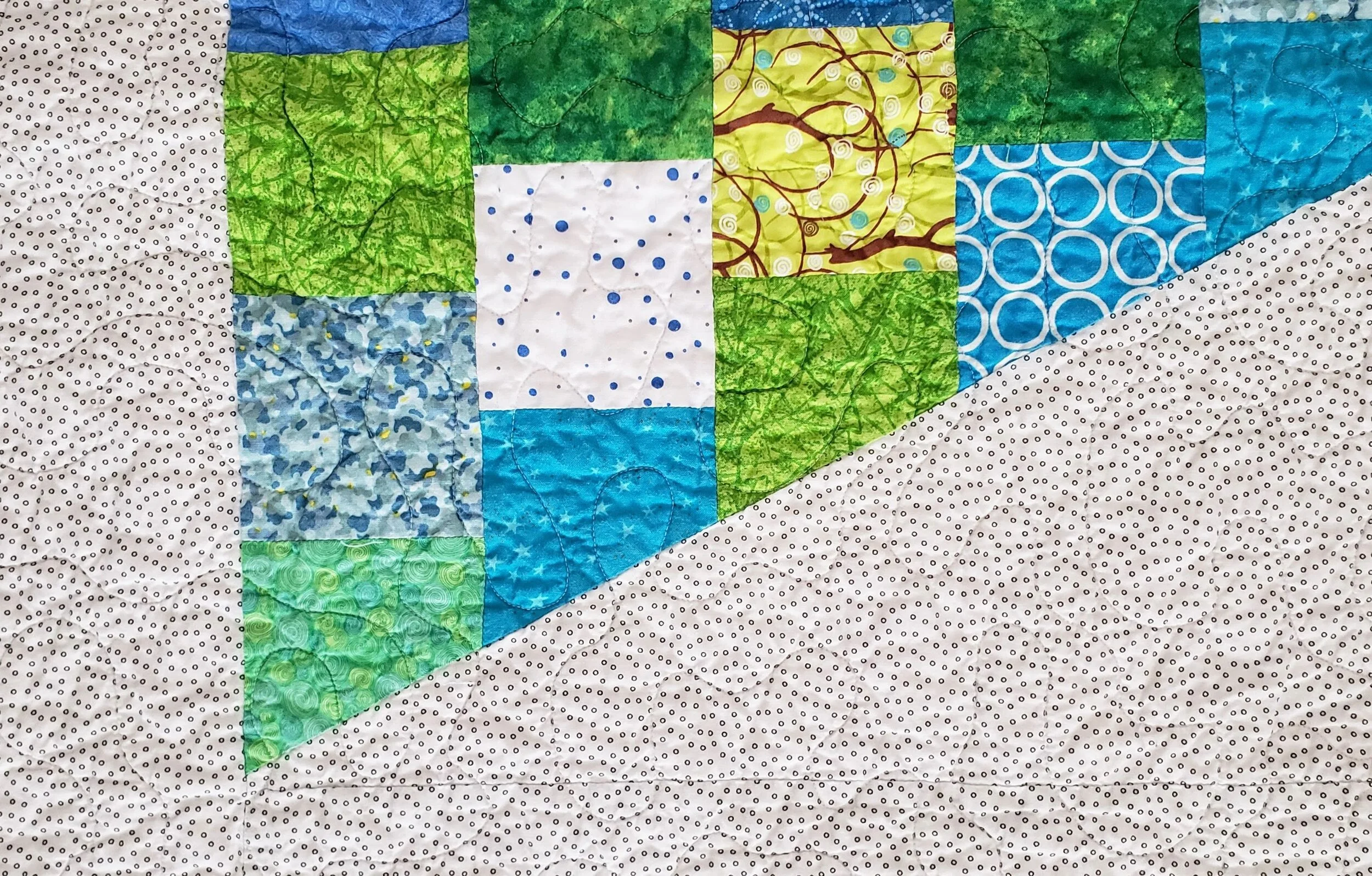
As usual, The Monster helped me baste the quilt and she suggested the red thread. I used a Wonderfil option from my thread stash. In fact, I bought nothing to make this quilt. The backing was a combination of two fabrics from my Tag collection. I loved the mix of the names prints - showcasing the diverse community of our local elementary school where all the signatures came from - and the texting print of all thumbprints. My batting was put together from leftovers. Nothing like Frankenbatting to truly embrace a make-do approach!
The binding was a fun choice. We know I like a contrasting binding. It actually wasn’t my intention here, but nothing I chose in black, red, pink, or otherwise looked good. On a whim I pulled out my blue and green bins. This royal blue Pearl Bracelet was exactly the right colour and I had just enough to make this work.
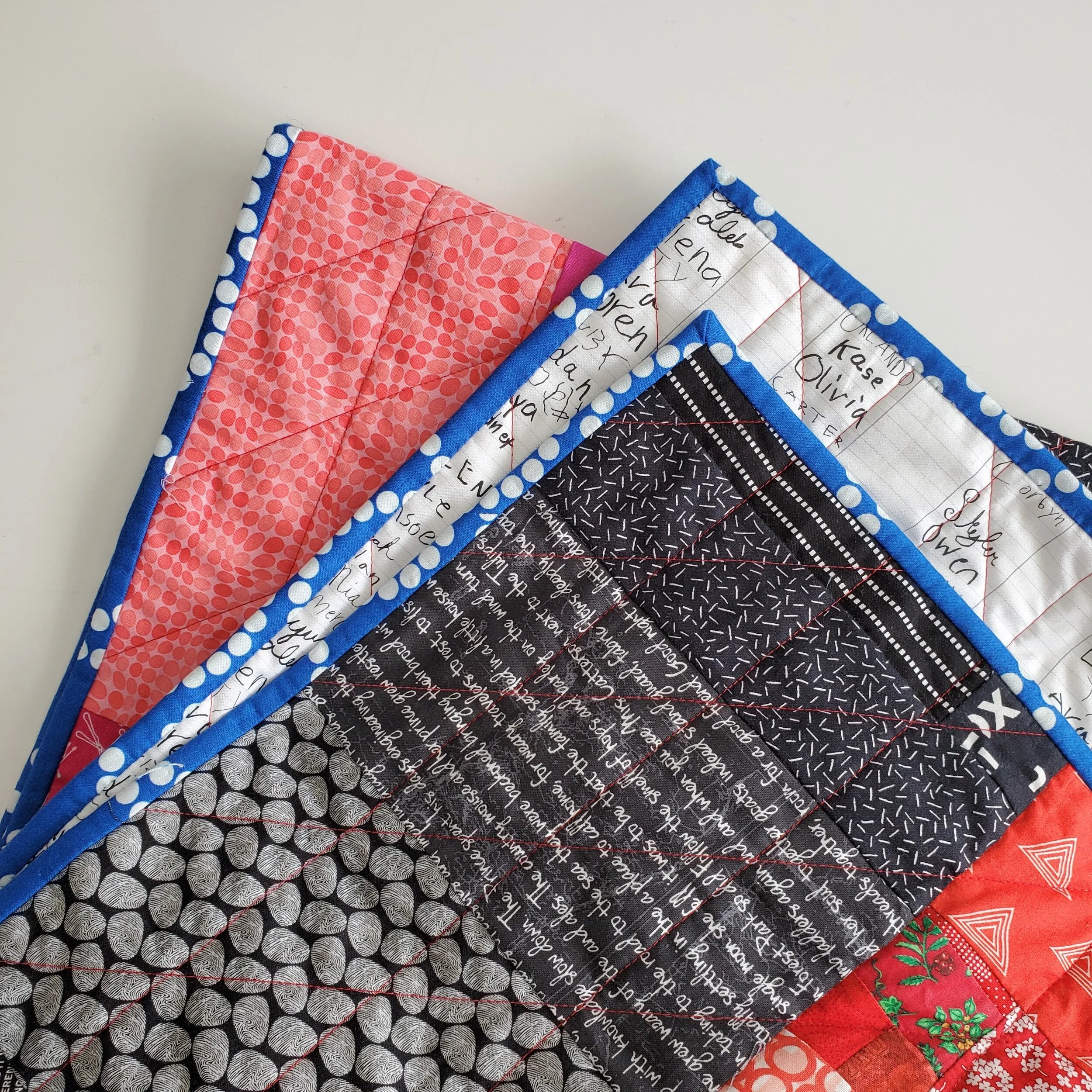
The quilting itself, with the aforementioned red thread, was a fun grid. Vertical lines first, every 2”. Then I did a diagonal line with the same spacing, following the lines of the large HSTs in the pattern. It isn’t fancy, but it is effective. And quick.
Obviously, a quilt along is not going to solve systemic racism. What it does achieve, however, is a continued conversation and visibility for the topic. Both are important in our community. With the quilt along finished it is now up to the rest of us to continue that conversation.
As a quilt teacher one of the places I do this is in my classroom, virtual or in person. My goal is to create a space where everyone and anyone is welcome. I promise you I will shut down the commentary, judgement, and racism/homophobia should it come out in the classroom. And if people don't think I should do this then they shouldn't hire me. As a quilter, I will do this by continuing to read, to listen, to encourage the conversation, to use the materials I have on hand, and to use my platform for all of this. I know loads of people want to keep politics out of quilting, but you just can’t. And I won’t.
If you are interested in the Color of Connection pattern or the goals of the project you can find out more here.