"inspiration"

Rocky Road to Kansas With a Vibrant, Modern Twist

Rocky Road to Kansas Cheryl Arkison

When you don’t have enough fabric to make a quilt you make pillows.

When you have an idea that won’t get out of your head you make something.

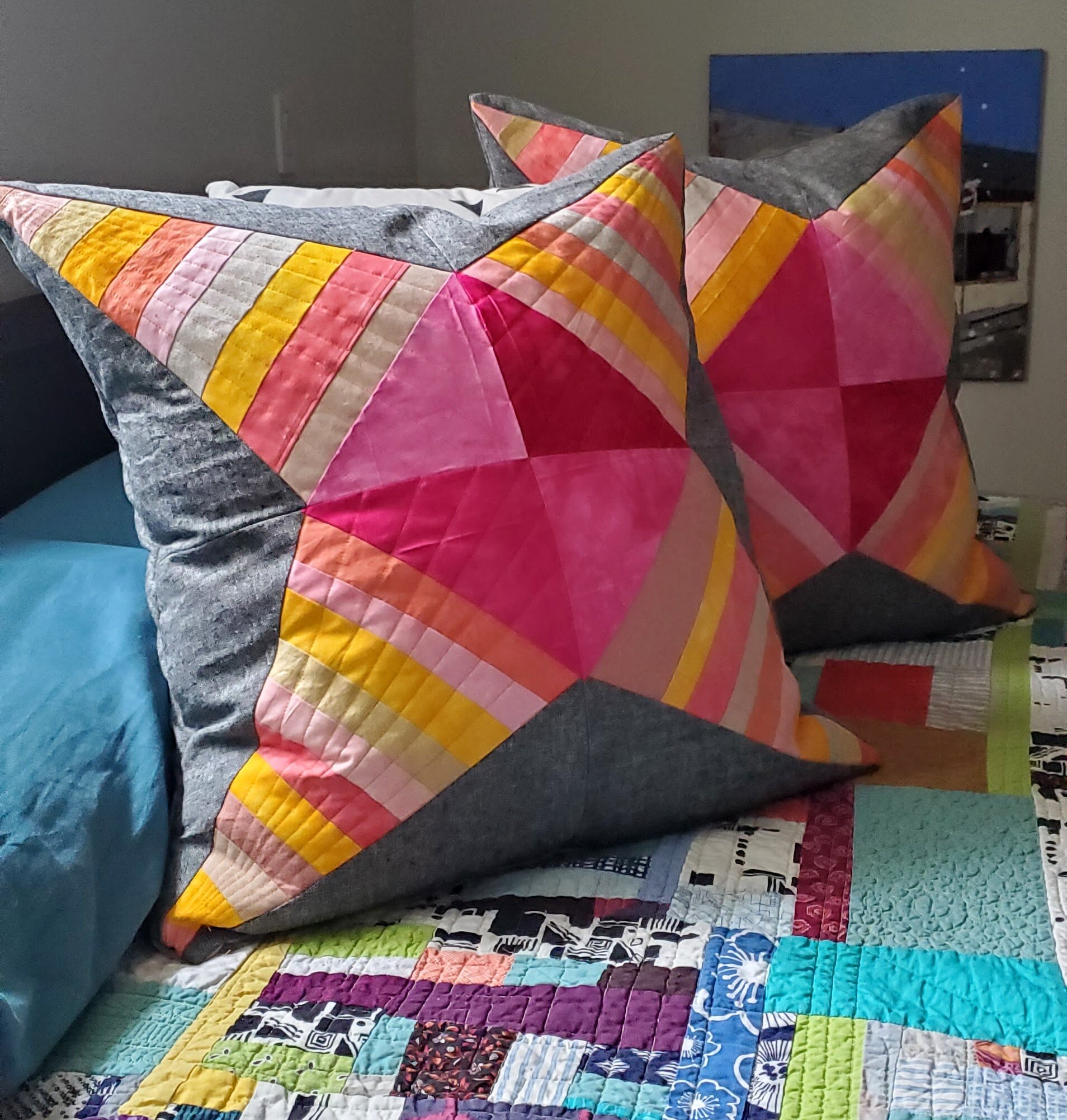
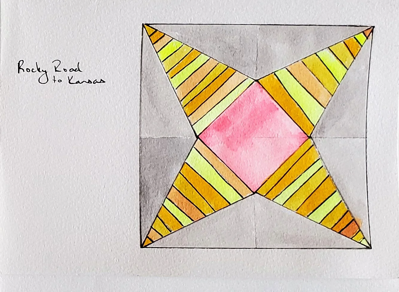
Back in September, when I was painting traditional quilt blocks fo Morning Make I painted one particular block: Rocky Road to Kansas. It’s quite a cool design. Even Barbara Brackman doesn’t say much about the block’s particular history, but it does have a long one. The block is seen in quilts nearly 130 years old, in variations more like a crazy quilt or a string quilt. It is definitely a block that can read extremely modern too. Like most quilt blocks, it all depends on the fabric you use.

Rocky Road to Kansas Cheryl Arkison

In my case - once the idea borrowed itself in my creative consciousness - I went with a collection of hand dyed fabrics and some charcoal linen. The hand dyes came from two sources. The vibrant colours were a gift from my husband and daughter 5 years ago. At the culmination of a epic road trip to Whitehorse they came across a quilt store and shockingly, went in for me. They came across some vibrant fabric that was dyed by a local. Well, that local, it seems, now lives in Fiji so I think these tropical colours make a lot of sense now! The rest of the fabric was a collection of precious scraps from Debbie Aruda. I met Debbie teaching at The Workroom. Using natural dyes she was manipulating fabric in gorgeous ways and she gifted me with some. The combination of luminescent and subtle colours works so well together, I think.

To make the quilt block I drafted a freezer paper template. That way I could get nice, crisp lines and, hopefully, matching points. It was also useful as I was working with a limited supply of fabric. Each block is actually a four patch. Together they make a 24” square.

Rocky Road to Kansas Cheryl Arkison

I probably had enough fabric to make a total of 10 corners. Of course, I could have augmented the blocks with other stash fabric too. At one point I entertained doing a whole deconstructed thing. You know, one block with 4 corners, one with 3, one with 2, and then just 1. That would have got me a decent size quilt. it would have also got me a quilt top that likely would have sat for years before being finished. So, pillows it is.

My husband actually hates decorative pillows on the bed and I hate laying in bed for anything other than sleep and well, sex. But these pillows are on the bed and they look pretty good there too. I guess they will be purely for show and I am not complaining one bit!

In March I played with making marks with watercolour. That led to further watercolour explorations. That led to sewing these blocks. This project is a perfect example of creativity begets creativity.

Wish Upon a Star

Mills and Stars from Perfectly Pretty Patchwork

Wish Upon a Star

48” x 48”

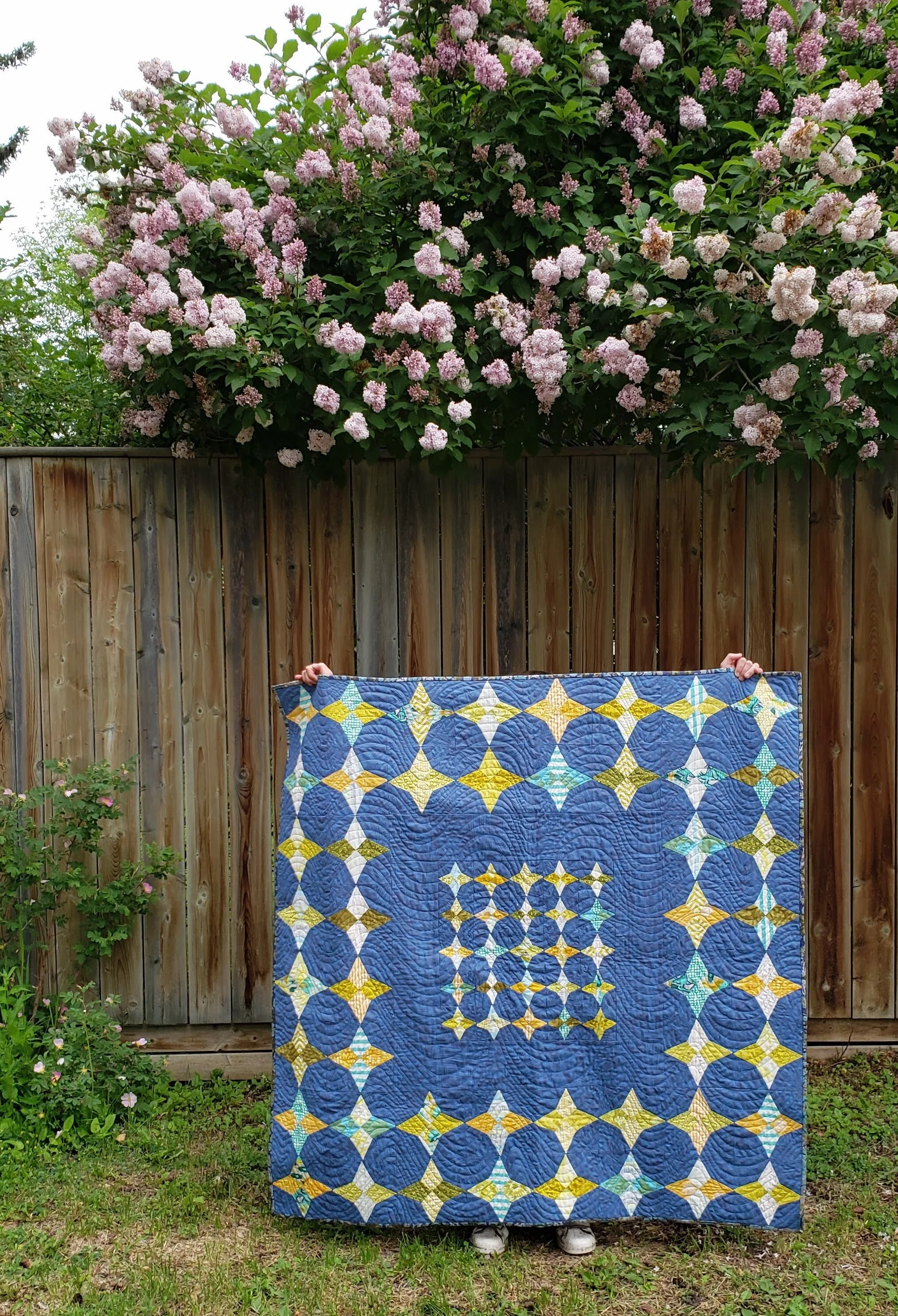
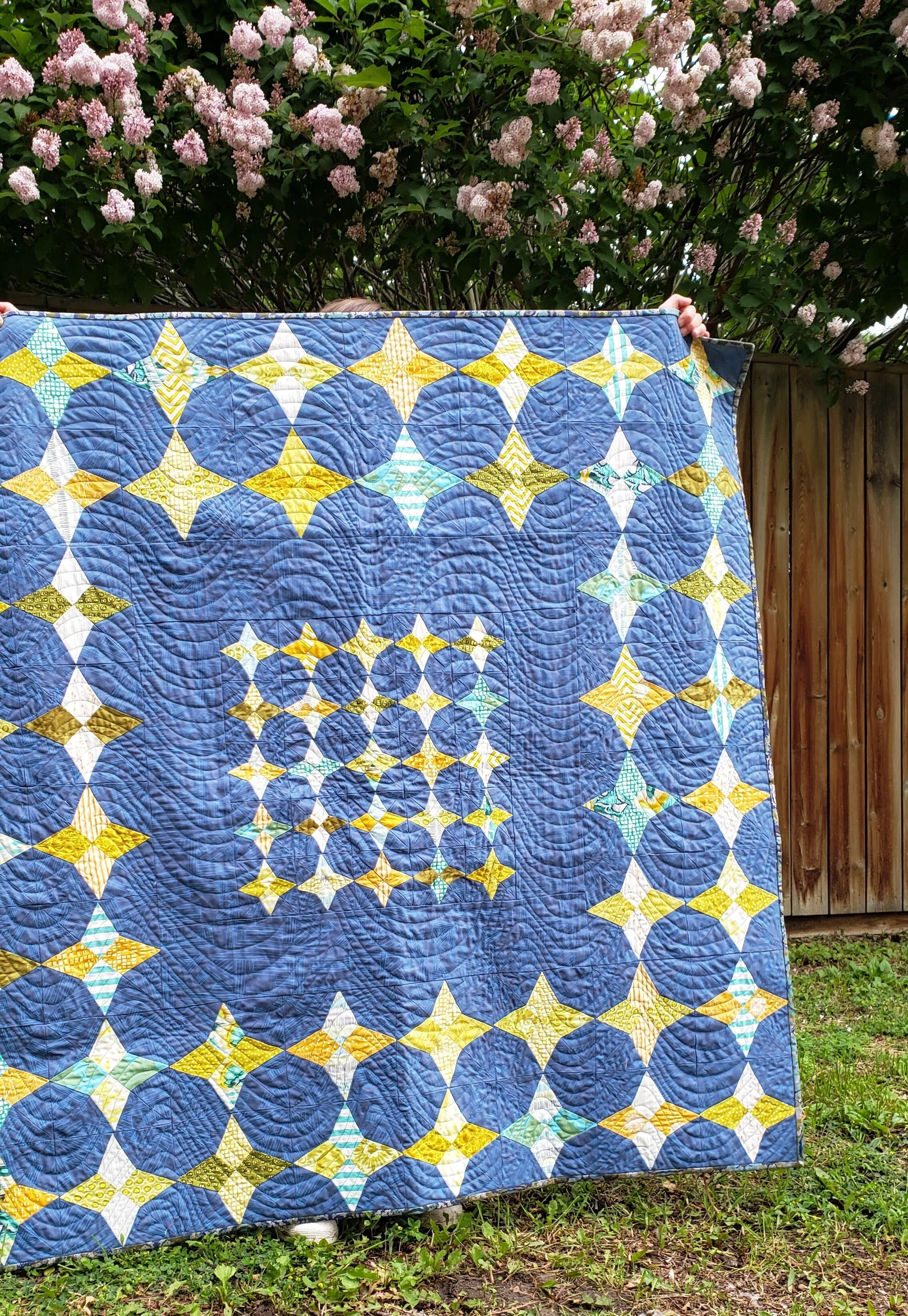
For a little baby boy, born to parents raised across the country , a quilt to make all the wishes. Or, just to spit up, poop, and play on. And hopefully keep you warm. Heading your way soon.

This quilt is a slight adaptation of a pattern by Kristyne Czepuryk in her recent book, Perfectly Pretty Patchwork. The only change I made was to skip the outside round of stars, thus reducing the overall size of the quilt. It was a definite change in making for me - using templates and all that precision piecing! Changing things up can be good though! Keeps you on your toes.

Cheryl Arkison Pretty By Hand Tula Pink Carolyn Friedlander

Most of Kristyne’s work is soft, pastel, and oh so pretty. It’s gorgeous stuff but not necessarily what I am drawn to for my own quilts. Not wanting to go shopping I decided to see what I could do with what was on hand. I’d been saving this Carolyn Friedlander print for a totally different project. It had been sitting long enough, however, and deserved to see some glory. The rest of the colours came from an Ikat butterfly print by Tula Pink. You can see it there in that corner star, and again on the back (below). The nice thing about this pattern is that I could dig through my stash and scrap bins to cut the diamonds for the stars. It meant a lot of variety; scrappy all the way. The prints used are a combination of old and newer, modern and boring, bright and simple. All together I think they balance nicely and create so much visual interest.

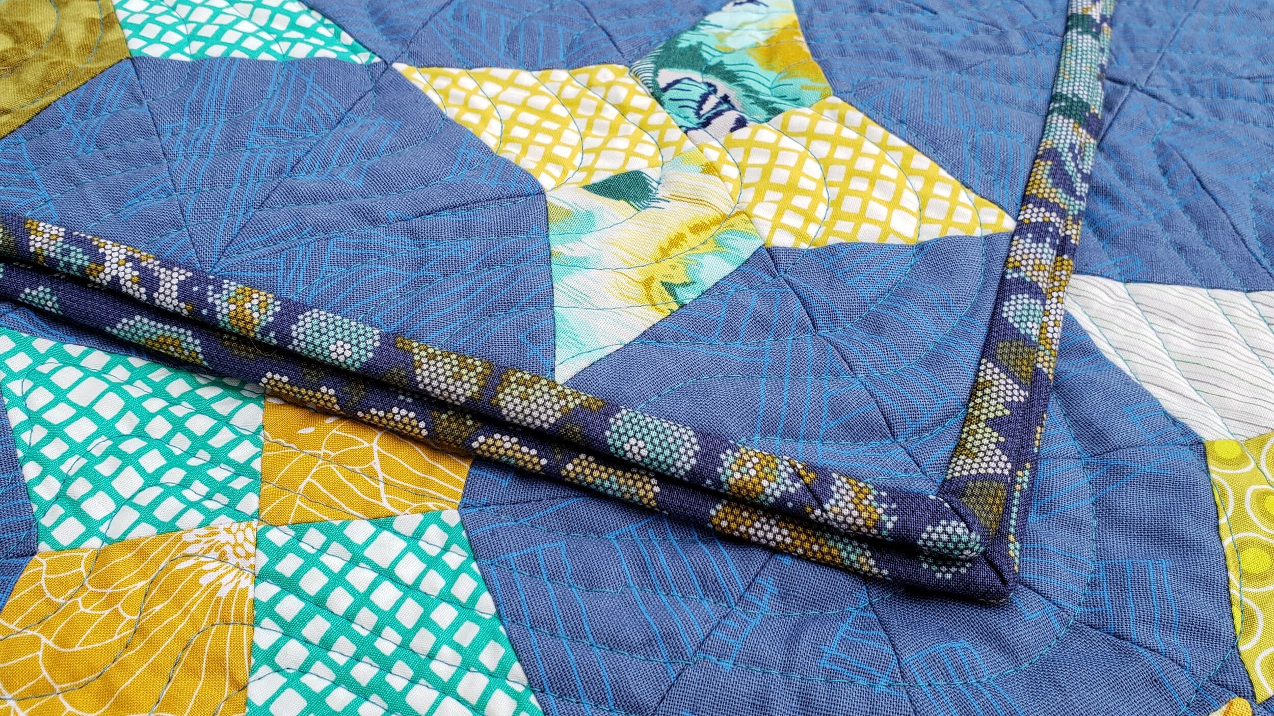
To quilt it I simply did an edge to edge wave, varying the thickness of the lines as I went. It was nice to have the change in texture from the points on the pattern. With a pattern like this I think you can really emphasize all those points with ditch or echo quilting, or you can contrast it. Bonus: contrasting it is easier. My thread choice was a dark turquoise Aurifil in my stash. It doesn’t stand out too much anywhere but doesn’t quite blend in. I rather love it.

Tula Pink Lotta Jansdotter fabric

Binding was an unexpected choice. I didn’t have enough of any green or yellow that worked to make it around all 4 sides. I debated using the same dominant blue print. Grey seems boring too. Then I spied this other Tula Pink in the stash. It’s a really cool pixelated print of tigers. (Both the binding and the inspiration/backing fabric are from her Eden line.) Cut for binding it looks totally different! I rather like the change and I think it frames the quilt nicely.

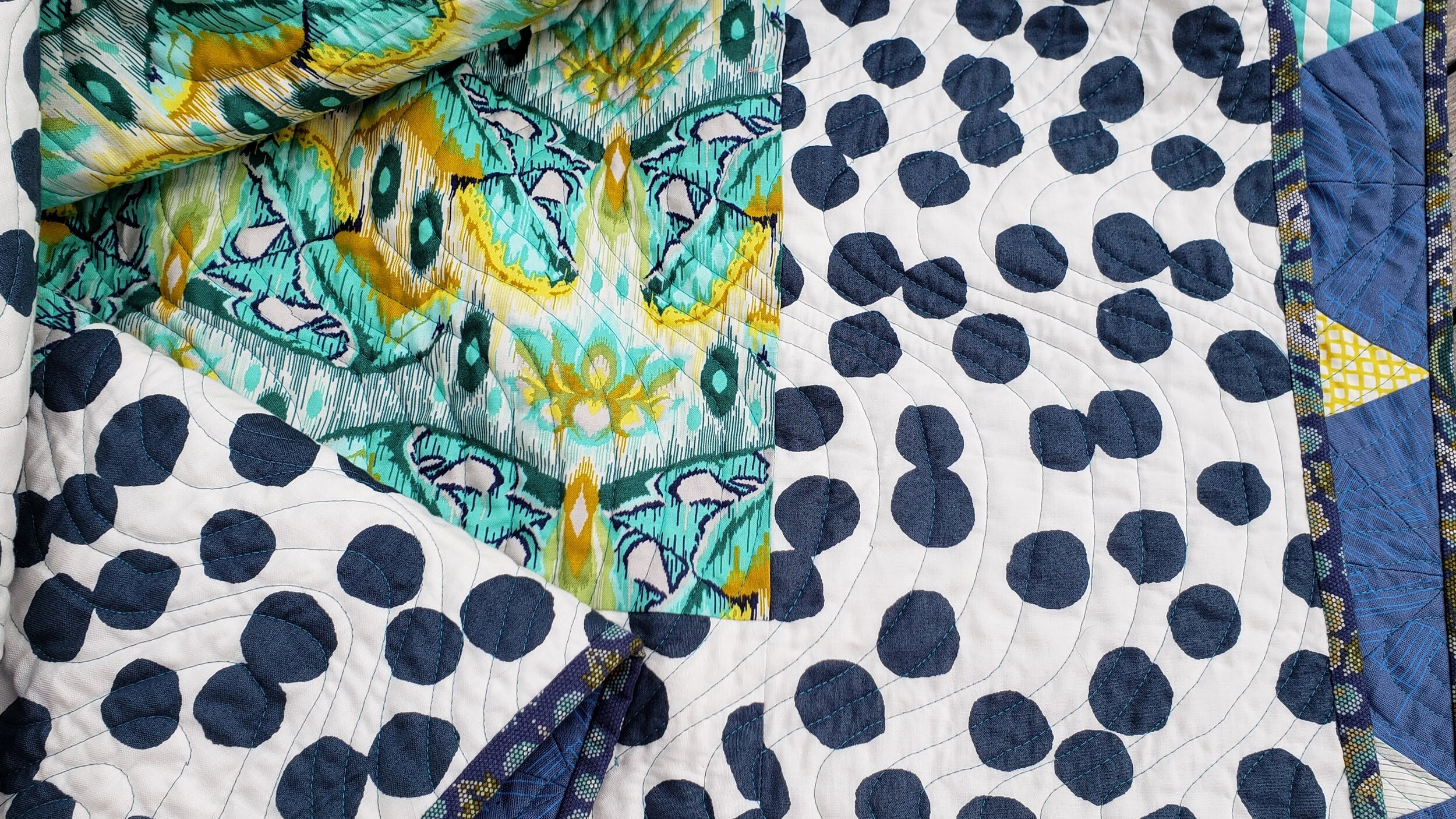
Again, because I couldn’t pop out to the store and wanting a backing done when I wanted it done I got creative with my stash. There wasn’t enough of the butterfly print to make it so I added these big blue dots (a leftover piece of Lotta Jansdotter fabric from our collaborative Lilla quilt) as a frame. This might be one of my favourite quilt backs ever.

Mills and Stars Cheryl Arkison Kristyne Czepuryk

Thank you for pushing me out of my box a little here Kristyne! I won’t lie, I’m a little sad to send this one out the door but a certain baby boy will surely appreciate it.


Ripples - A Water Inspired Quilt

Ripples Cheryl Arkison

Ripples

52” x 68”

Next in the landscape series of quilts. (First there was Mountain Meadow, then Names for Snow).

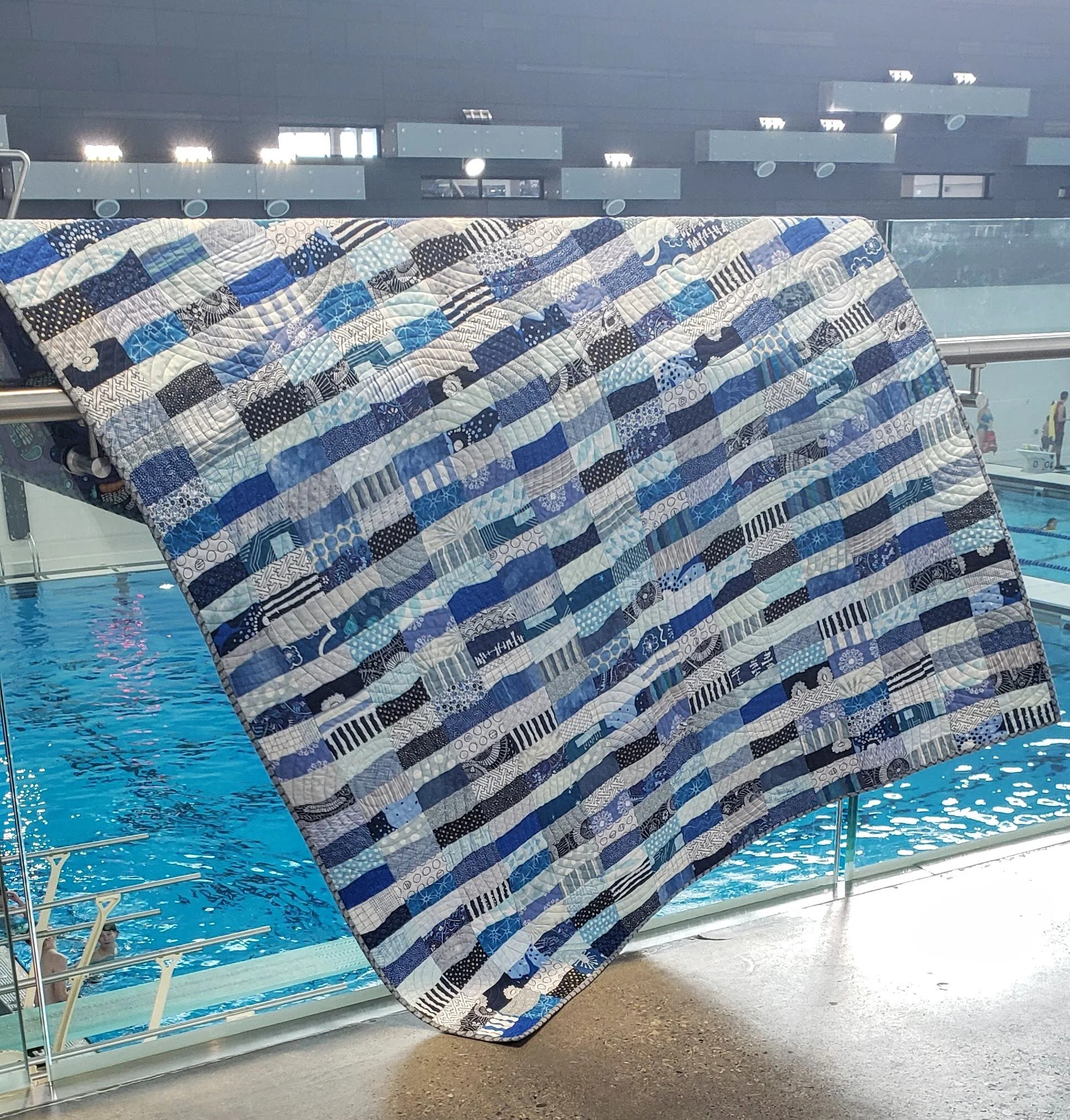
Completely inspired by the deep blue landscape of Prince Rupert, British Columbia. Whether it was the morning sun reflecting off the calm ocean, or the hidden blues of the spruce trees in the rain, or even the rolling fog covering the community like a quilt, they all found a home in this quilt.

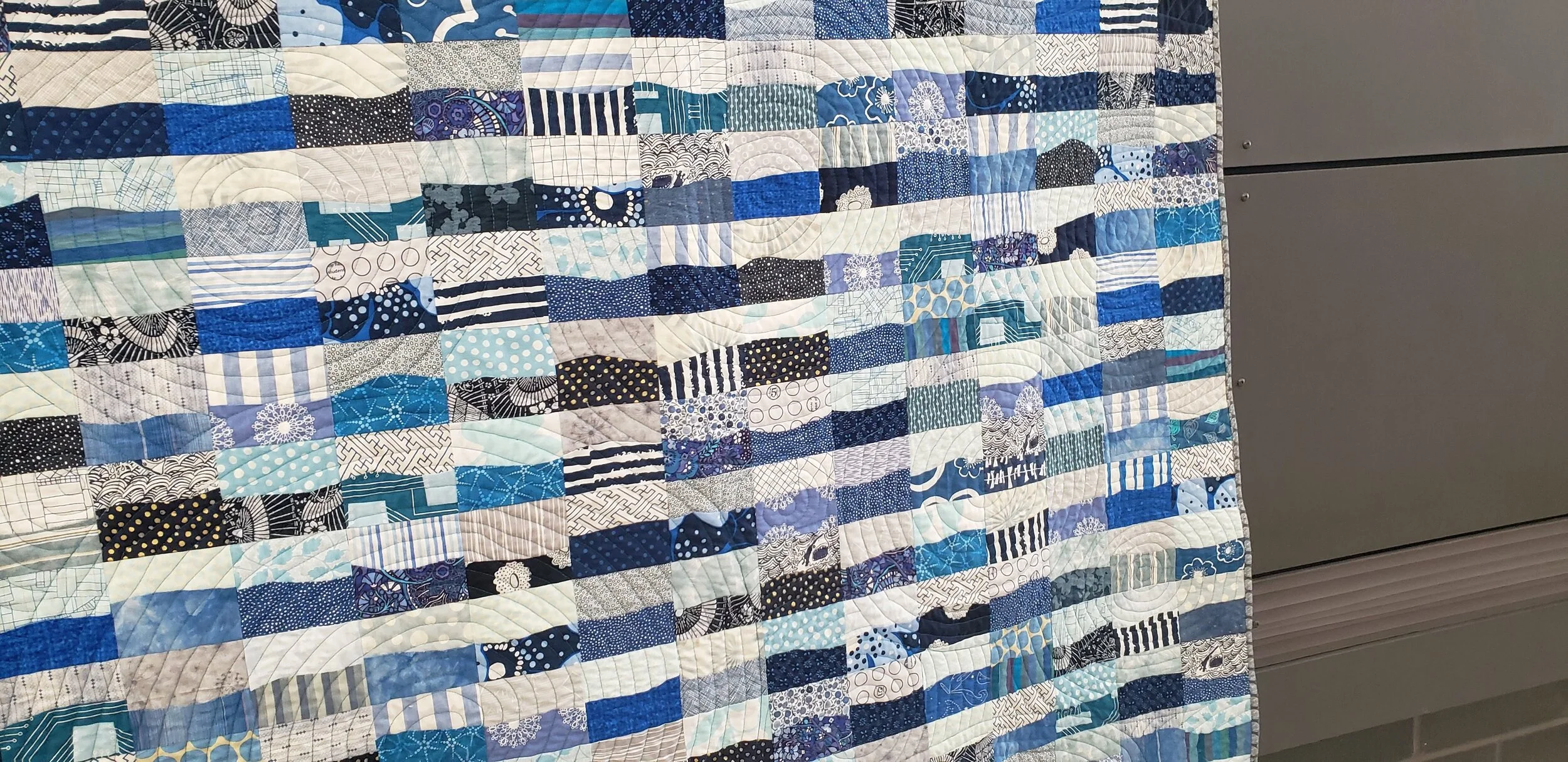
Simple improv curves, the repetition of blocks and colour an homage to all that I saw that long weekend on the coast. A way to capture the energy of the community and the creativity of all the people I met. This is absolutely Improv With Intent.

Free motion quilting circles


Quilted with concentric circles to emphasize the Ripples. Kind of like the ripples on the surface when you toss a handful of rocks into the water. Or the ripples when the seals poke their heads up to see what you see. Or when the fish bubble up, trying to hide from the seals and the herons. Or, as I see more often than not in our life on the Prairies, kids jumping in a pool!

The quilting was done on my Bernina 820 with an Aurifil 50W in teal. It blended with the front and the fabric on the back.

Ripples Cheryl Arkison Improv Curves


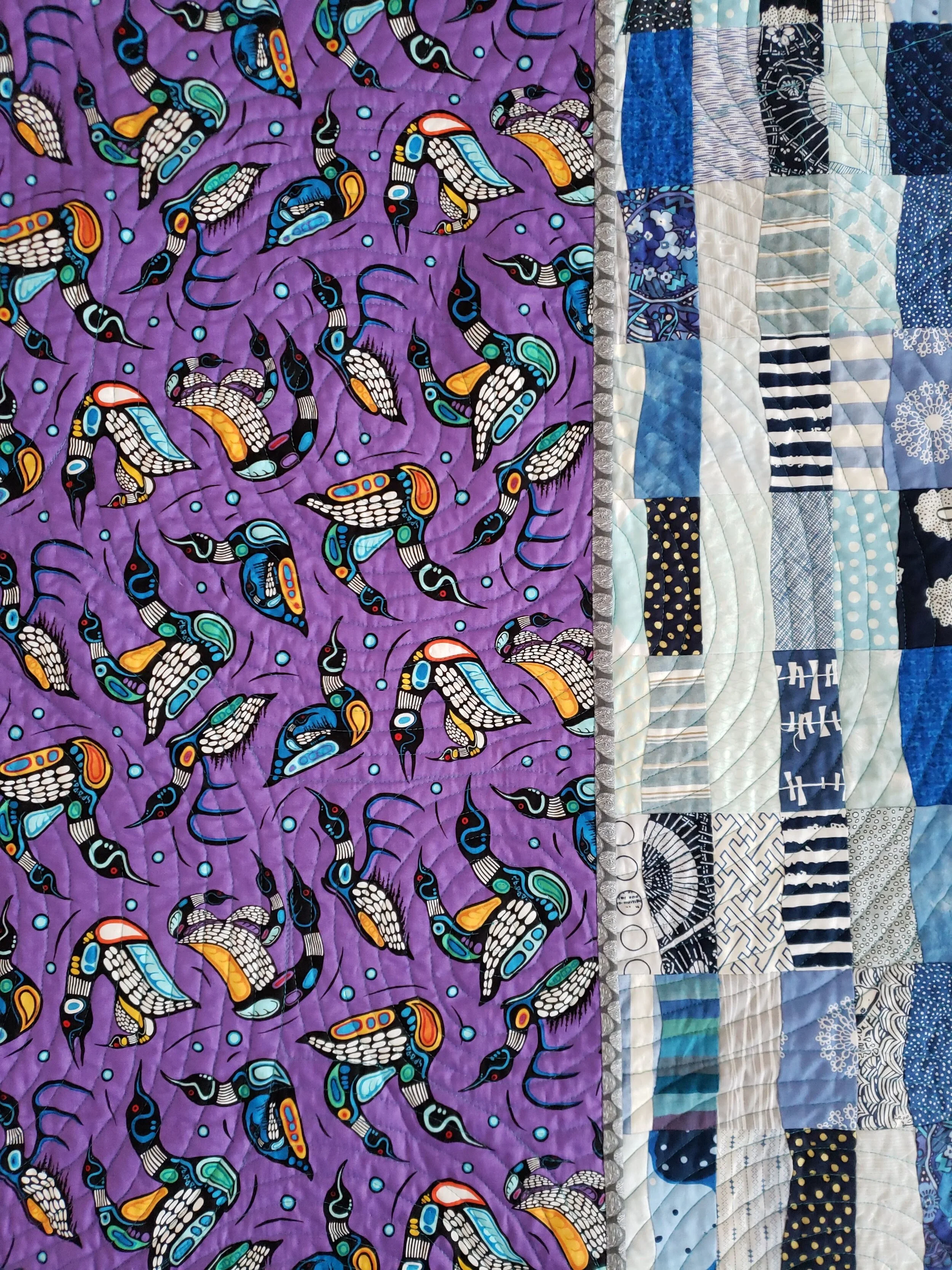
Backed with a gorgeous loon print from Mark Anthony Jacobson, an Ojibwe artist. Bound in grey, one of my own prints, to remind me of the fog, the logs, and the weathered wood of the docks.

To see more of the inspiration, check out the original post.

Mark Anthony Jacobson


Quilt Bravely - Creatively Contrasting Binding

This is the first is a series of posts encouraging you to be different, quilt different, quilt bravely. To bend or even break some rules while pumping up your creative voice. You have the creative confidence, I’m just here to remind you of it.

So you need to bind a quilt? You might be one of those quilters who not only selected their binding fabric with the rest of the fabrics but also made your binding before needing it. That would be awesome! This post is for those of us looking to jazz up our quilts with binding, not just treating it as an afterthought.

Binding selection generally comes as the quilting winds down. Maybe even as the quilted quilt sits and marinates or you muster the energy to do it at all. You might have a default binding - black and white stripes, anyone? You might search for just the right shade of blue that coordinates with everything in the quilt and the quilt back. You might pick the stripe from the fabric collection that the quilt top is made from.

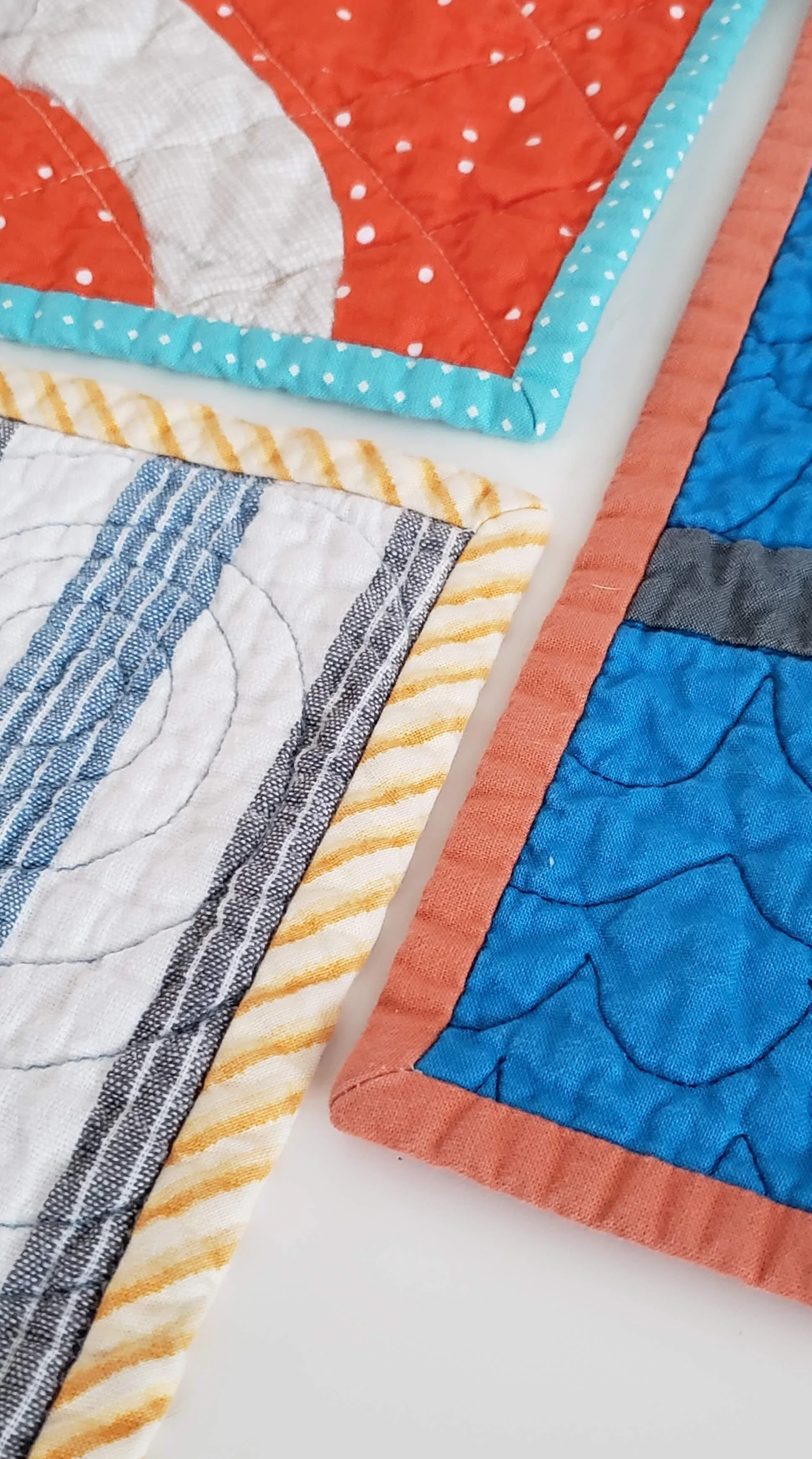
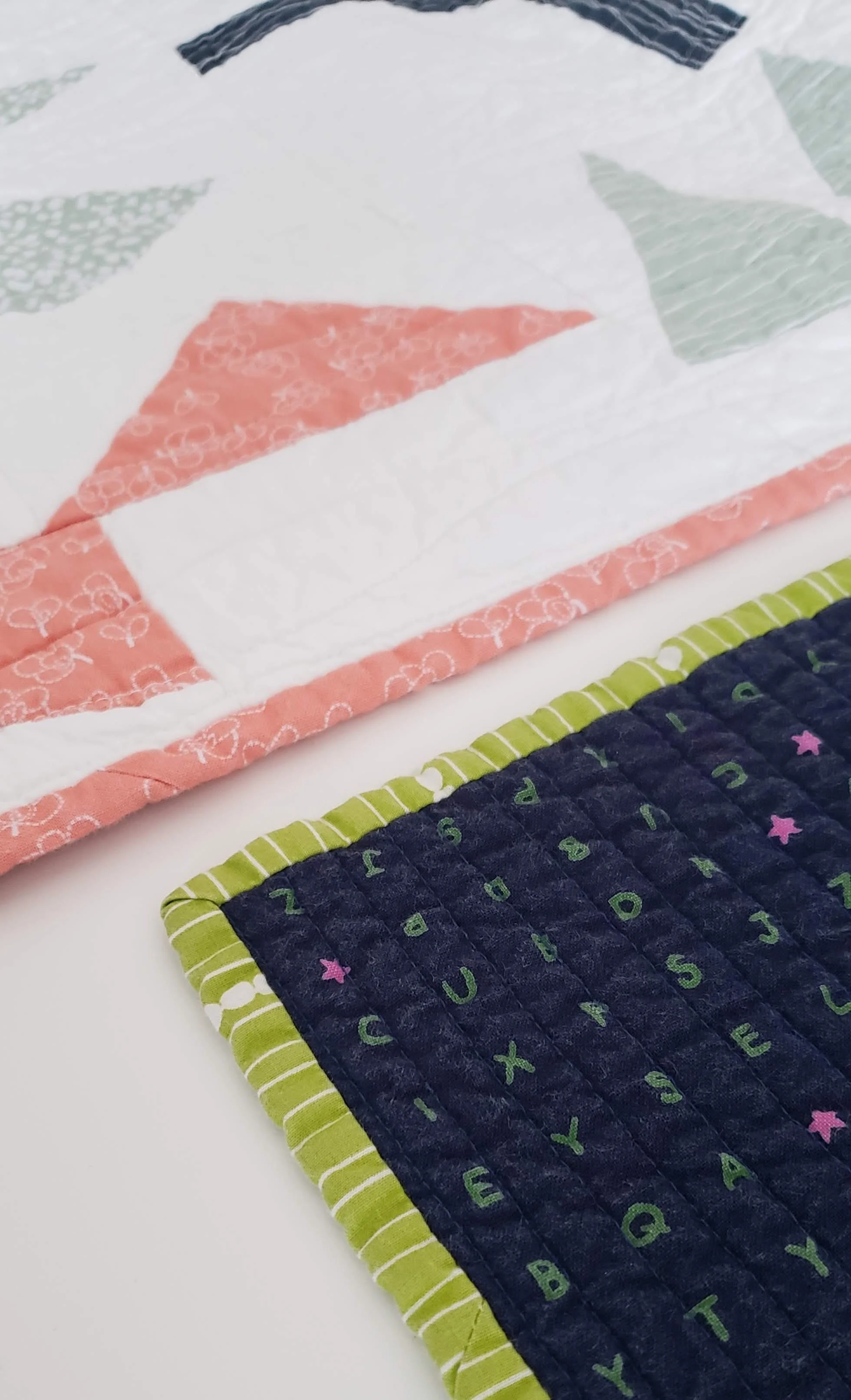
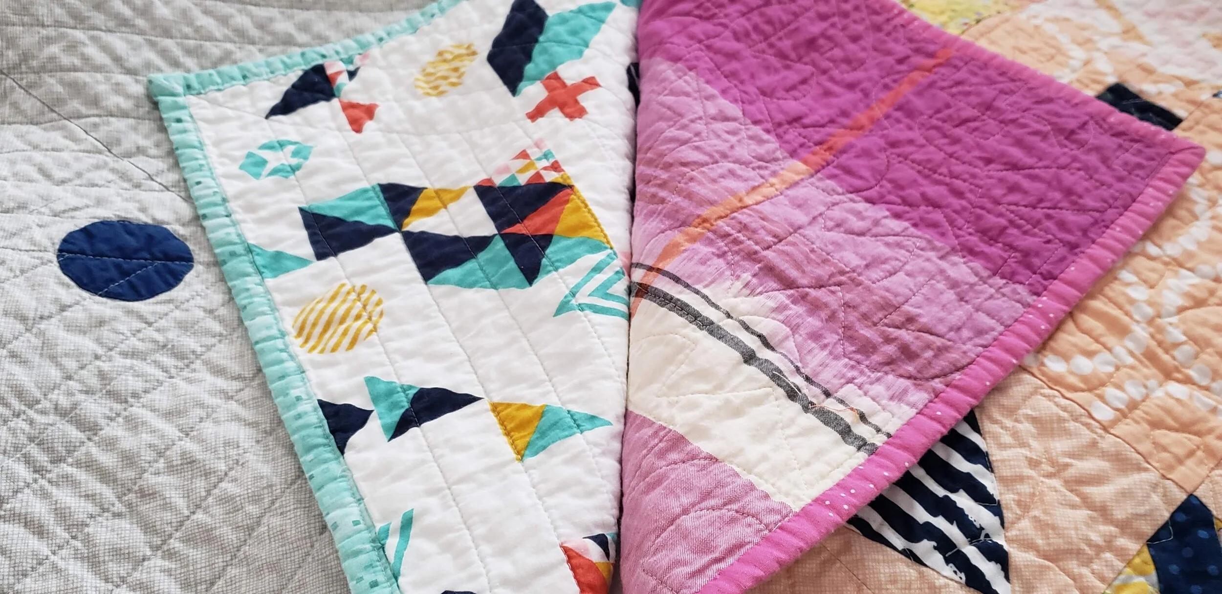
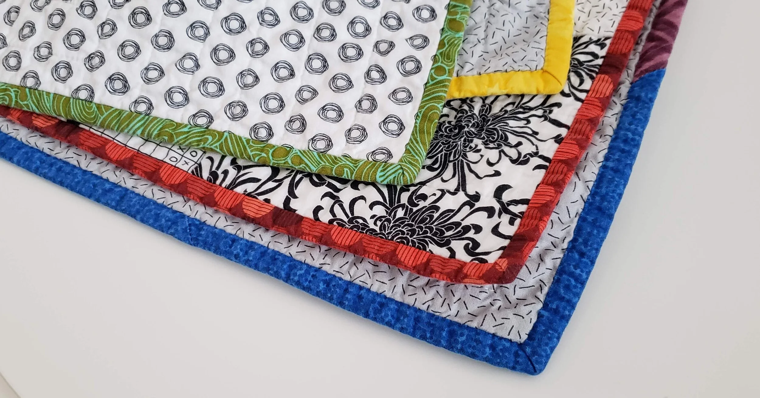
My challenge to you is to embrace a contrasting binding. Whether in colour, style, value, or design a contrasting binding might be exactly what your quilt needs for a stellar finish. If not contrasting, think creatively about what choice you can make. The unexpected one is often the exact right one. Here are some great ways to play with your binding selections.

Colour Wheel Contrast Binding Fabric

High Contrast

Use the colour wheel or simple preference as your guide. Pick a colour not even in the quilt top but that coordinates nicely. Using the colour on the opposite side of the colour wheel is an excellent way to do this. For example, orange and blue.

Shiver

Stripes

(yet to be shared)

Binding Fabric Selection

Highlight a Little Used Colour/Fabric

If you have just a little bit of a colour in the quilt top use the same colour binding fabric to wrap it all together. The examples above show me pulling out the green in the background print, even though there is no other green in the quilt top and using the same coral fabric that is only used sparingly in a quilt with 100 blocks.

Smooch

Lilla

Quilt Binding Options

Look to the Back

You may have picked a fabric that coordinates with the front but doesn’t necessarily use all the colours of the quilt top, go ahead and pick your binding from that fabric.

Lilla

Compose Yourself

Pale binding.jpg

Think White or Pale

Most of us shy away from a white binding, fearing a show of dirt. Let me tell you, that isn’t a fear worth having. It looks absolutely amazing on a quilt. Whether a print or a solid a light binding is an exciting frame to your work.

Morning Make I

Crossword

Pieced Bindings

Insert Highlights in Bindings

Add a pop of a different colour randomly or make intentional inserts to extend the design of your quilt top. This is the moment to really think of your binding as part of the quilt and not necessarily just the frame.

Plus Size

Pieced Bindings

Pieced Bindings

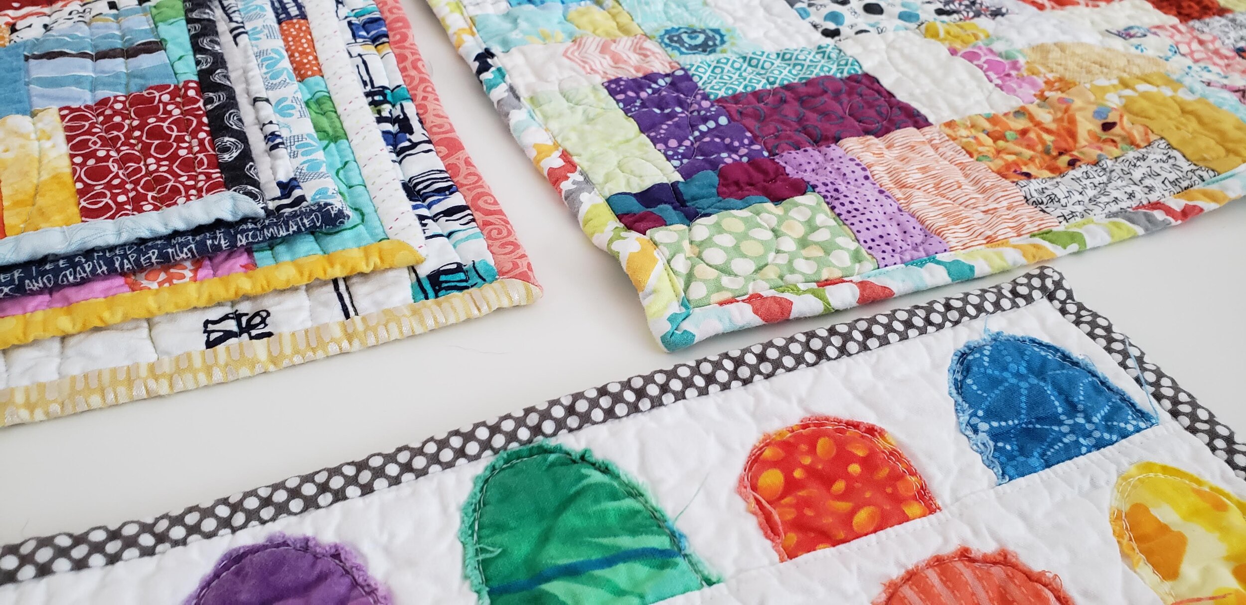
Okay, so all bindings on a not-mini quilt are technically pieced. Use different fabrics to accentuate the design of your quilt top. For example, I made a rainbow of binding to wrap around my Pride quilt. I’ve used leftover strips to create a scrappy binding. Play with it.

Pride Quilt

Binding a Scrap Quilt

Scrap Quilts Call for Anything and Everything

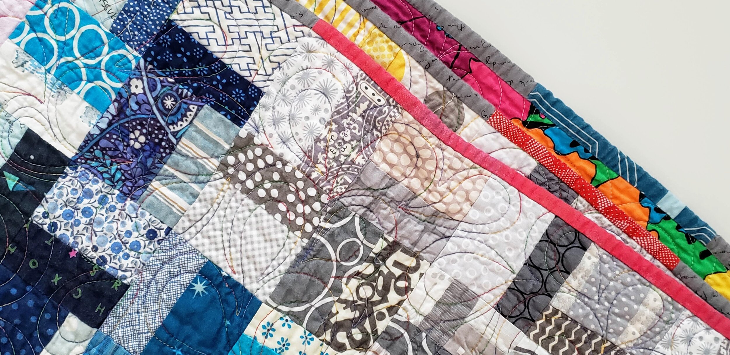
Probably the most commonly used binding for a scrap quilt is some form of black and white stripe. It’s nearly a cliche. Sure, it looks good, but think outside the box. Grey is a good option. As is using the scraps of binding you have stashed all pieced together. Multicolour prints also look great. Or pick one colour you feel is underrepresented in your quilt top and use that.

Values Plus

Wine Gums

Forgiveness

Funky Quilt Bindings

Embrace the Uneveness

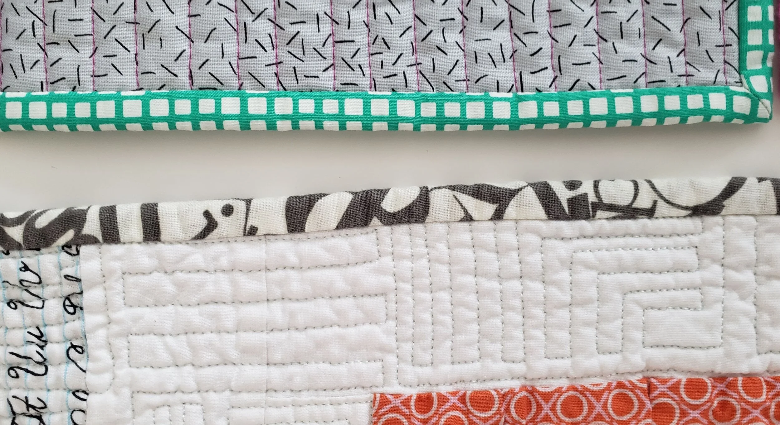
One of the reasons people love a stripe on the bias is that there is no concern about it looking ‘off’. And when was the last time you used a plaid or check on a binding? Just run with it and let your eye move around and even be fooled. It’s quite a fun effect actually. Essentially, you are ignoring the pattern to embrace what the fabric can do on the small scale of a binding.

Sewing Machine Quilt

Pocket Squares