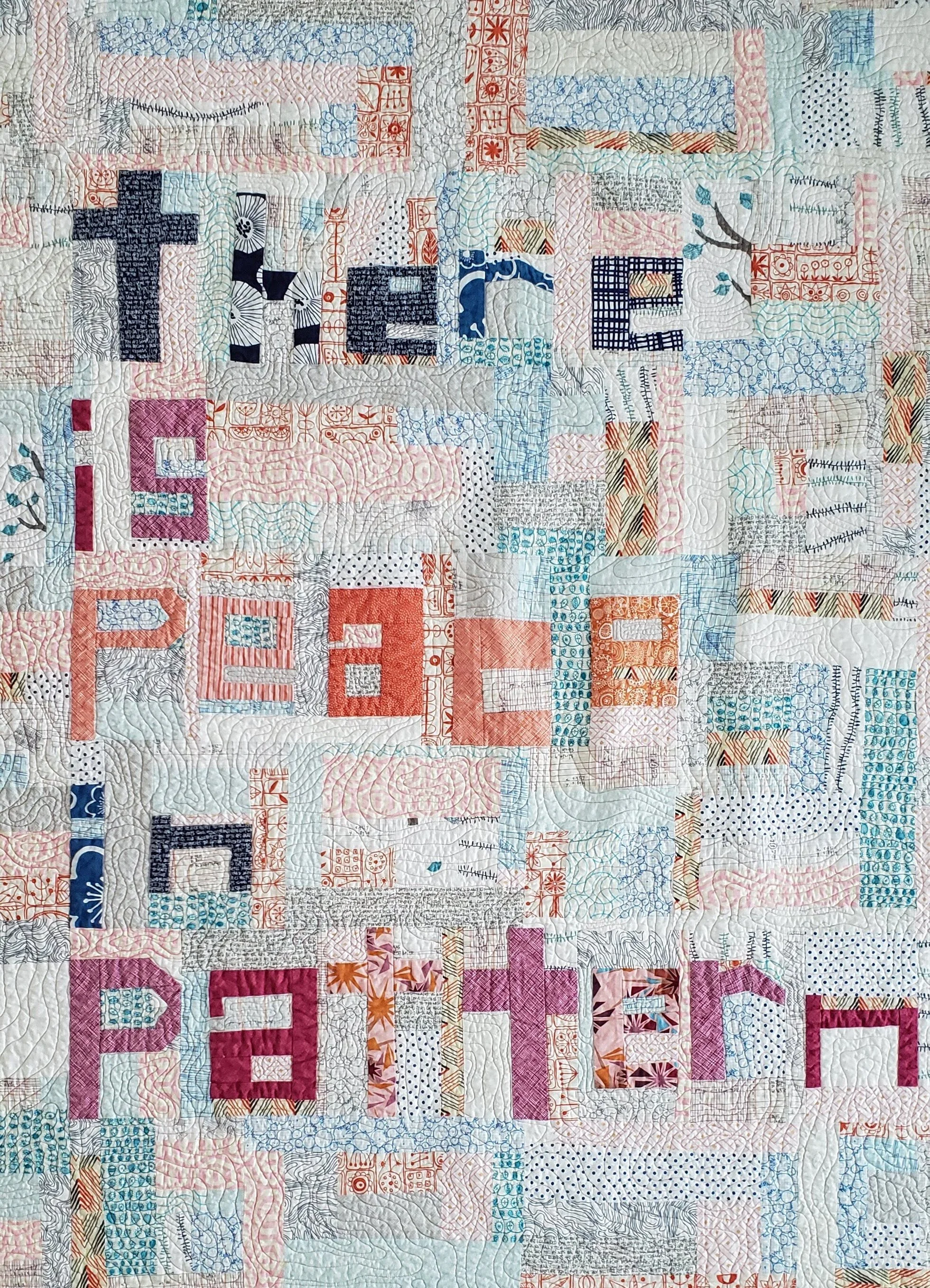
"creativity"

Sanctuary Sewing With Kids

How many of you seeing your sewing/quilting as your sanctuary? The one place you can go, especially in these times, where you get personal space and peace?

Yup, me too.

That’s why it is a personal conflict when the kids want to sew too. On one hand, total pride and excitement that they want to take up the craft and make their own art. Joy that they feel their creative juices flowing and want to be just like Mama. On the other hand, that’s my space, my thing, my break. Obviously, I am more excited than annoyed. Way more excited.

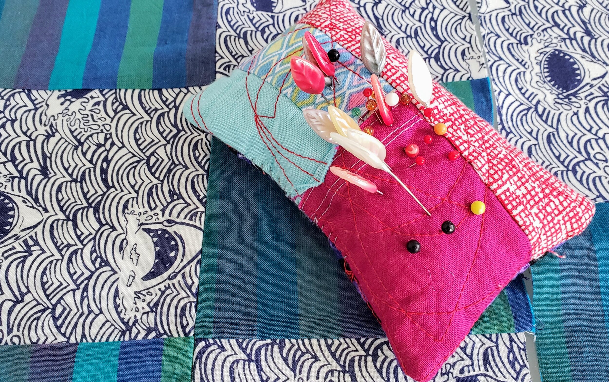
Improv Pincushion Cheryl Arkison

So when my son, my newly minted 8 year old, asked if he could learn to sew All. By. Himself. I jumped at the chance to teach him the machine. Prior to this he’s sat on my lap or played with the fabric, maybe a little hand stitching. He definitely has an eye for design. We had a lesson on the machine parts and what they do, on safety, and how to sew a straight line. He is a very cool kid who absorbs all lessons like a sponge so he took to it right away. Even made up his own mnemonic songs to remember steps. And in less than a day he had a 20” patchwork block. It was going to be a pillow, but as soon as he was done he asked to make a quilt. And another 24 hours later he had a second block.

And a pincushion.

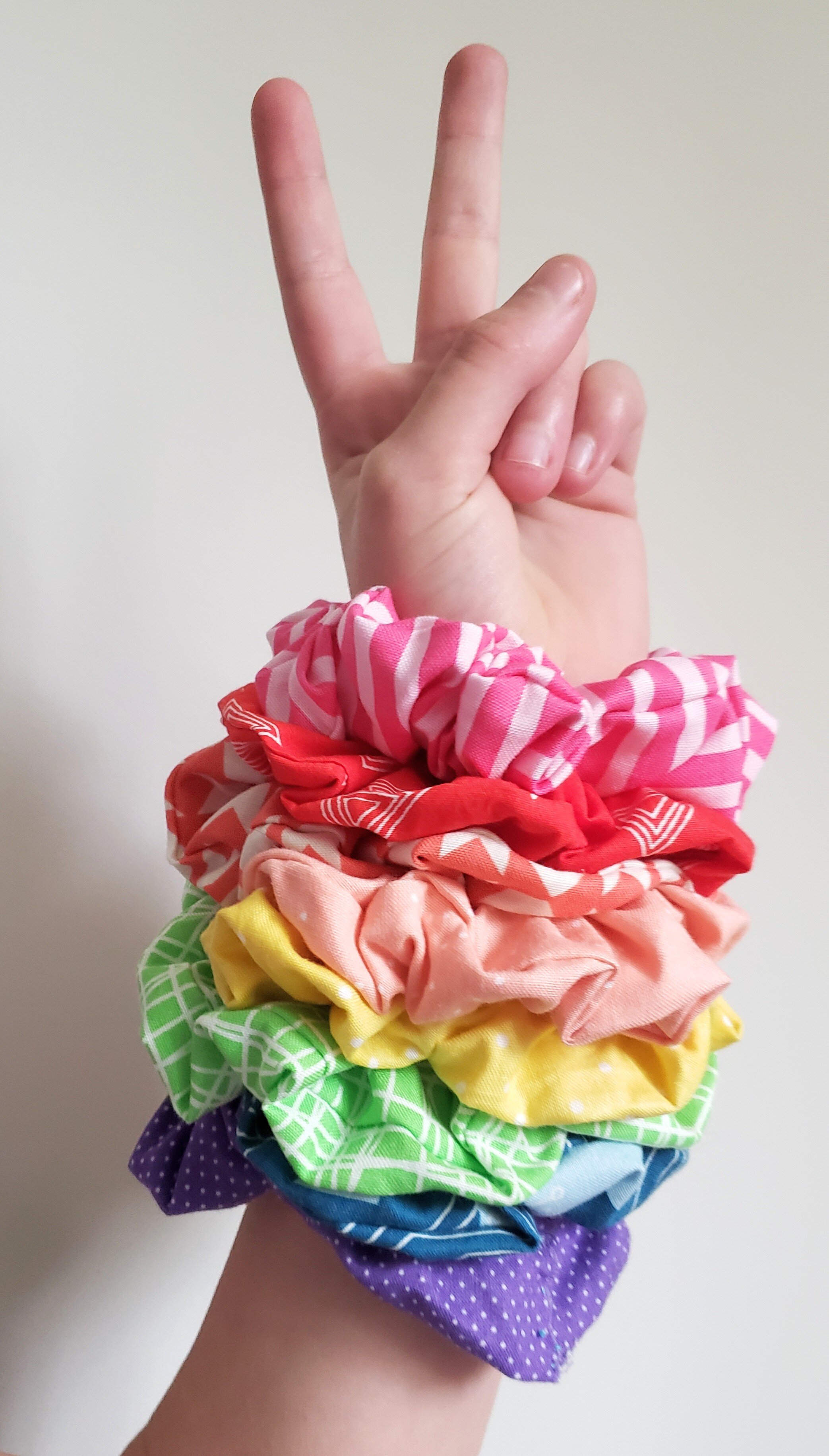
Scrunchies

The girls have been sewing during isolation too. Scrunchies and yo-yos. Moments of quiet creativity to calm the spirit. So many yo-yos…

Then someone else decided she wanted to turn her hand stitched nine patches into machine stitched, because one can’t be outdone by their little brother after all! I only have two machines! (Only?!) so I get booted off for their sewing. So much for my sanctuary. But this is so, so much better.

Yoyos Cheryl Arkison

Morning Make - March 2020

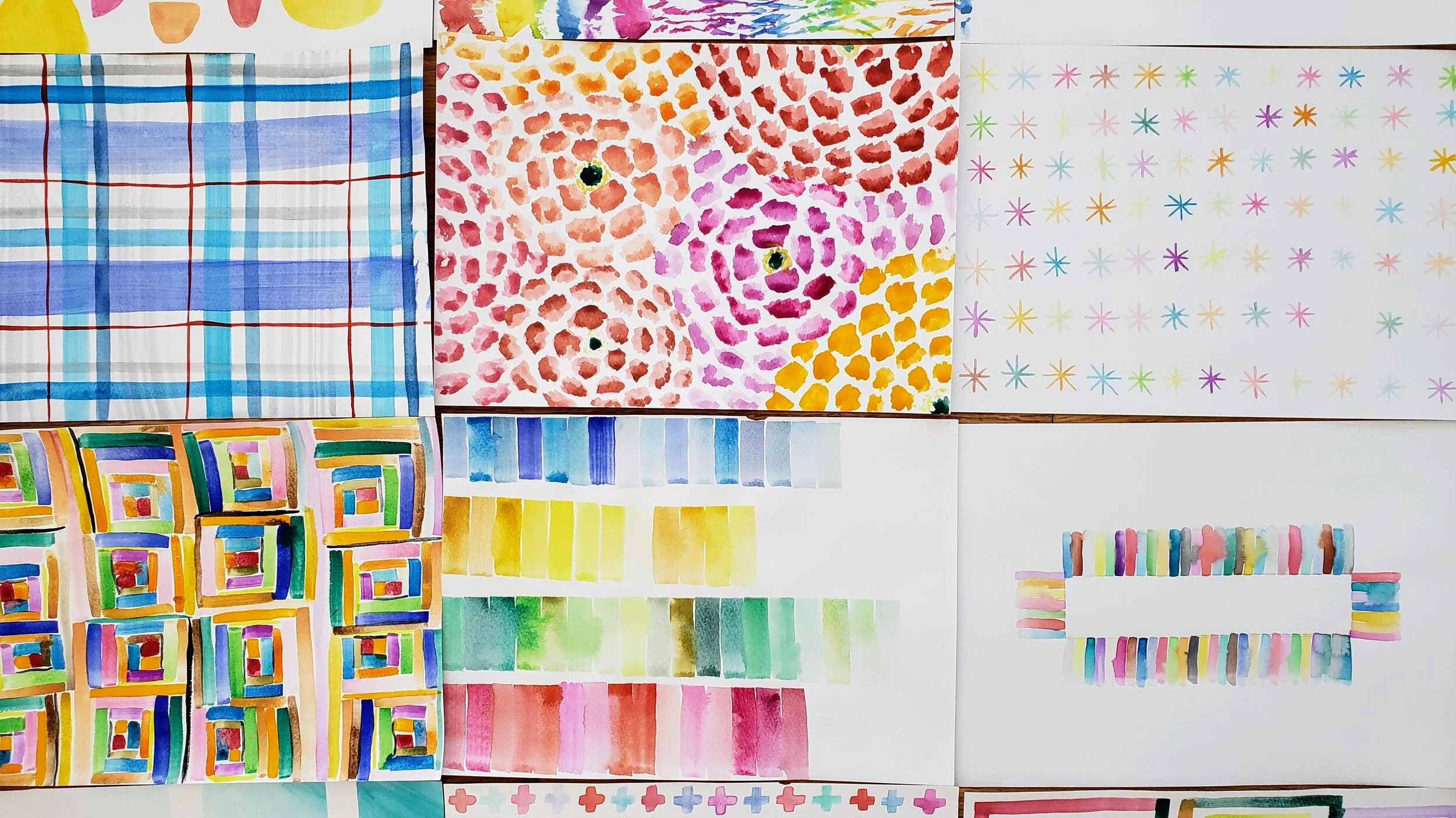
Morning Make Creative Bug Painting

On February 29 I woke up with the flu. Just the regular flu, thankfully, but I still spent the next few weeks sicker than I can remember being in my adult life. And I thought shingles was bad this past fall! Anyway, when it came time to start March Morning Make I absolutely needed something easy, something mindless, something that was creative without being terribly challenging. In my fever addled state I remembered my Creative Bug membership and the multiple daily challenge classes.

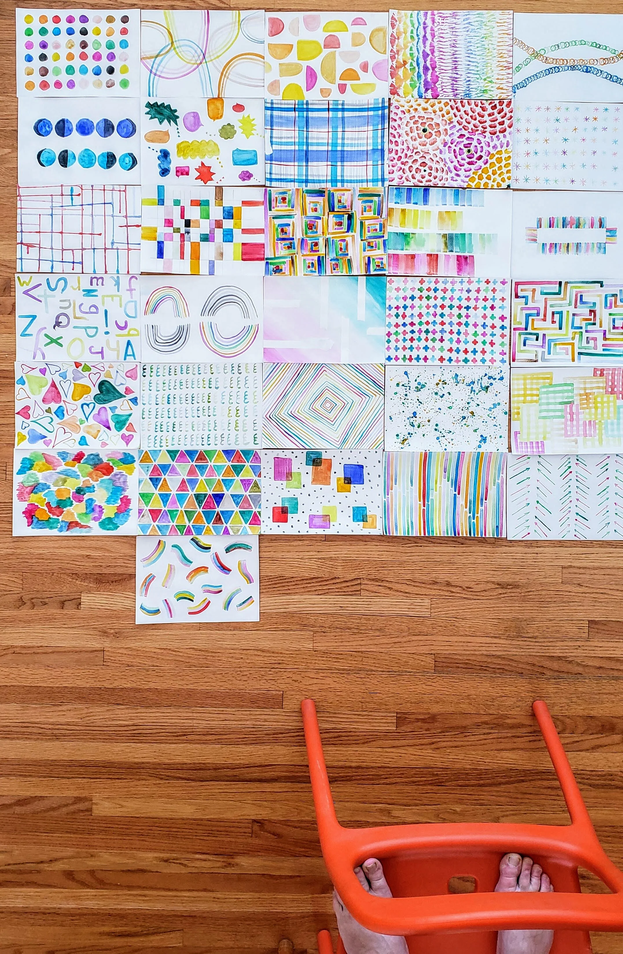
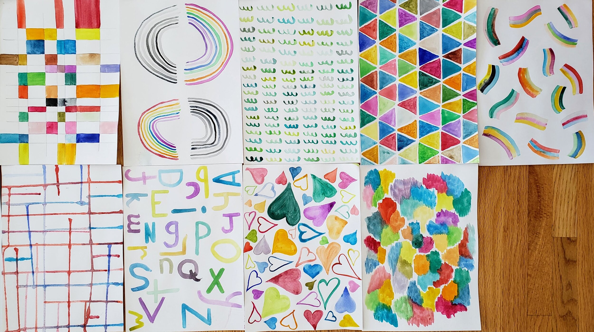
With my kiddo’s IKEA paint set at my side I started Lisa Solomon’s Color Meditation class. I had no idea how perfect of a choice this was. More on that.

Note: I am spelling Color the American way here so people can find the class.

Once I was able to be vertical I went out and bought more watercolours, fancy ones from the art store. A week later I bought another set. That was when the kids came home. They joined me in the mornings then. We painted together, a calm start to these crazy days.

Watercolour painting Lisa Soloman Teacher

I knew zero about watercolour before starting this class. I can’t claim to know much more now - this isn’t a class on technique - but I have a comfortableness and willingness to play with the paint now. Any previous watercolour experience on my part was sitting beside the kids while they made shapes and landscapes and such.

Even when sick I found this painting to be pure escape. Then when our world got turned inside I found it to be a perfect balm. Lisa calls them Color Meditations and it is apt. I got lost in the process, much like I do when I am sewing. The end result didn’t matter, it was about the physical act of paint on paper. It was about playing without colour and water and shape. It was about the breath when we did it.

Morning Make watercolour painting
Lisa Soloman Color Meditations

Sometimes the daily painting was only 15-20 minutes. Sometimes I sat there over an hour. Many, many times one or more of us would come to the table throughout the day with a cup of water and play.

You don’t have to start a daily practice like this on the 1st of the month. Try it tomorrow morning, I promise you won’t regret it.

Any daily creative practice is so important right now. People are baking bread, learning how to knit, picking up the guitar. Why? Because we need both the physical action of making/doing and the mental break from the rest of the world. When we do this our brain and body release from what is going on and allows us to be fully present. This is what meditation does for us and there is no one who can argue that meditation is bad. If sitting on a pillow and taking deep breaths while on a big journey isn’t your thing, then a creative challenge may suit you. Whatever that may be.

Lisa Soloman Creative Bug Color Meditations

For April I am back to sewing. It’s been a few months since I did that for Morning Make. Each day I am making a 12.5” square X Plus blocks.

Morning Make - February 2020

Embroidery Sampler Cheryl Arkison

As the granddaughter of the quintessential Ukrainian Baba it might have been inevitable that I would embroider something at some point. I won’t lie, I’ve avoided, even resisted, embroidery over the years. That was Baba’s thing, not mine. When the girls played around with it I could support them, but stayed out of the way. Mostly, it just never appealed to me.

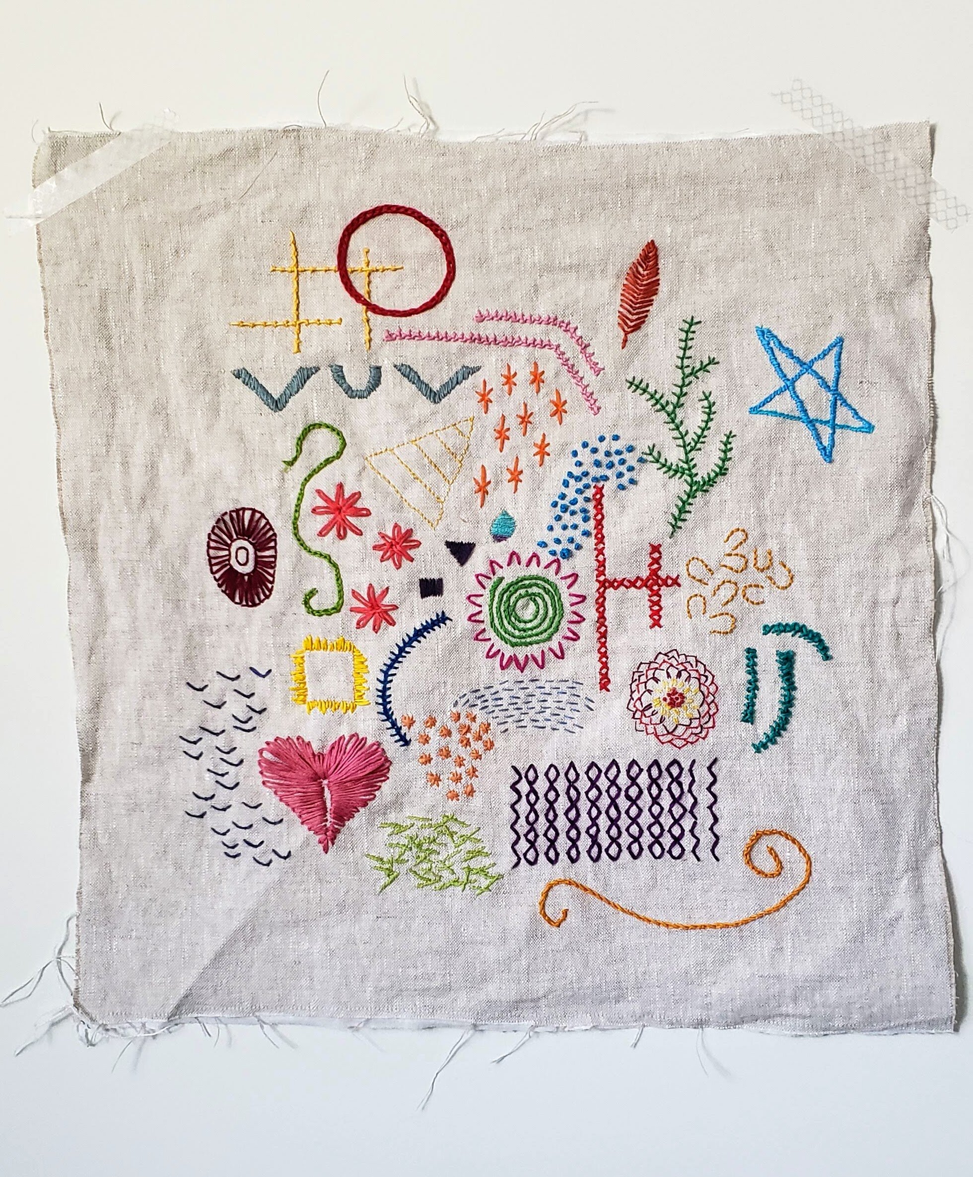
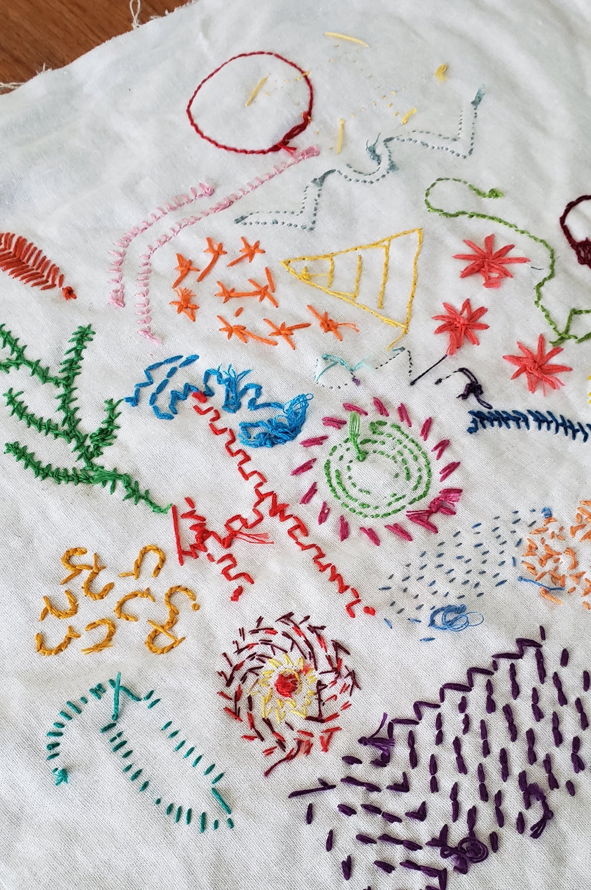
For February I decided to face it. A new stitch or motif every day for all 29 days. No commitment to finish a designed piece or fill a space. Just pure experimentation and play.

I did not account for really enjoying this.

Modern Embroidery Sample Morning Make
Modern Embroidery Morning Make
Modern Embroidery Sample Cheryl Arkison

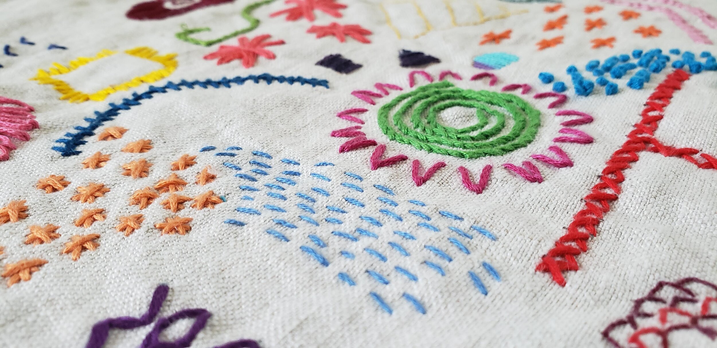
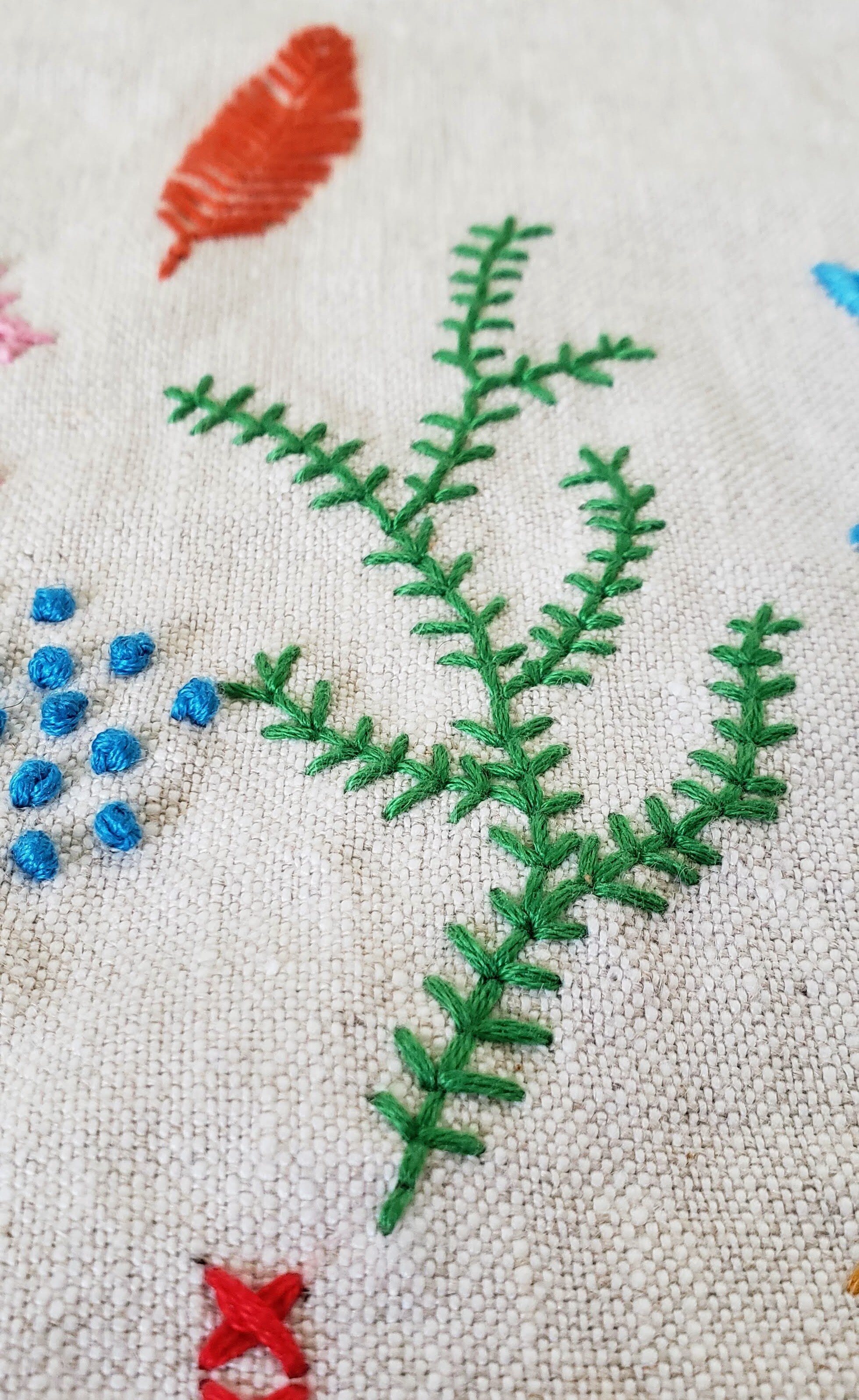
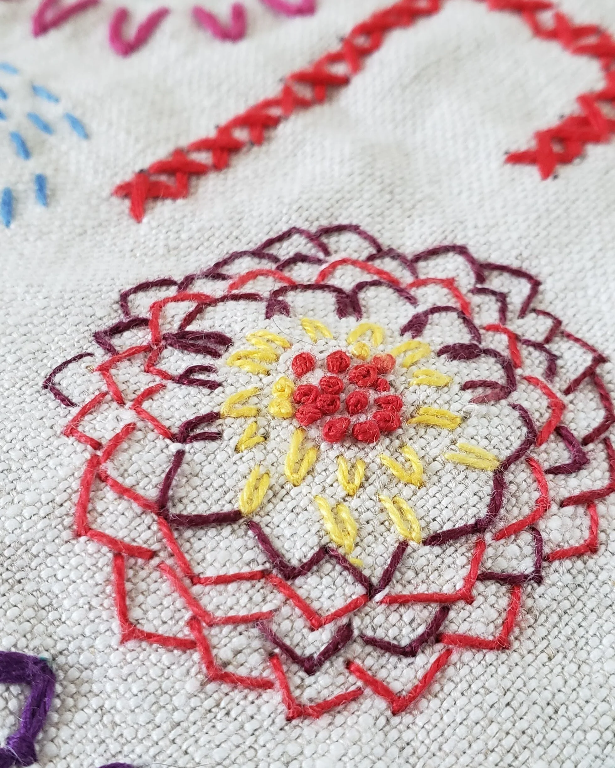
To start, I fused a stabilizer (some random one in my drawer) to a piece of linen. I dug out my Baba’s stash of embroidery floss, colour sorted thanks to one of my daughters plus my stash of Valdani threads. I found a few videos on You Tube and a couple of books on my shelf to begin. Using basic stitches like back stitch, stem stitch, lazy daisy, and a running stitch I got the first few days in. Then I looked for more things to do. The more I looked, the more I wanted to try! There are a heck of a lot of embroidery stitches out there!!!

My one stipulation was that I only use one thread per day. A couple of times it was a variegated thread so it looks like more than that though. This limitation kept me from making intricate designs, both a good and a bad thing. Good because this was about learning stitches and experimenting. Also good because I only had my 20-30 minutes in the morning and more detailed work takes time. Bad because I would get really excited and start thinking about things I could do with the stitch and patterning if I could just add another colour or alternate stitches.

This is ultimately the point of these Morning Make exercises - to see what you can do with your limitations and open up your mind to creative possibilities!

I will confess, that part of the reason I wanted to do this was to see if I could find some potential quilting stitches. You see a lot more hand work beyond the perfect quilting stitches and cliche big stitch out there. Those are great, but could I do more than plus signs/Xs? Here is the back of the piece - what do you think?

Modern Embroidery Sample Cheryl Arkison

Here are some of my favourite resources for technique or inspiration:

S is for Stitch by Kristyne Czepuryk
Handiworks You Tube Channel

@kim_broidery on Instagram

Now on to March! I’ve started the month with the flu so have chosen some relaxing Colour Meditations by Lisa Solomon via CreativeBug. They’ve been a lot of fun to share with my son, who is also sick.

Quilt Bravely - Say Hello to Prints as Background

This is the second in a series of posts encouraging you to be different, quilt different, quilt bravely. To bend or even break some rules while pumping up your creative voice. You have the creative confidence, I’m just here to remind you of it.

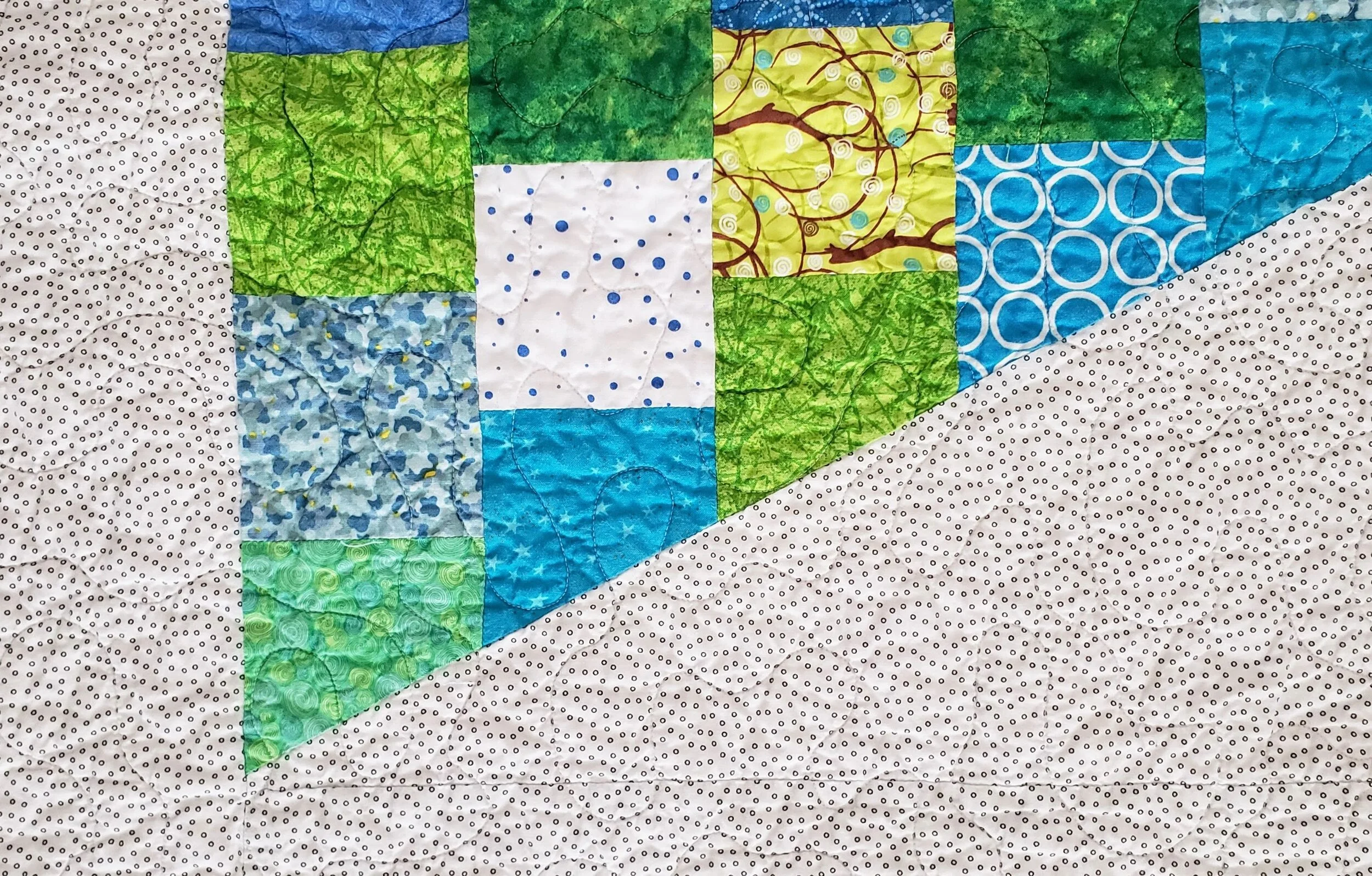
Most of the first few quilts I ever made - some 2 decades ago - were pretty colours with a white background. For those first few years I couldn’t imagine how I would make a quilt any other way because it just looked so perfect to me. Well, I’m not sure what changed, but it’s been at least a decade since I made a quilt with a plain white background!

To be clear, I was almost never using plain white, a solid. No, I was using that lovely stuff called White on White, or what we used to refer to as WOW prints. A pretty shiny white ink on white fabric. Now, of course, the whites were never all the same and this row of fabrics in any quilt store will read from bright white to eggshell to cream.

Side note: if you ever find that white ink to be too bright, use the wrong side of the fabric. You get the idea of the print without the glaring brightness of the ink.

Then I discovered low volume prints. There weren’t as many then as there are now, but they definitely existed. More often than not that can still be located in the black and white section of the fabric store. Only now you can get a lot more choices of coloured ink.

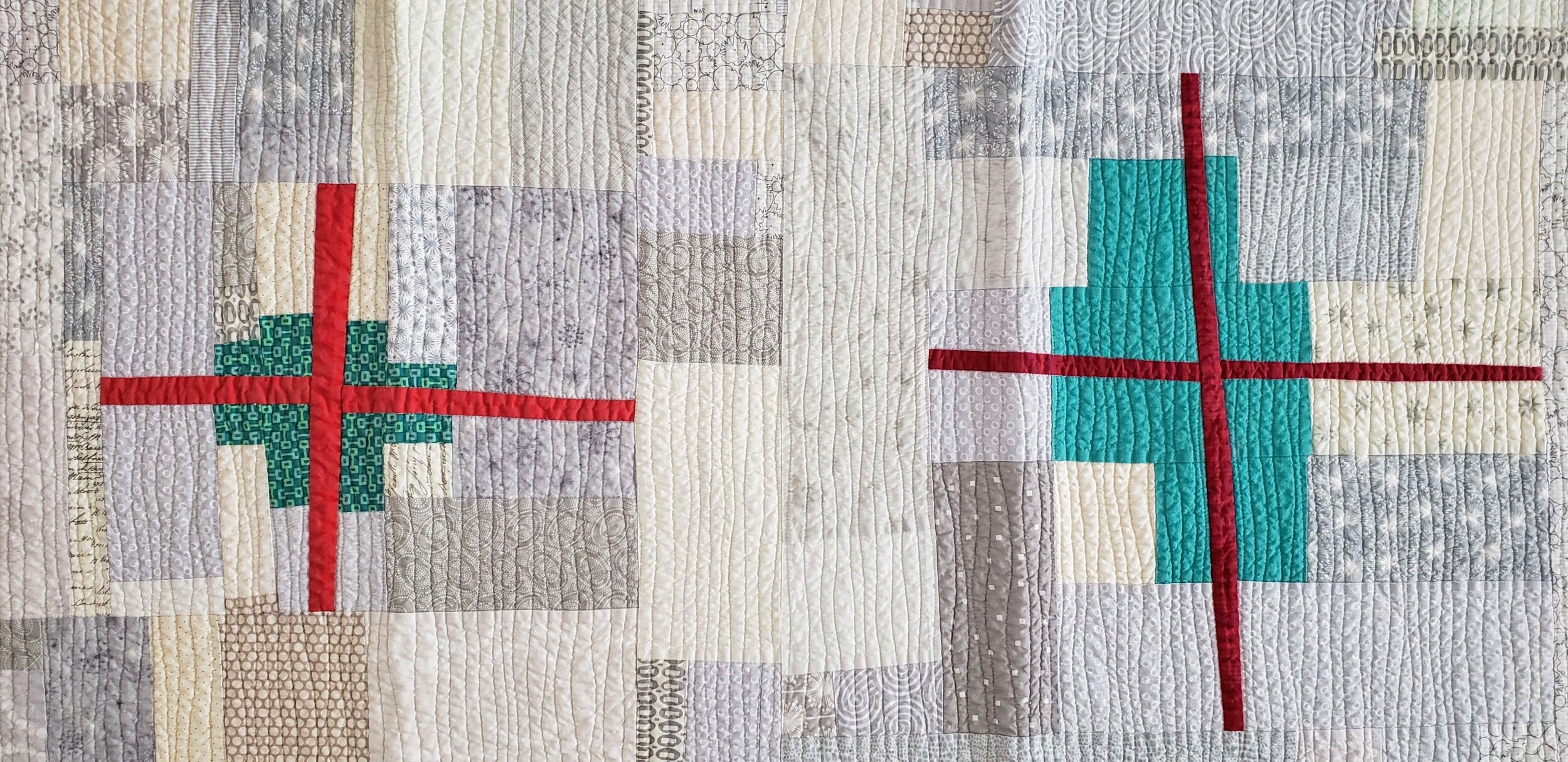
I do find that people are afraid to use prints in a background, worried that they will overwhelm the design. Or, they are used and the design disappears. Here are two fundamental lessons to making sure neither thing happen.

Value Matters

Value is the relative light and dark of a fabric. The key word being relative. It is about what the fabrics look like next to each other. If you want your design to stand out, then you need good contrast between the main design components and the background. This matters especially so when all the fabrics are prints. It isn’t enough to just have colour contrast, or maybe you want a monochromatic look. Either way, making sure the value of the background prints contrast with the design elements is important.

You also want to make sure that your background prints are all of similar values. They don’t have to be match match perfect, but aim for similar. This leads to the next key lesson.

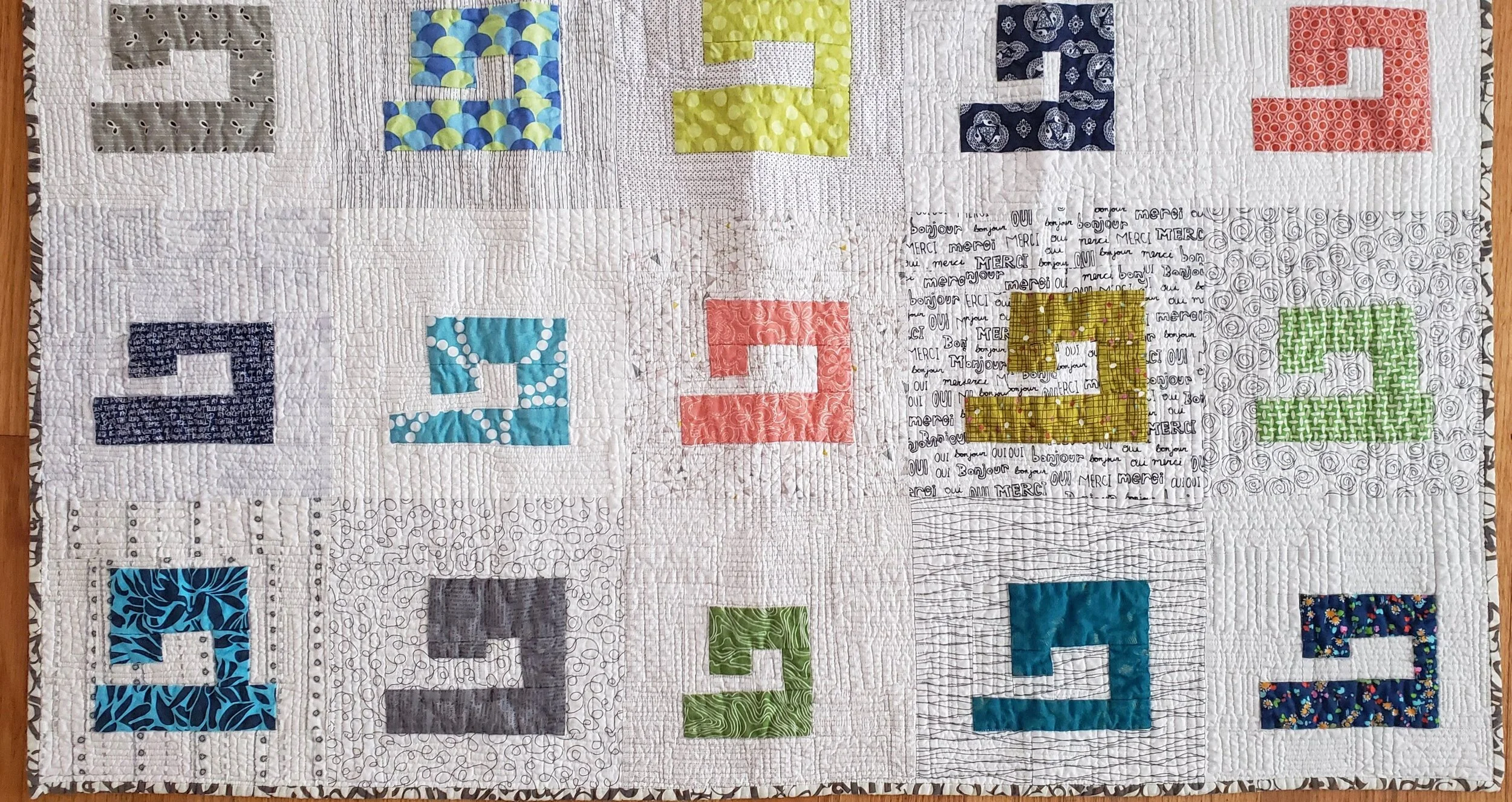
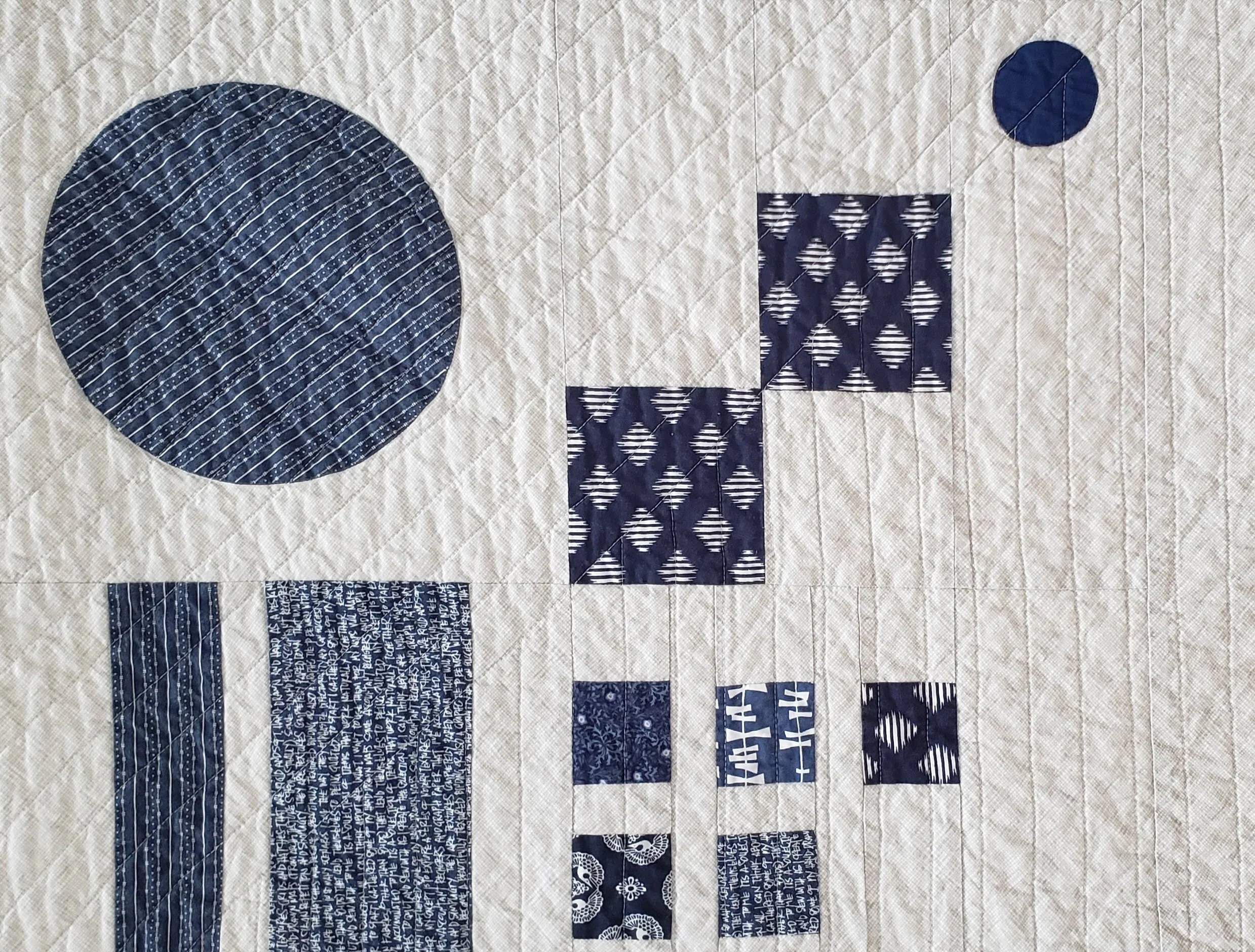
Sewing Machine Quilt, check out Pattern Drop

Sewing Machine Quilt, check out Pattern Drop

Texture Matters

Texture is the look or density of the print. Is it a sparse, large scale print with negative space between design elements? Is is a dense text print with little space. Side by side, the dense print will look darker.

It isn’t that you have to pick prints where they are all the same density, but knowing that some will pop while others will recede allows you to balance their use across a quilt. And if you have one print that really seems to be taking over the background you can do two things: remove it, or add more similar prints, so nothing stands out on its own.

Colour can make a difference in backgrounds. Be willing to experiment with pale colours instead of white. Pick multi coloured low-volume prints instead of black and white. Mix grey with black and white. Or heck, make your main design elements a light colour and your background a delicious, dark print.

Have fun playing with prints. They are a pure delight. And we have such amazing fabric designers in the world providing us with endless inspiration.

Check out the first in the Quilt Bravely Series: Creatively Contrasting Binding.

For more details on using low volume prints as background make sure to check out my book, A Month of Sundays. It gives you all the lessons!