"colour"

Color of Connection Quilt

Color of Connection 1.jpg

Color of Connection

58” x 64”

The premise behind the Color of Connection quilt along was to sew together, yes, but to also inspire discussion and efforts around diversity and inclusion in the quilt community.

Diversity and inclusion in the quilt community? I believe that while quilters come in all stripes and colours, the spaces are dominated by white women. So yes, quilters are a diverse bunch, but it is still a far from inclusive community. This #colorofconnectionqal is highlighting that. I've met a number of new quilters and new to me quilters, quite a few with stories about bad experiences with quilt guilds and communities. It is painful, but not surprising that this is still happening. Quilting community is going to be a reflection of the larger world. Just because we are quilters we aren't all magically kind and wonderful, despite the grandma stereotype. If we want the change here and everywhere we have to make the change.

This was my first quilt along, at least the first I can remember participating in. I felt it was important to both join the discussions and lead by example. It really wasn’t about the quilt. (But I will still talk about the quilt in a moment.) It was about a bit of a reckoning for our quilt community. It was also about building community for ALL quilters, for acknowledging that the spaces we are creating may not be welcoming, and for having this Color of Connection community be a truly inclusive space.

Kudos to the organizers Porfiria Gomez, Keyana Richardson, and Michelle Collins.

Color of Connection Cheryl Arkison

Now, to the quilt.

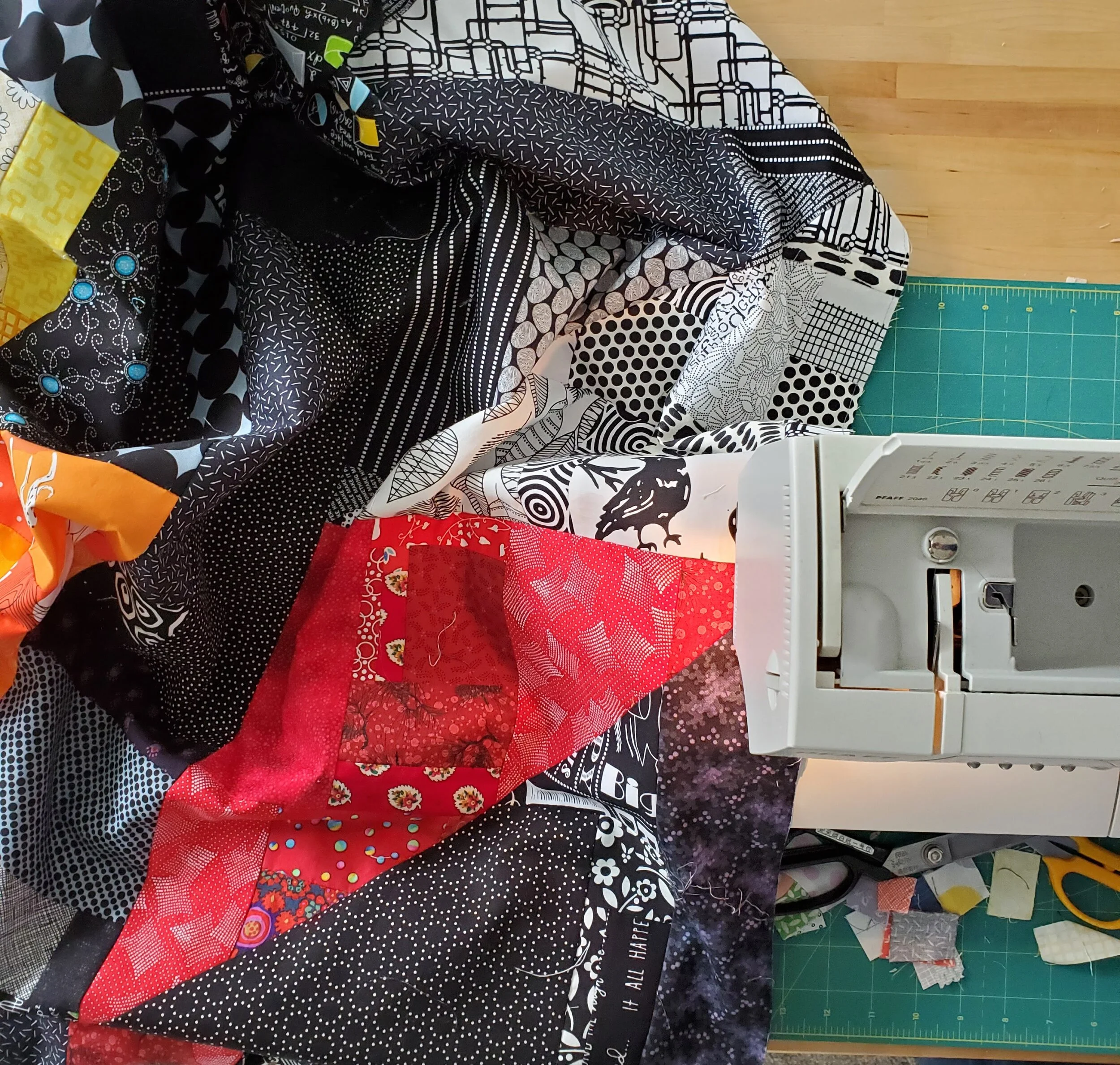
It’s me, so you know I have a hard time following a pattern. I followed the quilt along and the discussion prompts, but played with the pattern a bit. The original quilt called for large solids or at least large cuts of prints. As my scrap bins were overflowing I decided I would make slabs and cut my pattern pieces from them. I started with black solely because I was thinking about Black Lives Matter. This particular quilt seemed like a good one to get symbolic. After that I chose warm colours to share joy and warmth of people. And because they looked good.

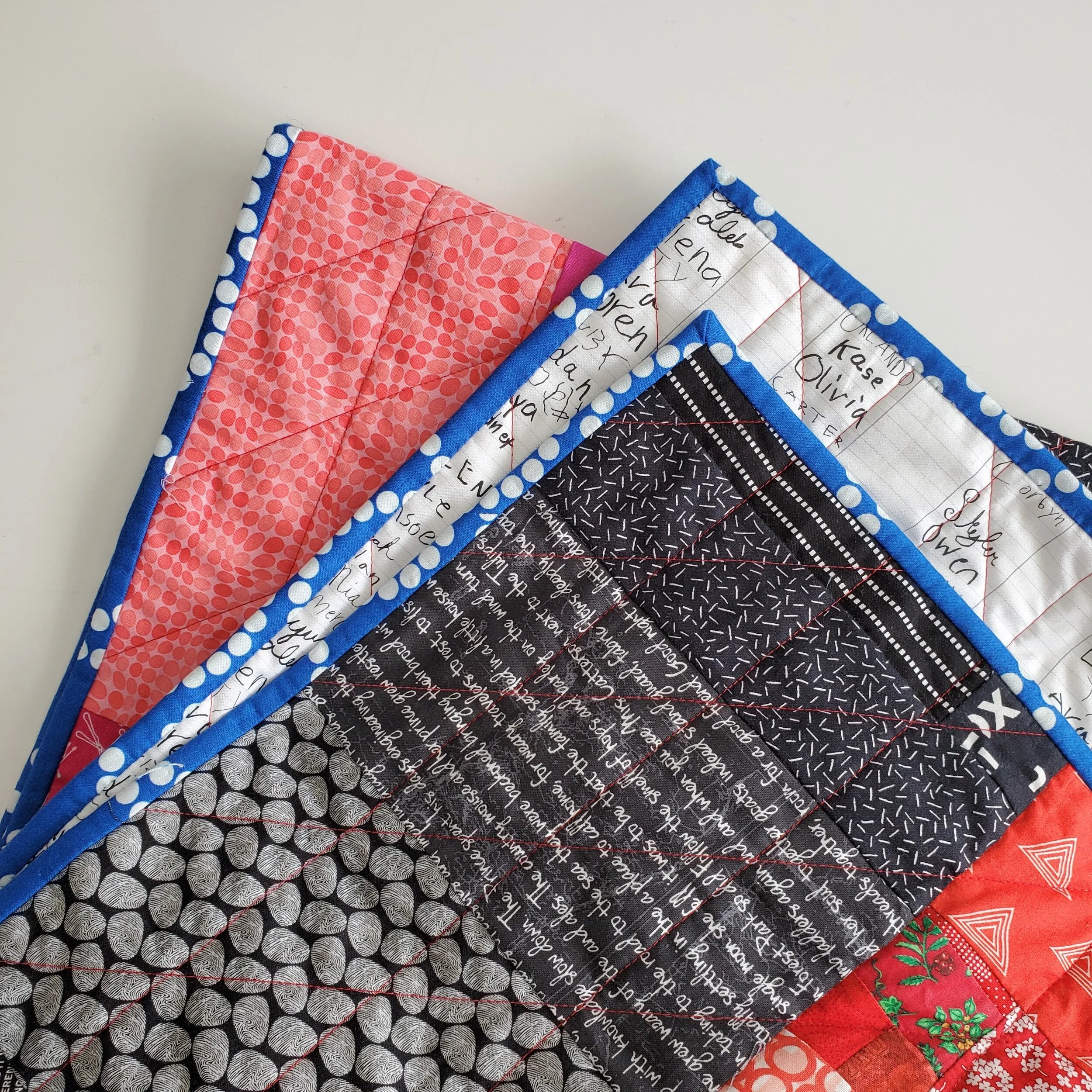
As usual, The Monster helped me baste the quilt and she suggested the red thread. I used a Wonderfil option from my thread stash. In fact, I bought nothing to make this quilt. The backing was a combination of two fabrics from my Tag collection. I loved the mix of the names prints - showcasing the diverse community of our local elementary school where all the signatures came from - and the texting print of all thumbprints. My batting was put together from leftovers. Nothing like Frankenbatting to truly embrace a make-do approach!

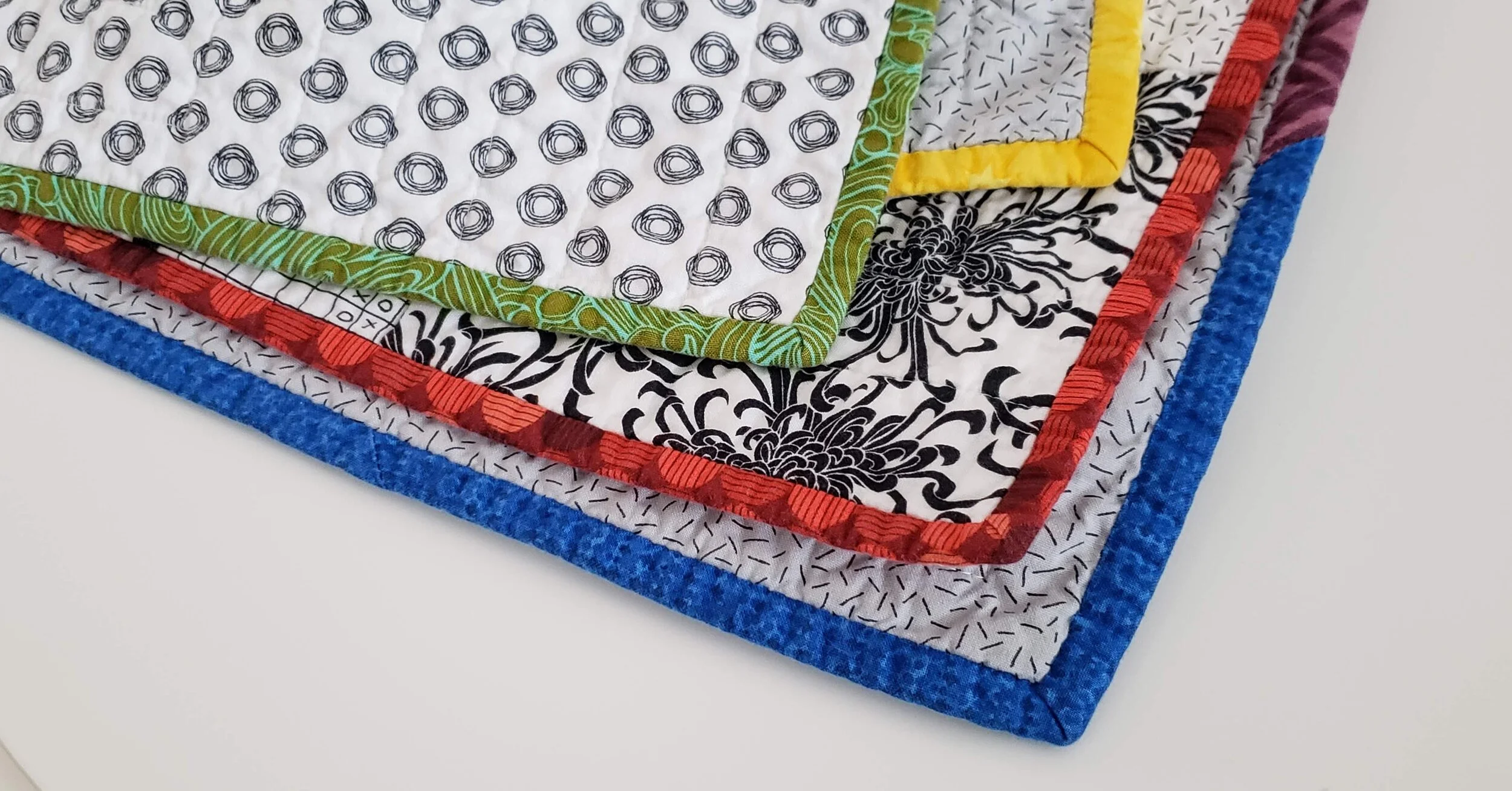
The binding was a fun choice. We know I like a contrasting binding. It actually wasn’t my intention here, but nothing I chose in black, red, pink, or otherwise looked good. On a whim I pulled out my blue and green bins. This royal blue Pearl Bracelet was exactly the right colour and I had just enough to make this work.

Color of Connection Cheryl Arkison

The quilting itself, with the aforementioned red thread, was a fun grid. Vertical lines first, every 2”. Then I did a diagonal line with the same spacing, following the lines of the large HSTs in the pattern. It isn’t fancy, but it is effective. And quick.

Obviously, a quilt along is not going to solve systemic racism. What it does achieve, however, is a continued conversation and visibility for the topic. Both are important in our community. With the quilt along finished it is now up to the rest of us to continue that conversation.

As a quilt teacher one of the places I do this is in my classroom, virtual or in person. My goal is to create a space where everyone and anyone is welcome. I promise you I will shut down the commentary, judgement, and racism/homophobia should it come out in the classroom. And if people don't think I should do this then they shouldn't hire me. As a quilter, I will do this by continuing to read, to listen, to encourage the conversation, to use the materials I have on hand, and to use my platform for all of this. I know loads of people want to keep politics out of quilting, but you just can’t. And I won’t.

If you are interested in the Color of Connection pattern or the goals of the project you can find out more here.

The Slow Comfort of Painting a Quilt

Quilt Paintings Cheryl Arkison

Small comforts.

These days that is what we take, what we can find. Whether that be in the consumption of something, Or, as it would be more likely for readers here, the creation of something.

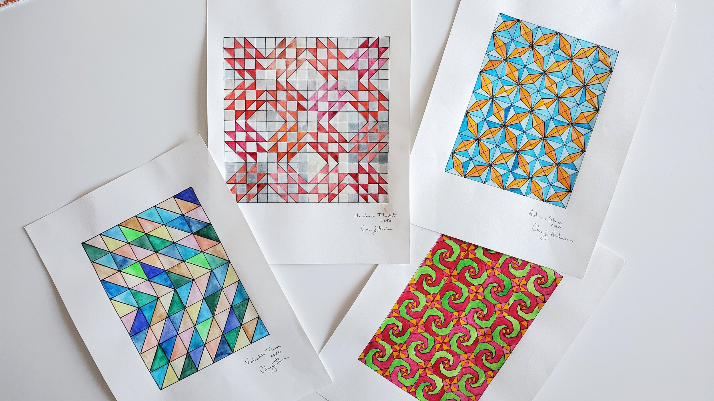
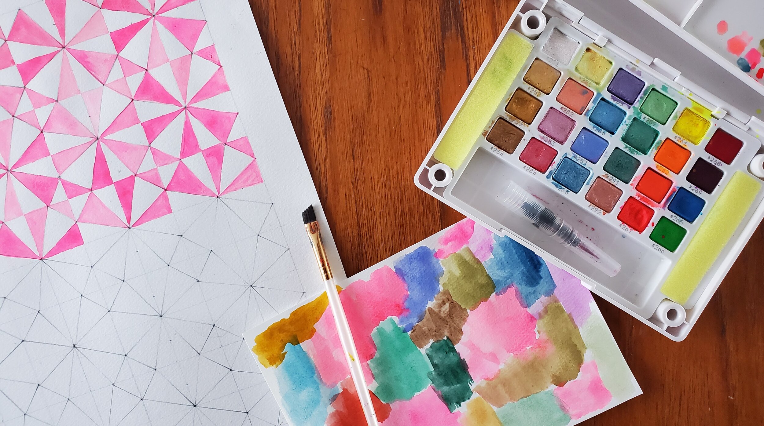
A cup of tea or a glass of wine, candles lit, a ruler and a quilt book close at hand. Don’t forget my now trusty watercolours. I had no idea when 2020 started they would become familiar, comforting. It took me some time, but I’ve brought them to my quilting. Rather, I’ve brought quilting to the watercolours.

Quilt Paintings Cheryl Arkison

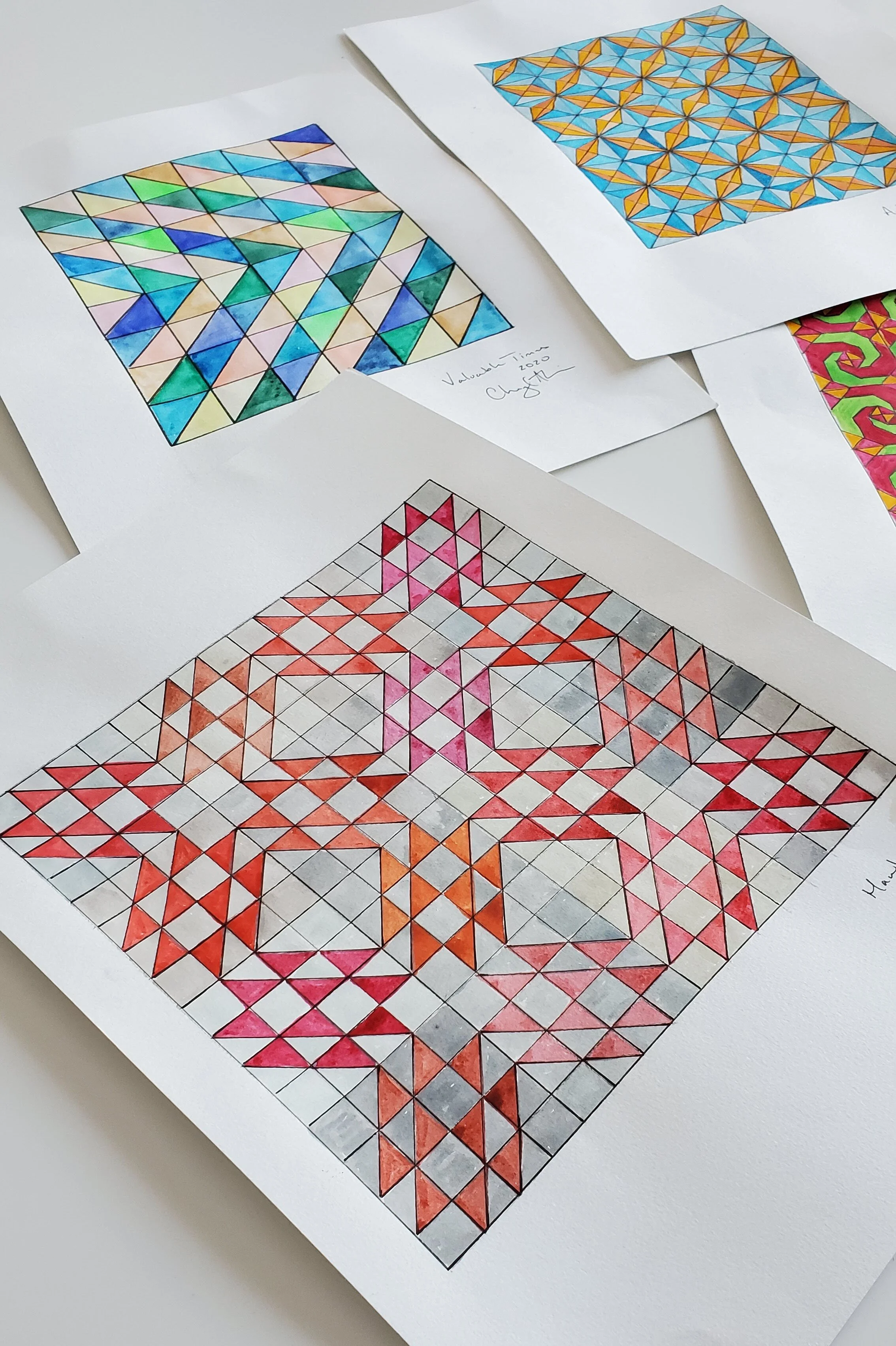
Meditative to make, these paintings are an exploration of traditional quilt patterns. They are significantly more detailed than the cards I made back in September. In a way, they are my opportunity to play with precision piecing without having to actually precision piece. They serve to try out colour combinations, as if I was sewing with solid fabrics, also something I don’t do that often.

I can’t say that I want to go out and make these quilts now. They are comforting to make, but aren’t necessarily inspiring me to sew. At least each one only takes me a few hours to make. Much faster than a quilt with fabric!

Showman's Puzzle Quilt Cheryl Arkison

Each one starts with a sharp pencil, a block pulled from history, and a ruler. I draw the whole thing with pencil then start painting. Painting is a multi day/evening process as I like to have the paint dry in between. It’s watercolour so I don’t want the paint to bleed. Once the colour is all done I go over the seam lines with a black marker, to highlight them. Without that last step it feels a bit unfinished. Kind of like me adding the quilting stitches to a flimsy.

These aren’t fine art and I have a lot to learn yet, but the comfort it gives me is divine. A quiet, slow moment in a noisy world that wants to reach in and swallow me whole.

And maybe this way I can convince my husband to put a quilt on the wall?!

Morning Make - March 2020

Morning Make Creative Bug Painting

On February 29 I woke up with the flu. Just the regular flu, thankfully, but I still spent the next few weeks sicker than I can remember being in my adult life. And I thought shingles was bad this past fall! Anyway, when it came time to start March Morning Make I absolutely needed something easy, something mindless, something that was creative without being terribly challenging. In my fever addled state I remembered my Creative Bug membership and the multiple daily challenge classes.

With my kiddo’s IKEA paint set at my side I started Lisa Solomon’s Color Meditation class. I had no idea how perfect of a choice this was. More on that.

Note: I am spelling Color the American way here so people can find the class.

Once I was able to be vertical I went out and bought more watercolours, fancy ones from the art store. A week later I bought another set. That was when the kids came home. They joined me in the mornings then. We painted together, a calm start to these crazy days.

Watercolour painting Lisa Soloman Teacher

I knew zero about watercolour before starting this class. I can’t claim to know much more now - this isn’t a class on technique - but I have a comfortableness and willingness to play with the paint now. Any previous watercolour experience on my part was sitting beside the kids while they made shapes and landscapes and such.

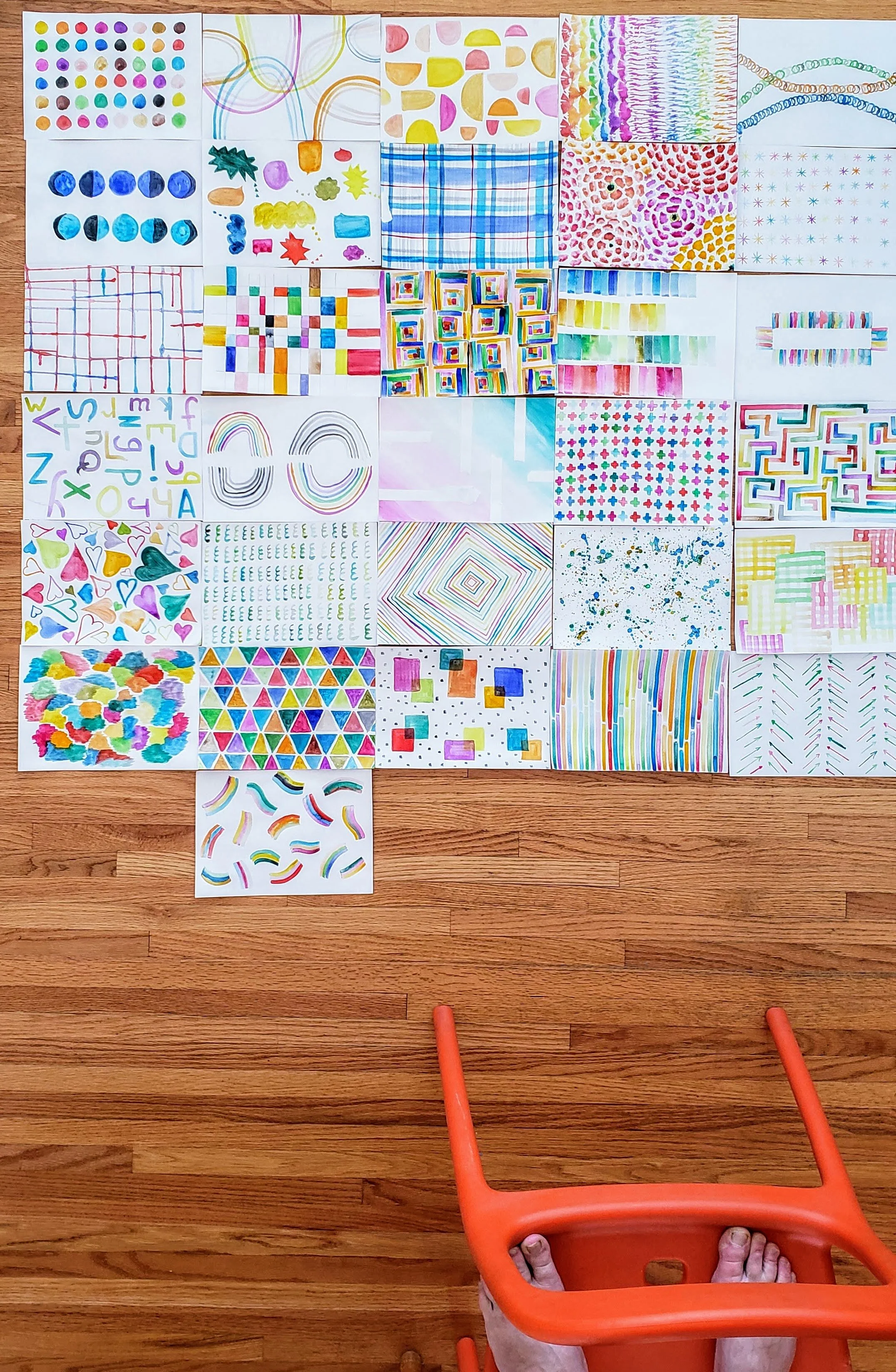
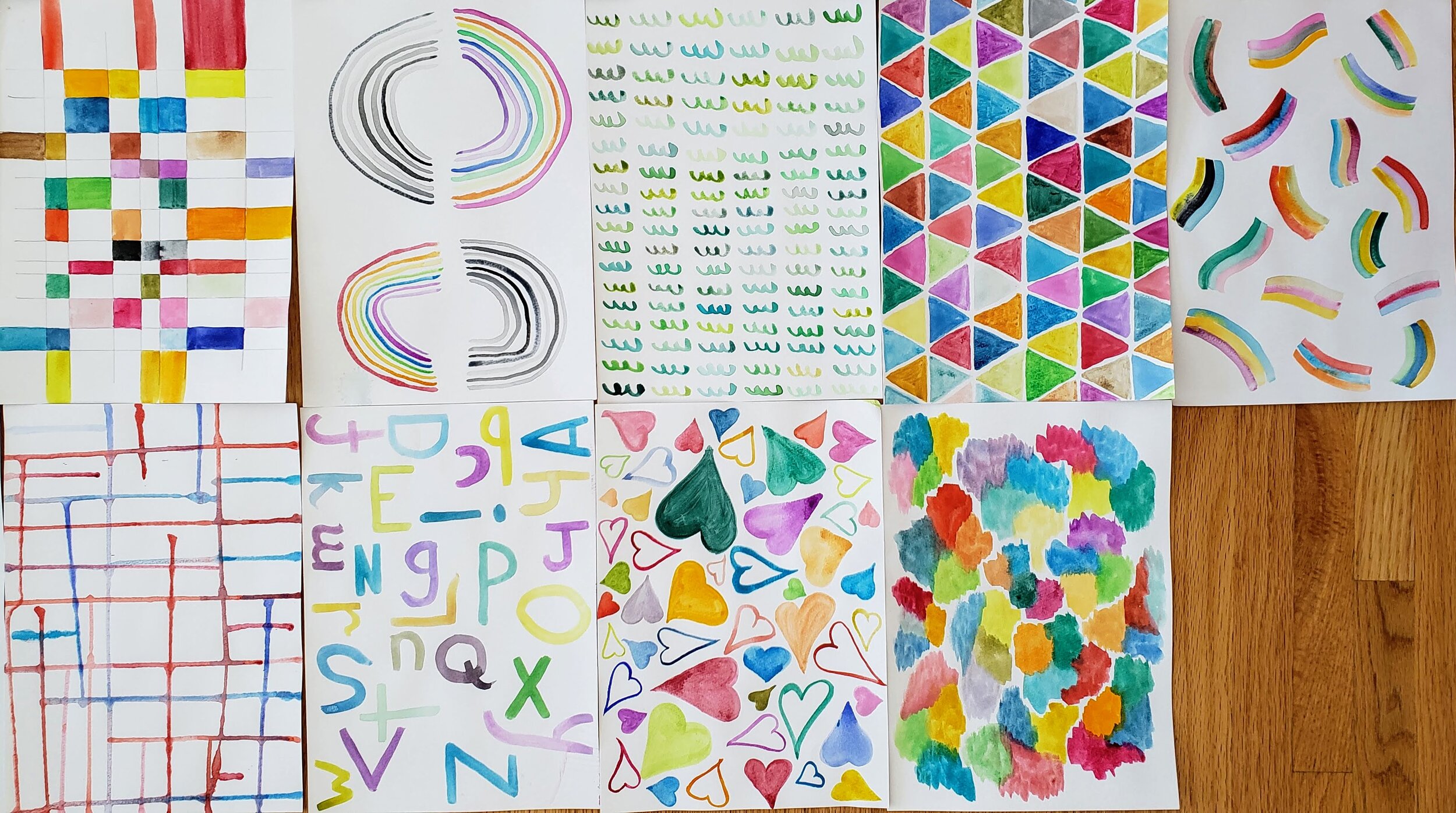
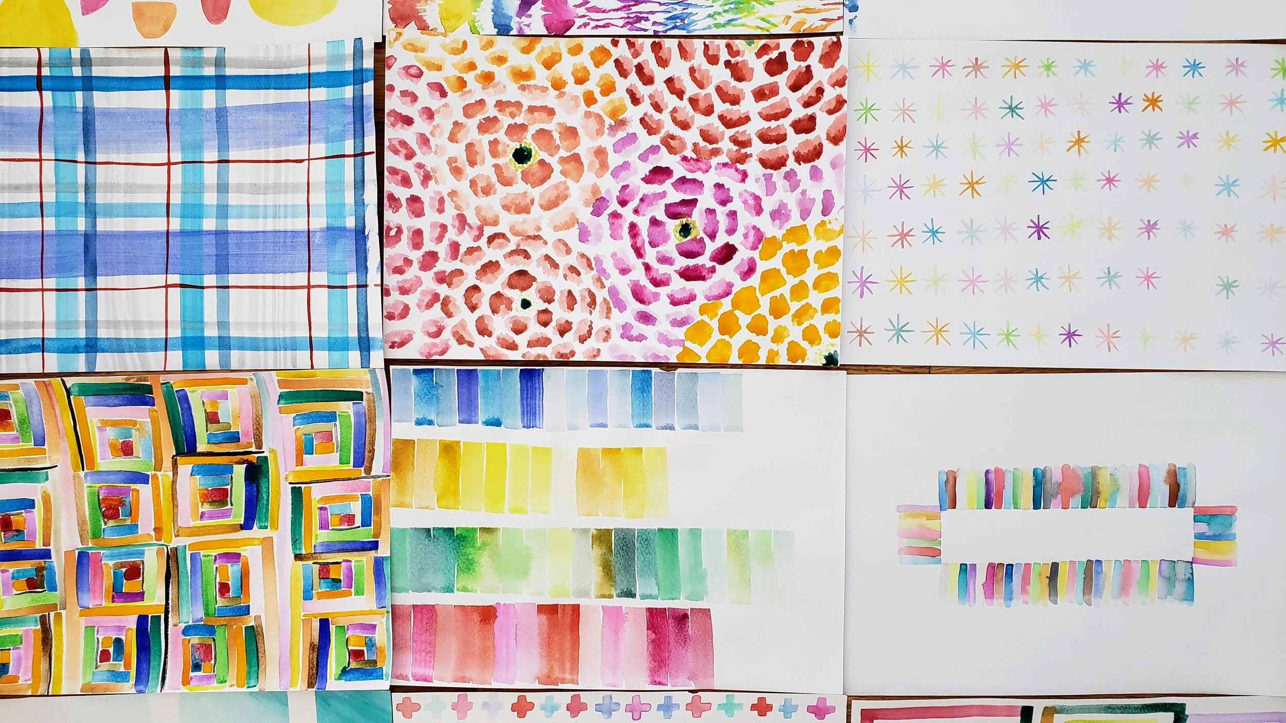
Even when sick I found this painting to be pure escape. Then when our world got turned inside I found it to be a perfect balm. Lisa calls them Color Meditations and it is apt. I got lost in the process, much like I do when I am sewing. The end result didn’t matter, it was about the physical act of paint on paper. It was about playing without colour and water and shape. It was about the breath when we did it.

Morning Make watercolour painting
Lisa Soloman Color Meditations

Sometimes the daily painting was only 15-20 minutes. Sometimes I sat there over an hour. Many, many times one or more of us would come to the table throughout the day with a cup of water and play.

You don’t have to start a daily practice like this on the 1st of the month. Try it tomorrow morning, I promise you won’t regret it.

Any daily creative practice is so important right now. People are baking bread, learning how to knit, picking up the guitar. Why? Because we need both the physical action of making/doing and the mental break from the rest of the world. When we do this our brain and body release from what is going on and allows us to be fully present. This is what meditation does for us and there is no one who can argue that meditation is bad. If sitting on a pillow and taking deep breaths while on a big journey isn’t your thing, then a creative challenge may suit you. Whatever that may be.

Lisa Soloman Creative Bug Color Meditations

For April I am back to sewing. It’s been a few months since I did that for Morning Make. Each day I am making a 12.5” square X Plus blocks.

Quilt Bravely - Creatively Contrasting Binding

This is the first is a series of posts encouraging you to be different, quilt different, quilt bravely. To bend or even break some rules while pumping up your creative voice. You have the creative confidence, I’m just here to remind you of it.

So you need to bind a quilt? You might be one of those quilters who not only selected their binding fabric with the rest of the fabrics but also made your binding before needing it. That would be awesome! This post is for those of us looking to jazz up our quilts with binding, not just treating it as an afterthought.

Binding selection generally comes as the quilting winds down. Maybe even as the quilted quilt sits and marinates or you muster the energy to do it at all. You might have a default binding - black and white stripes, anyone? You might search for just the right shade of blue that coordinates with everything in the quilt and the quilt back. You might pick the stripe from the fabric collection that the quilt top is made from.

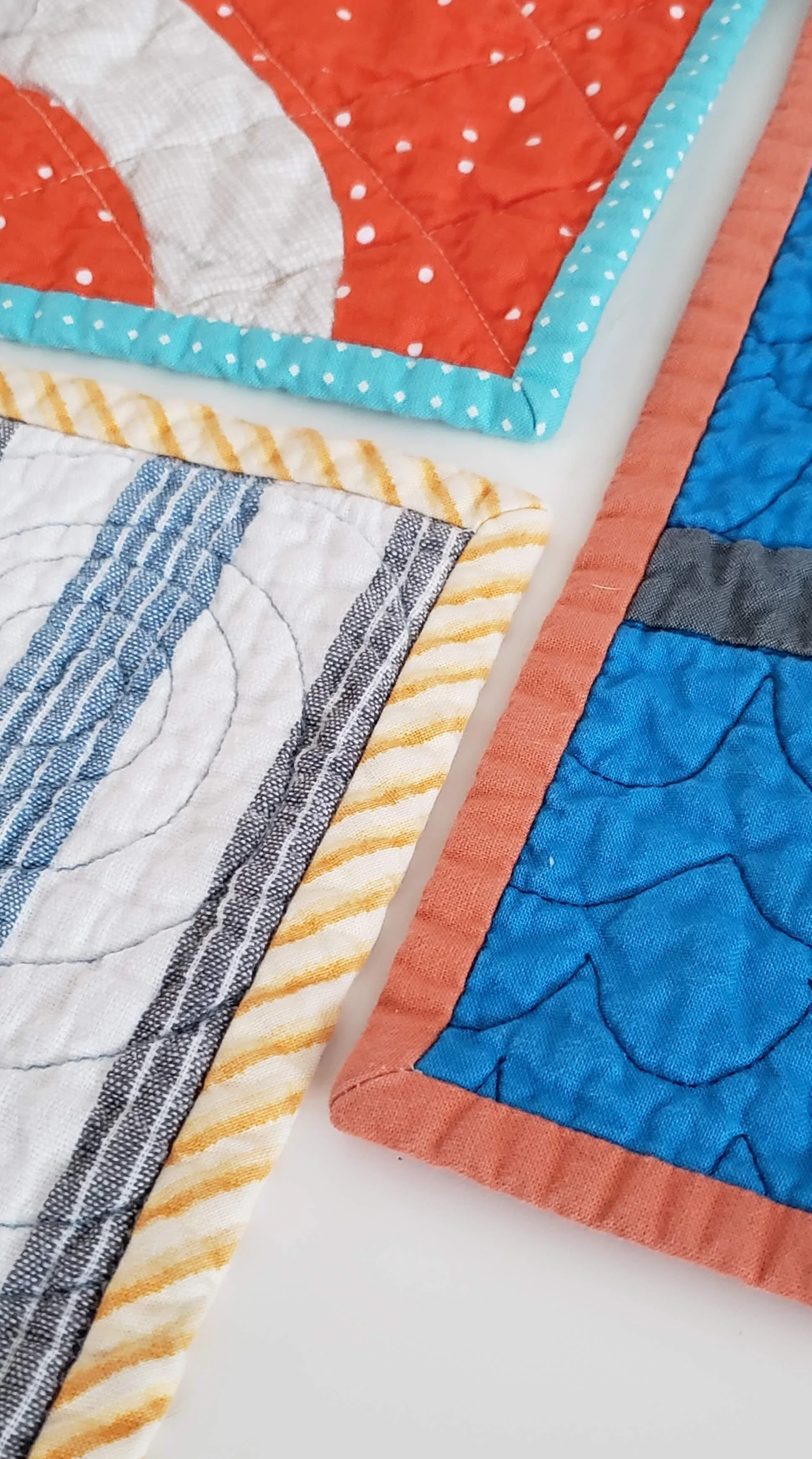
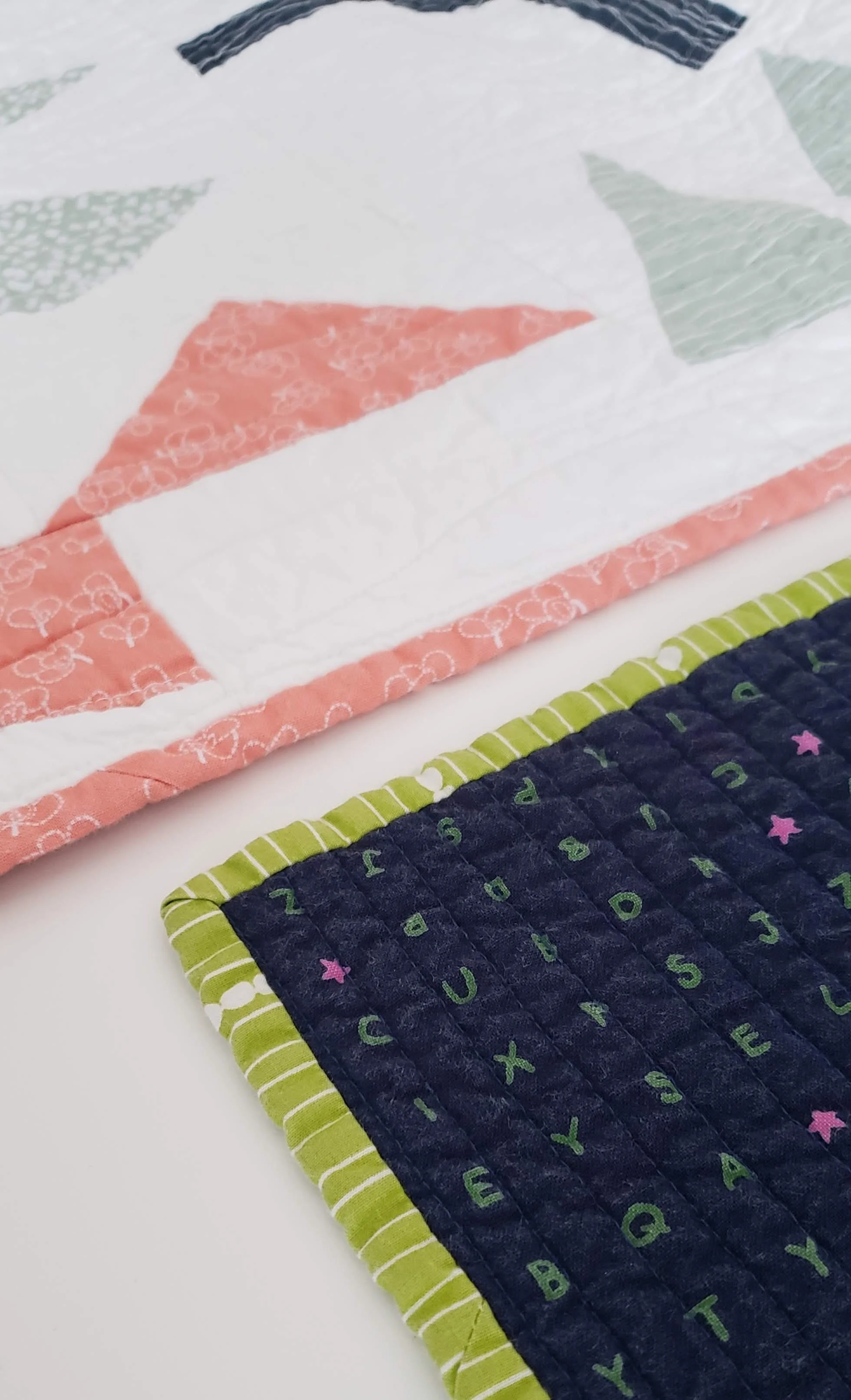
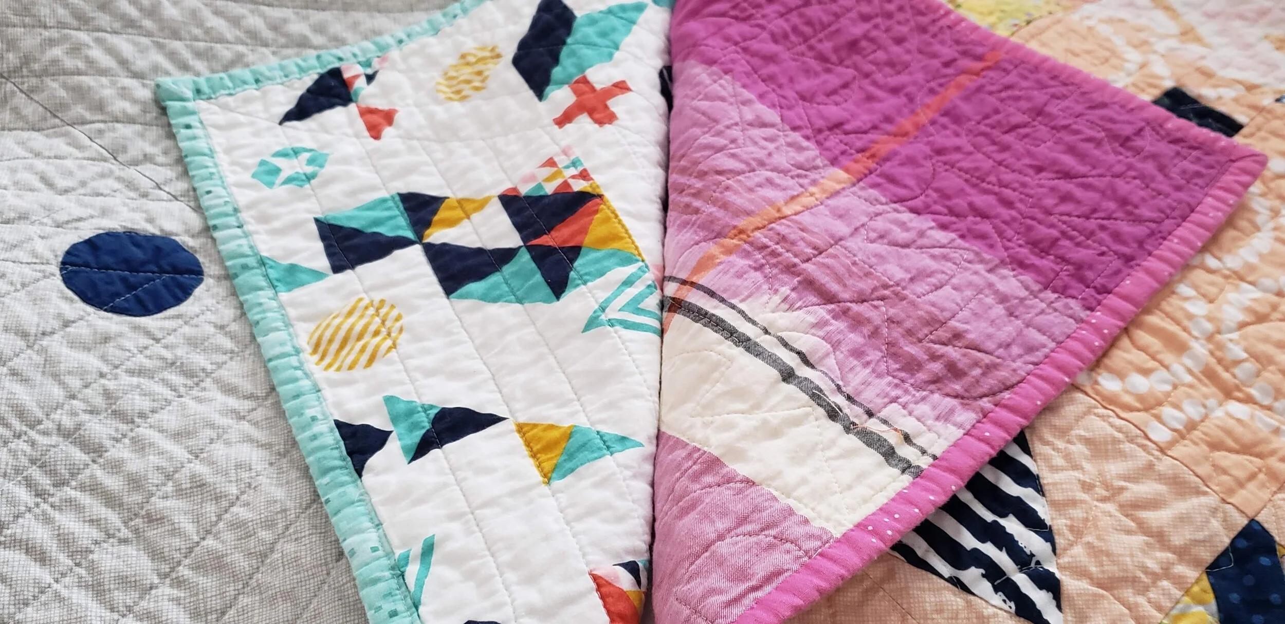
My challenge to you is to embrace a contrasting binding. Whether in colour, style, value, or design a contrasting binding might be exactly what your quilt needs for a stellar finish. If not contrasting, think creatively about what choice you can make. The unexpected one is often the exact right one. Here are some great ways to play with your binding selections.

Colour Wheel Contrast Binding Fabric

High Contrast

Use the colour wheel or simple preference as your guide. Pick a colour not even in the quilt top but that coordinates nicely. Using the colour on the opposite side of the colour wheel is an excellent way to do this. For example, orange and blue.

Shiver

Stripes

(yet to be shared)

Binding Fabric Selection

Highlight a Little Used Colour/Fabric

If you have just a little bit of a colour in the quilt top use the same colour binding fabric to wrap it all together. The examples above show me pulling out the green in the background print, even though there is no other green in the quilt top and using the same coral fabric that is only used sparingly in a quilt with 100 blocks.

Smooch

Lilla

Quilt Binding Options

Look to the Back

You may have picked a fabric that coordinates with the front but doesn’t necessarily use all the colours of the quilt top, go ahead and pick your binding from that fabric.

Lilla

Compose Yourself

Pale binding.jpg

Think White or Pale

Most of us shy away from a white binding, fearing a show of dirt. Let me tell you, that isn’t a fear worth having. It looks absolutely amazing on a quilt. Whether a print or a solid a light binding is an exciting frame to your work.

Morning Make I

Crossword

Pieced Bindings

Insert Highlights in Bindings

Add a pop of a different colour randomly or make intentional inserts to extend the design of your quilt top. This is the moment to really think of your binding as part of the quilt and not necessarily just the frame.

Plus Size

Pieced Bindings

Pieced Bindings

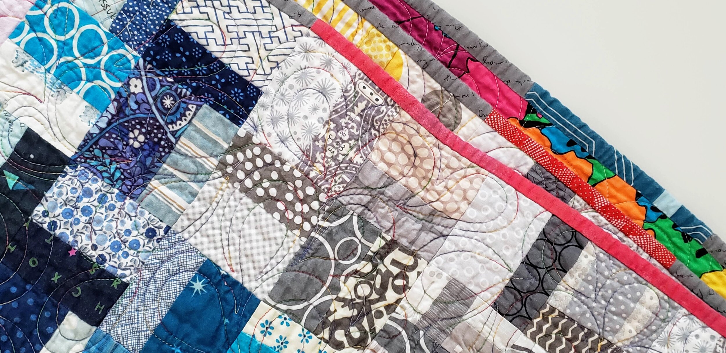
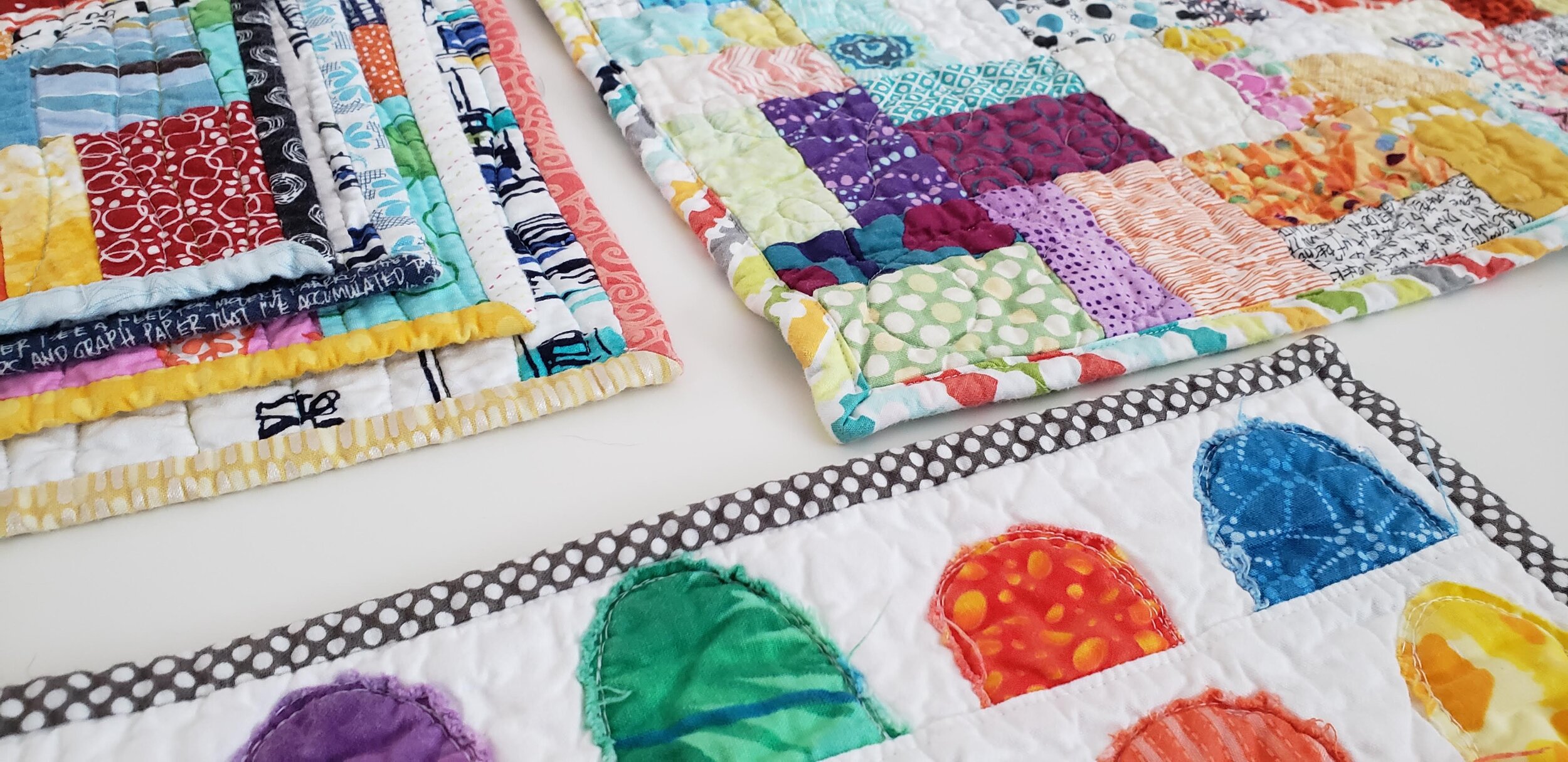
Okay, so all bindings on a not-mini quilt are technically pieced. Use different fabrics to accentuate the design of your quilt top. For example, I made a rainbow of binding to wrap around my Pride quilt. I’ve used leftover strips to create a scrappy binding. Play with it.

Pride Quilt

Binding a Scrap Quilt

Scrap Quilts Call for Anything and Everything

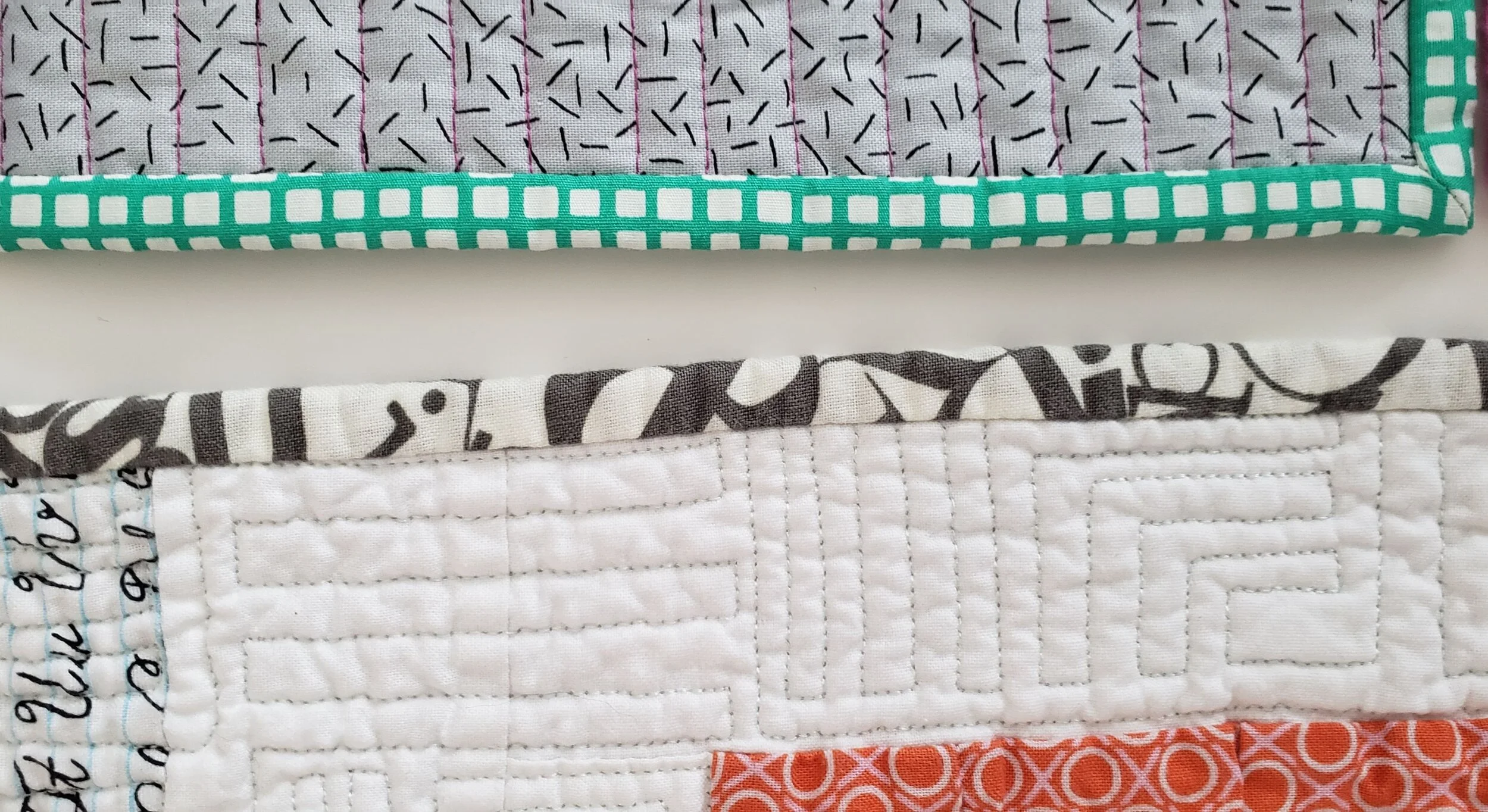
Probably the most commonly used binding for a scrap quilt is some form of black and white stripe. It’s nearly a cliche. Sure, it looks good, but think outside the box. Grey is a good option. As is using the scraps of binding you have stashed all pieced together. Multicolour prints also look great. Or pick one colour you feel is underrepresented in your quilt top and use that.

Values Plus

Wine Gums

Forgiveness

Funky Quilt Bindings

Embrace the Uneveness

One of the reasons people love a stripe on the bias is that there is no concern about it looking ‘off’. And when was the last time you used a plaid or check on a binding? Just run with it and let your eye move around and even be fooled. It’s quite a fun effect actually. Essentially, you are ignoring the pattern to embrace what the fabric can do on the small scale of a binding.

Sewing Machine Quilt

Pocket Squares